Gilded Bazaar of Valdûm — Kit 02
Dark fantasy merchant shop. 50 components — merchant panel, item grid, item detail. Hover and active states. Figma Variables, interactive prototype.
Most shop UI kits are just a grid and a buy button. No merchant identity, no item detail panel, no rarity system. You spend more time building the kit than designing the game.
A shop screen that feels complete — merchant panel, item grid, item detail, full rarity system. 50 components ready to drop in. Hover and active states included from the start.
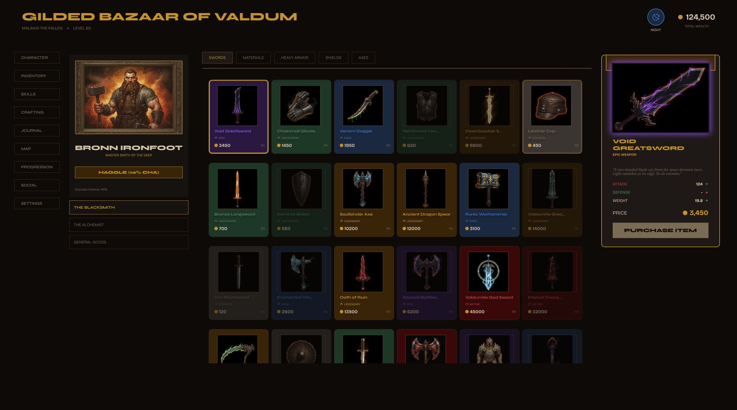
The shop flow — three steps.
Browse the merchant's stock, inspect the item, make the purchase. Every state in the kit covers one of these moments — nothing assumed, nothing left to build.
Meet the Merchant
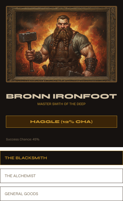
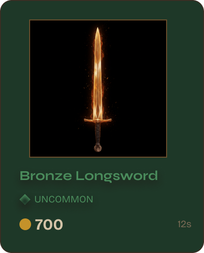
Portrait, name, reputation level — the world context is set before the player browses a single item. It's not a generic store. Category tabs across the top, item grid below. Every card is a component — hover, selected, and out-of-stock states included.
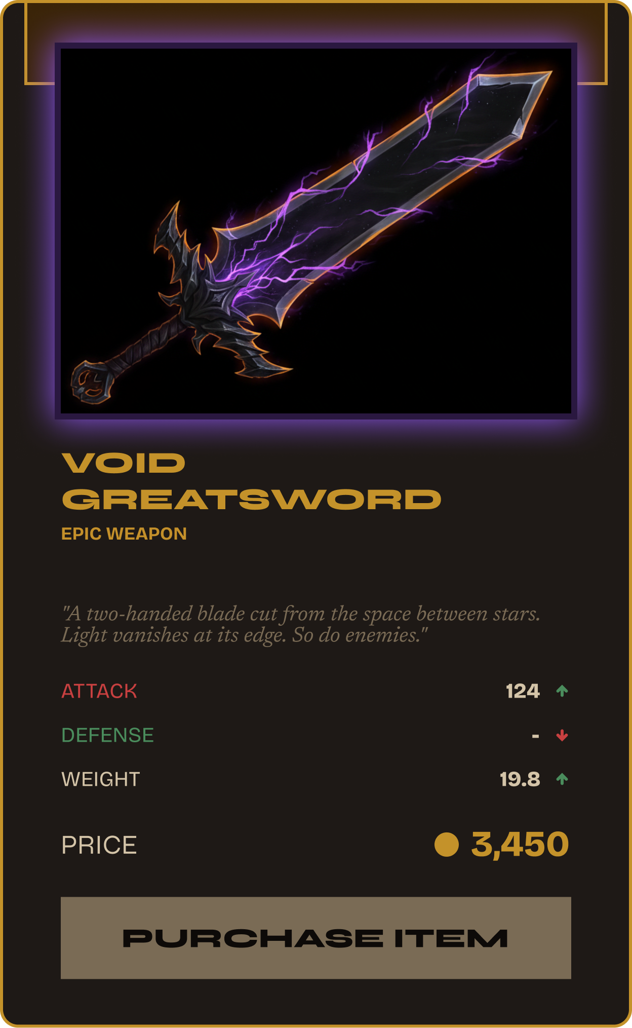
Item detail — every stat accounted for.
Item selected — the detail panel populates instantly. Weapon type, damage range, elemental affinity, attack speed. All visible at once, no second screen required.
Everything a developer needs to spec out.
Damage range, attack speed, elemental bonus, rarity tier, lore text. Three actions: Offer, Buy Now, Compare. Developers don't have to design any of this — it's all here.
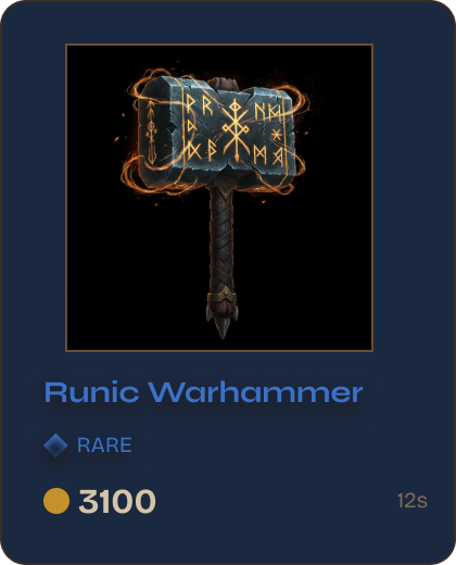
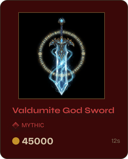
The Rare blue border and background tint shown here come from a single Figma Variable token. Swap the rarity and every element follows.
Same rarity system. Same Variables.
The Bazaar shares the same Figma Variable rarity system as all kits in the collection — 6 tiers, one token, everything updates. Mix Inventory, Bazaar, and Forge together — the component language is consistent across all three.
Every card updates.
All three kits share the same rarity Variables. Mix Inventory, Bazaar, and Forge — same colors, same borders, same logic throughout the entire system.
Kit 02 of 3 in the Dark Fantasy RPG UI System — set in the world of Valdûm. Character Sheet and Skill Tree are in progress. Same palette, same Variables, same world.
View full collection →Get Gilded Bazaar of Valdûm on itch.io
Instant download · 50 components · Hover + Active states · Figma Variables + Prototype included