14
Screens
Every gameplay screen covered — not just highlights.
250+
Components
Production-ready UI blocks for every gameplay screen.
6
Rarity Tiers
Common to Mythic — one variable swap.
44
Color Tokens
Re-theme the entire UI in minutes.
PC
Desktop Ready
Designed specifically for desktop RPGs.
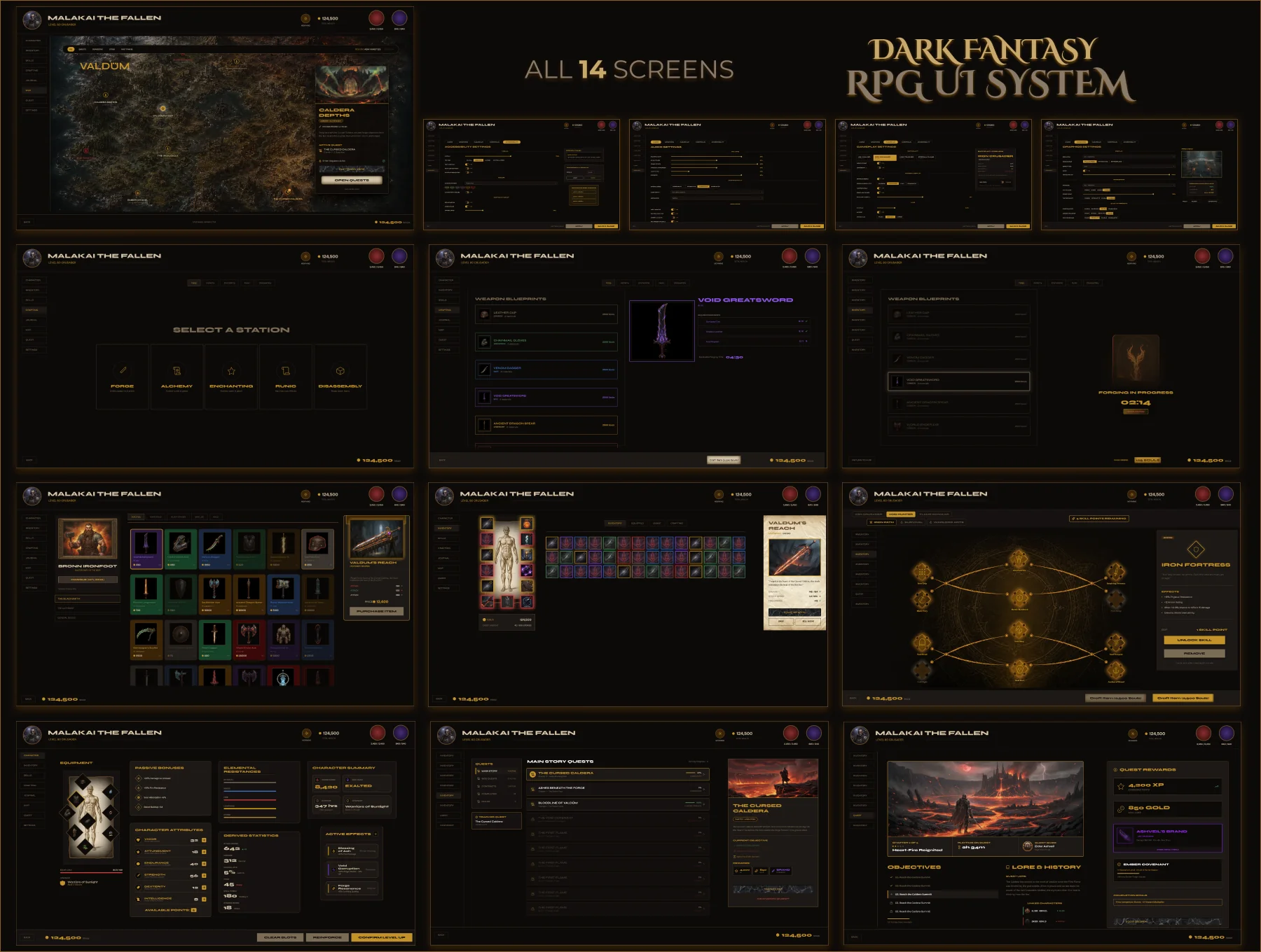
Valdüm — All 14 Screens Overview

Built for PC.
Not for mobile.

Every game UI kit currently on UI8 is built primarily for mobile. Valdûm is different. This is a complete, production-quality Dark Fantasy RPG UI system designed from the ground up for desktop — complex layouts, information-dense screens, and a scalable component architecture inspired by Elden Ring, Diablo IV, and Baldur's Gate 3.
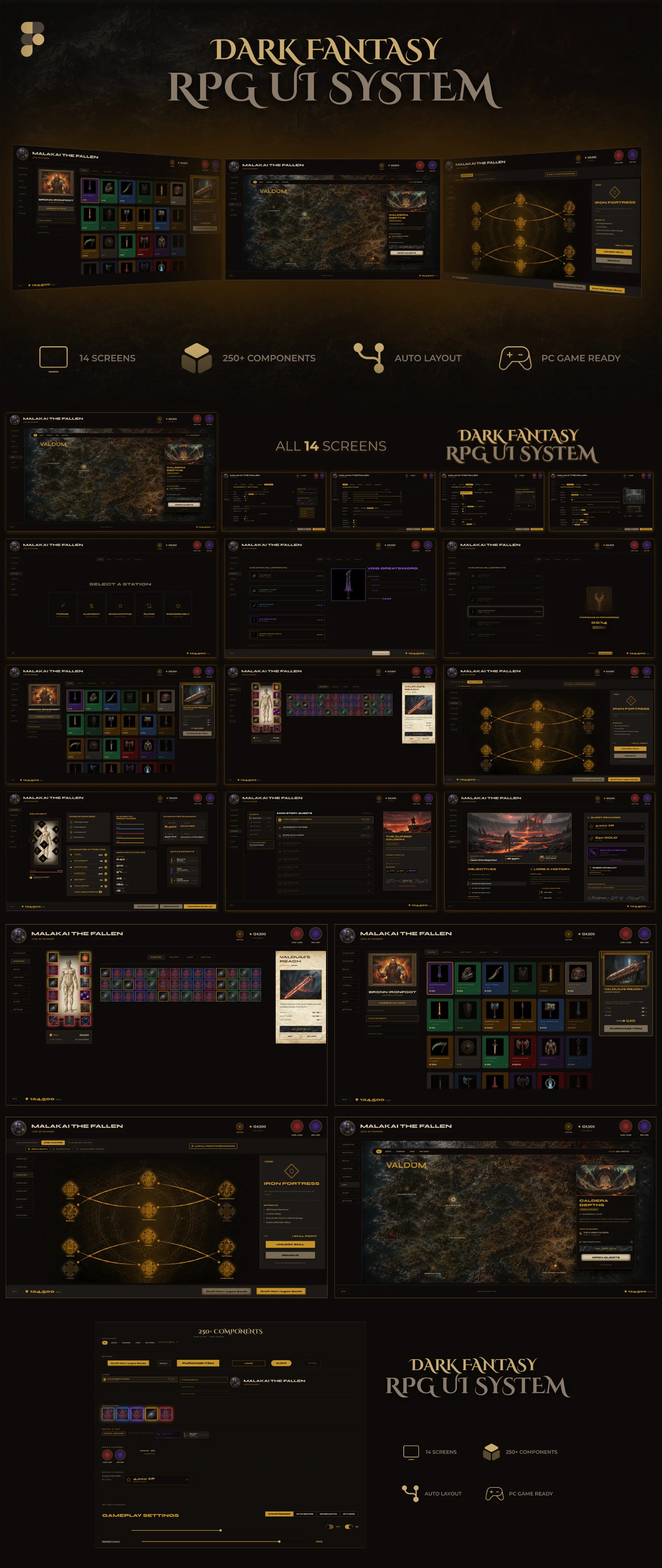
Valdûm — Full system preview, all 14 screens
All 14 screens — Inventory, Bazaar, Character, Skill Tree, World Map, Quest Journal, Quest Detail, Crafting (3 states), Settings (4 screens).
01 — Production First

Not a concept. A handoff-ready system.

Every state covered. Every edge case designed. Nothing left for the developer to guess, rebuild, or improvise.

02 — Desktop First

Built for keyboard and mouse. Not thumbs.

Designed for 1440×900 and above. Information-dense layouts that would break on mobile — intentionally.

03 — System Thinking

Not 14 isolated screens. One visual language.

Every element — every border radius, every gold accent, every panel depth — serves the whole system, not just the screen it lives on.

04 — Reusable Architecture

One component swap. Every screen updates.

255 components built on the same variable foundation. Change a token, and the entire system responds — no hunting through layers.

05 — Consistency over Decoration

Atmosphere without noise.

The parchment textures, gold glows, and dark materials are there. But they never compromise readability or the developer's ability to extend the system.

06 — Named for Handoff

Open the file. Navigate without instructions.

Semantic naming, organized layers, page-by-page structure. A developer who has never seen the file can find any component in under 30 seconds.

Click any tab above to dive into that screen's full case study
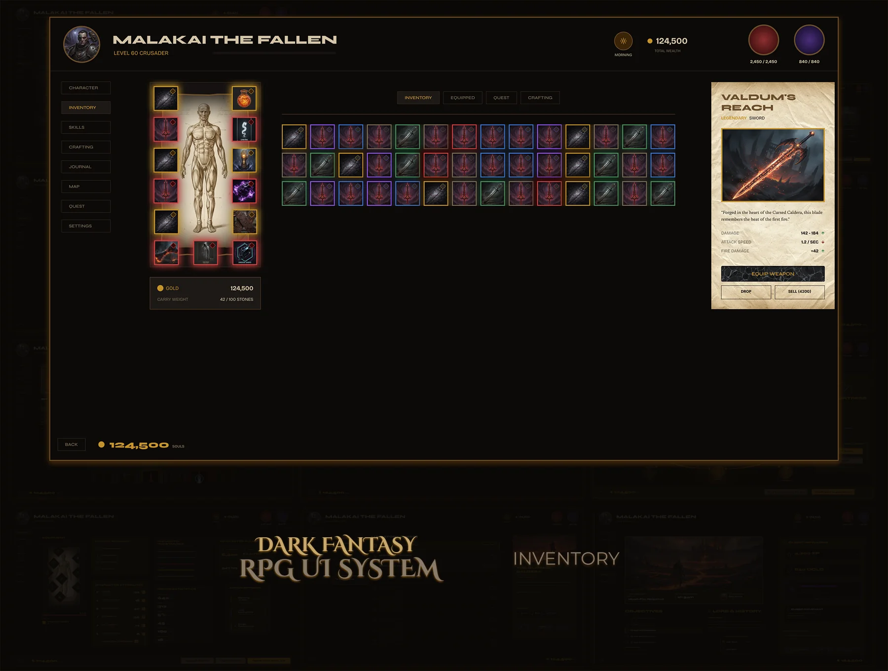
Inventory screen mockup
Inventory
Bazaar screen mockup
Gilded Bazaar
Character sheet mockup
Character Sheet
Skill Tree mockup
Skill Tree
World Map mockup
World Map
Quest Journal mockup
Quest Journal
Crafting Forge mockup
Crafting — Forge
Settings mockup
Settings (4 Screens)
See the System in Action
Open full screen →
Explore the complete gameplay flow — from inventory and bazaar to crafting, quests, and settings. Experience how every screen connects into one consistent desktop RPG interface.
Guided walkthrough. Some interactions are intentionally limited.

14 complete PC RPG screens.
Inventory Character Sheet Skill Tree Gilded Bazaar World Map Quest Journal Quest Detail Crafting — 3 states Settings — 4 screens

250+ reusable components organized into 16 sections. Every component follows a semantic naming structure, uses Auto Layout, and is connected to a complete color variable system.

Production-Ready Figma System.
  • Auto Layout throughout — every component
  • 22 Primitive + 22 Semantic color variables
  • 250+ reusable components
  • Semantic component naming
  • Organized design system — 16 sections
  • Premium dark fantasy visual language
  • 6 rarity tiers — one variable swap
  • Interactive prototype included

📖 Read Me — Setup guide, file structure, font links

🖥 14 Complete Screens — All screens in one organized Figma file

🧩 250+ Components — Organized by screen section, semantic naming

Fonts (all free via Google Fonts): Cinzel Decorative · Cinzel · Montserrat

Screen 01
Inventory — Dark Fantasy RPG Kit 01
Character equipment doll, 3×12 item grid, full item detail panel. Six rarity tiers — each driven by a single Figma Variable. 21 components, interactive prototype included. Drop it in, ship it.
Design Principle Every interaction should require zero explanation.
21
Components
6
Rarity Tiers
Variables
Figma Variables
Prototype
Interactive
Problem

Building an RPG inventory from scratch takes weeks — and most existing kits are missing states, skip the detail panel, or don't come close to dev-ready. You end up rebuilding half of it anyway.

Goal

A complete, production-ready inventory — character doll, item grid, detail panel, full rarity system. Every component and state a developer needs. Nothing to guess. Nothing to rebuild.
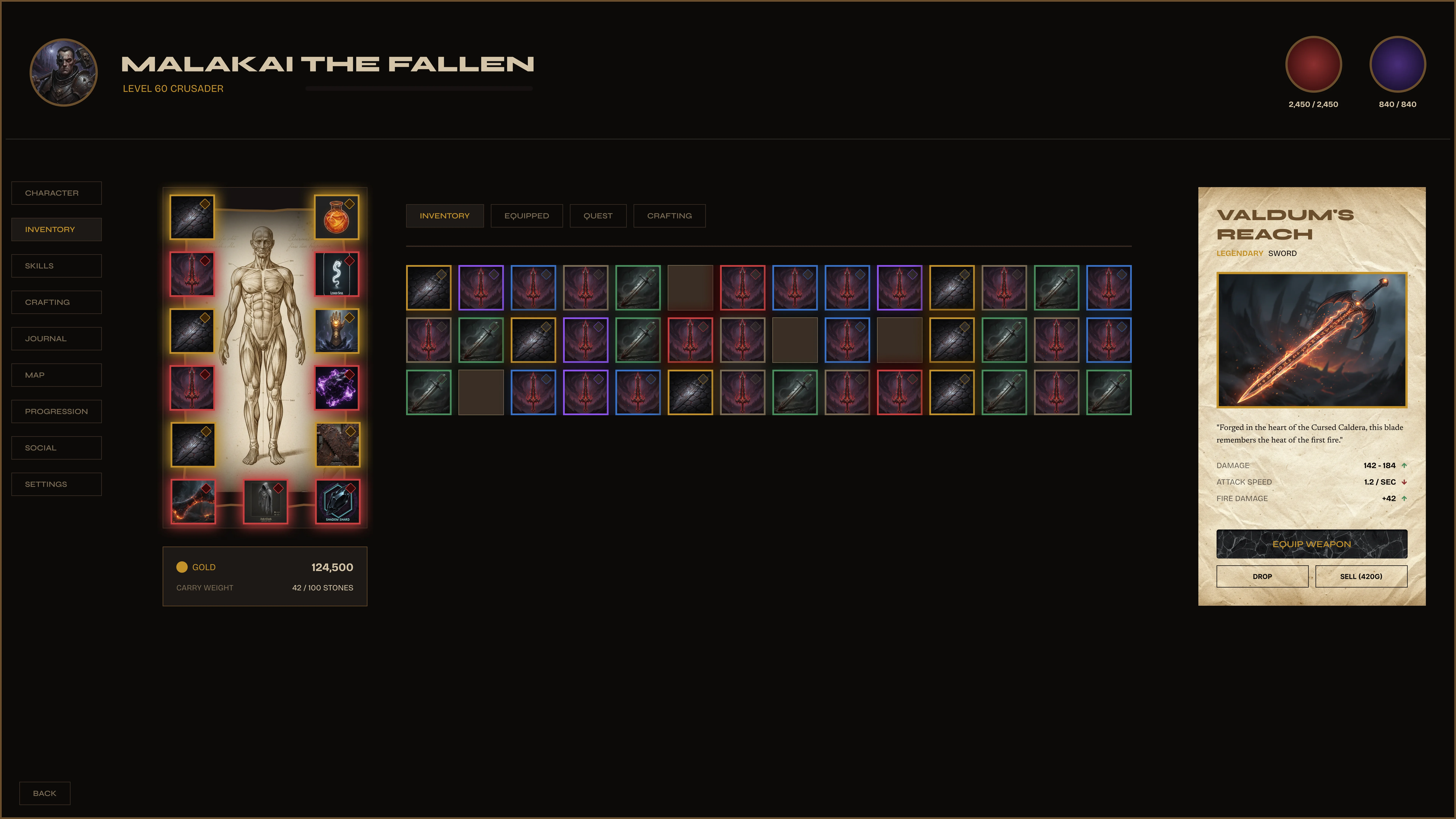
Valdüm Inventory — full screen
Full inventory — equipment doll (left), 3×12 item grid (center), item detail panel (right).
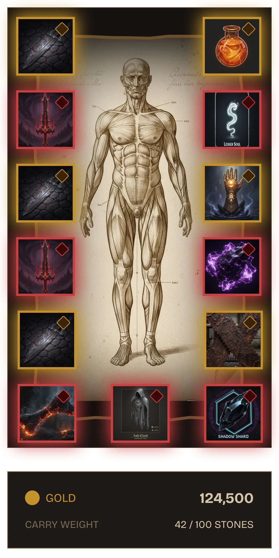
Equipment doll — every slot, every state.
Character silhouette with all equipment slots — weapon, armor, rings, amulet, accessories. Each slot built as a component: empty, equipped, and hover states. The Mythic red border shown is the highest rarity tier — all driven by Variables, no manual overrides.
Equipment doll — fully equipped
Equipment doll — Mythic-tier slots shown. The border color, glow, and frame are all one Variable swap.
Item detail — lore, stats, action.
Select an item and the panel updates instantly. Artwork, lore text, damage range, attack speed, elemental bonuses — three clear actions: Equip, Drop, Sell. Parchment texture grounds it in the world without pulling focus from the item. One component drives every item in the game.
Item Detail Panel

Fully specced. Zero decisions left for the developer.

Damage range, elemental affinity, attack speed. Rarity border glows at the correct tier. Three action buttons. The developer swaps the data — the design stays locked.
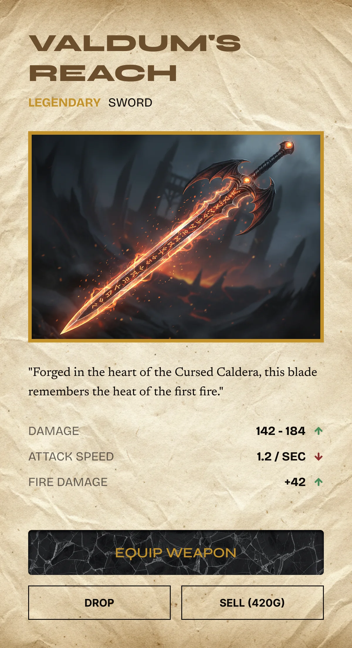
Item Artwork Stats Panel Lore Text 3 Action Buttons Rarity Border Glow
Item detail panel — Legendary sword
Live Figma Prototype
Open full screen →
Equipment Doll 3×12 Item Grid Detail Panel 6 Rarity Tiers Hover + Active States Auto Layout Figma Variables Interactive Prototype
Dark Fantasy RPG Inventory — Kit 01
$8.99 · Instant download · 21 components · Variables + Prototype included
Screen 02
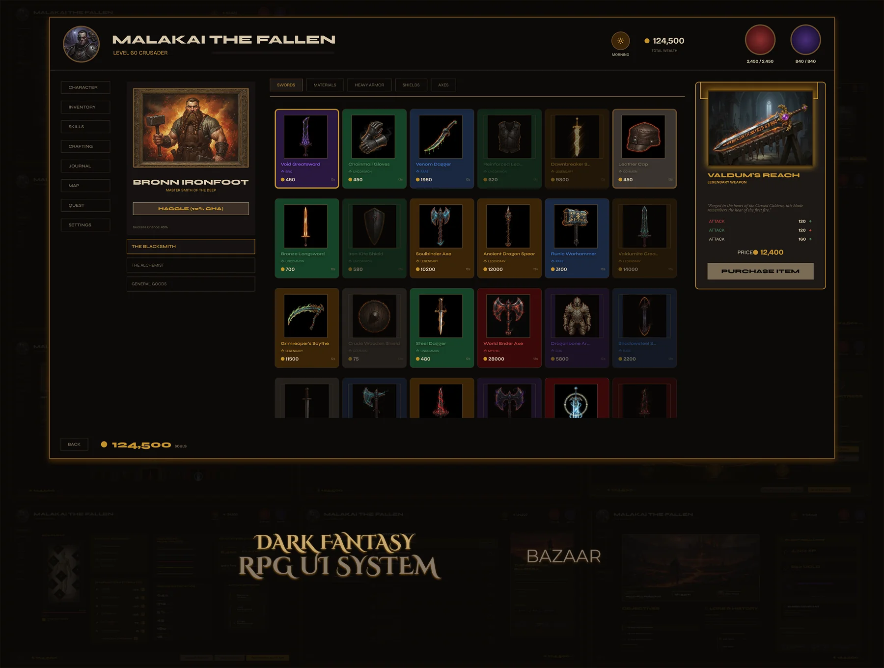
Gilded Bazaar — Dark Fantasy RPG Kit 02
Full merchant shop — portrait panel, scrollable item grid, item detail with stats and lore, buy/sell flow. 50+ components, four rarity tiers, interactive prototype. A shop that feels like a character's domain.
Design Principle Scanning should always be faster than reading.
50+
Components
4
Rarity Tiers
Hover+Active
Interaction States
Prototype
Interactive
Problem

Most shop UIs are a grid and a buy button. No merchant identity, no item detail, no rarity logic. You spend more time building the kit than designing your game — and it still looks generic.

Goal

A shop that feels like a character's domain. Merchant portrait panel, browsable item grid, full item detail with stats and lore, rarity system baked in. 50+ components — drop in, play.
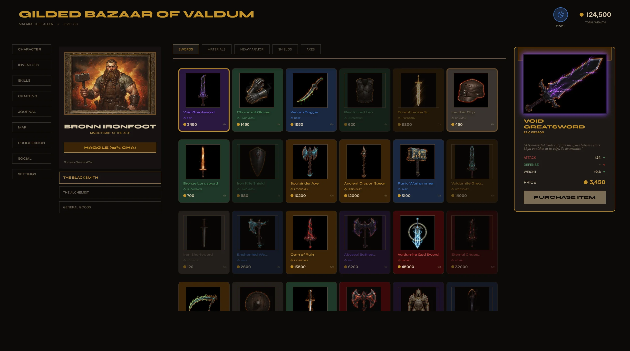
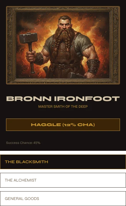
Valdüm Gilded Bazaar — full screen
Full Bazaar screen — merchant portrait panel (left), browsable item grid (center), item detail (right).
The merchant — not just a store.
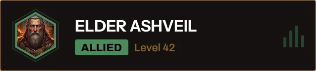
Portrait, name, reputation — world context set before the player browses. Category tabs organize stock. Every item card is a component with hover, selected, and out-of-stock states.
Merchant portrait panel
Merchant Panel

A character, not just a vendor.

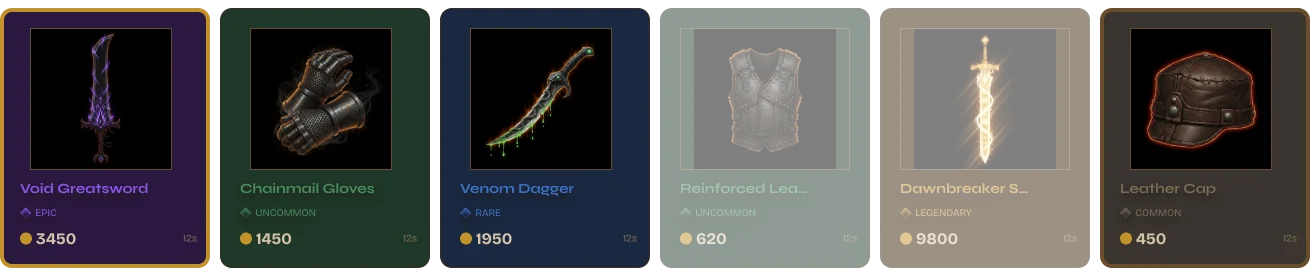
The merchant card carries portrait, name, reputation level, and specialty. Product rows below show icon, name, rarity badge, and price — four tiers visually distinct at a glance. No tooltip required to read the hierarchy.
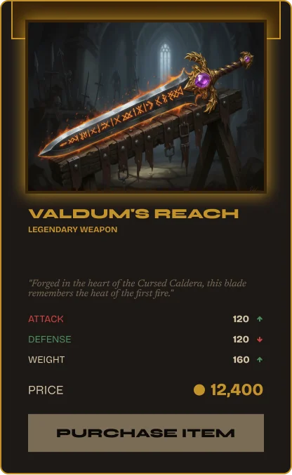
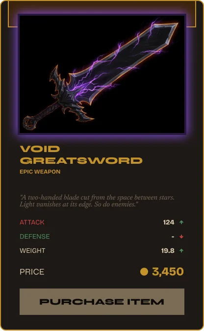
Portrait + Name Product Rows Rarity Badges Buy / Sell
Item detail — stats, lore, rarity.
Click any item — the detail panel opens. Damage range, elemental affinity, attack speed, lore text, ingredient list, and price. Same component, different rarity. The border color tells the whole story.
Item detail — Common
Common / Uncommon — base border
Item detail — Epic
Epic — gold border glow active
Product row — the item at a glance.
Each listing in the product list shows icon, name, rarity tier, and price. Hover state highlights the row. Selected state locks it and opens the detail panel. Built to handle any item in the game world.
Product rows — four rarity tiers
Product rows — Common through Epic shown. Rarity badge and tint visible without hovering.
Merchant Portrait Panel Scrollable Item Grid Item Detail Panel Buy / Sell Flow Hover + Active States 4 Rarity Tiers Auto Layout Figma Variables
Live Figma Prototype
Open full screen →
Gilded Bazaar — Dark Fantasy RPG Kit 02
$8.99 · Instant download · 50+ components · Prototype + Variables included
Screen 03
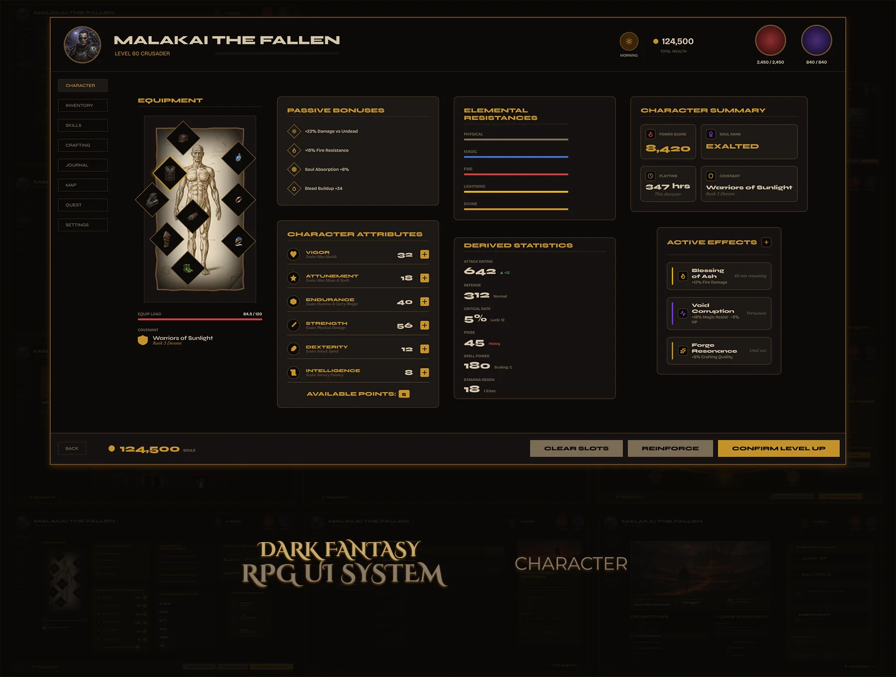
Character Sheet — Malakai the Fallen
The complete character screen — equipment doll, 6 core attributes with allocation controls, elemental resistances, derived stats, skill bonuses, active effects. 51 components, no panel left half-done.
Design Principle Hierarchy creates confidence.
51
Components
6
Attribute Panels
6
Resist. Types
Variables
Figma Variables
Problem

Character screens are one of the hardest UI systems in RPG design. Five to six distinct panels, each with their own logic. Most kits show the pretty version of one panel and skip the rest.

Goal

Every panel fully designed — equipment slots with all states, attribute allocation with controls, elemental resistances with color coding, derived stats, skill bonuses, active effects. One file, six panels, 51 components.
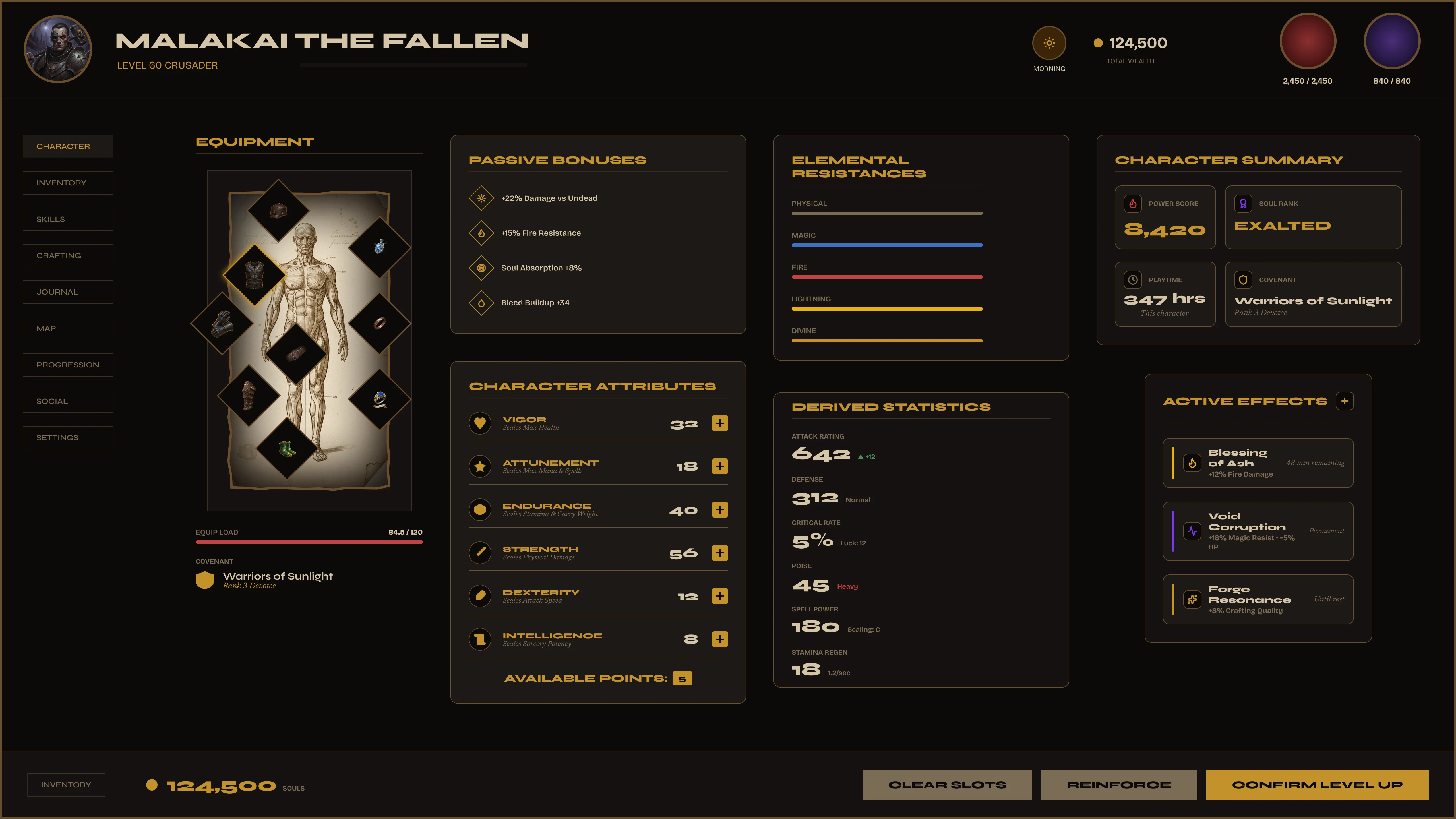
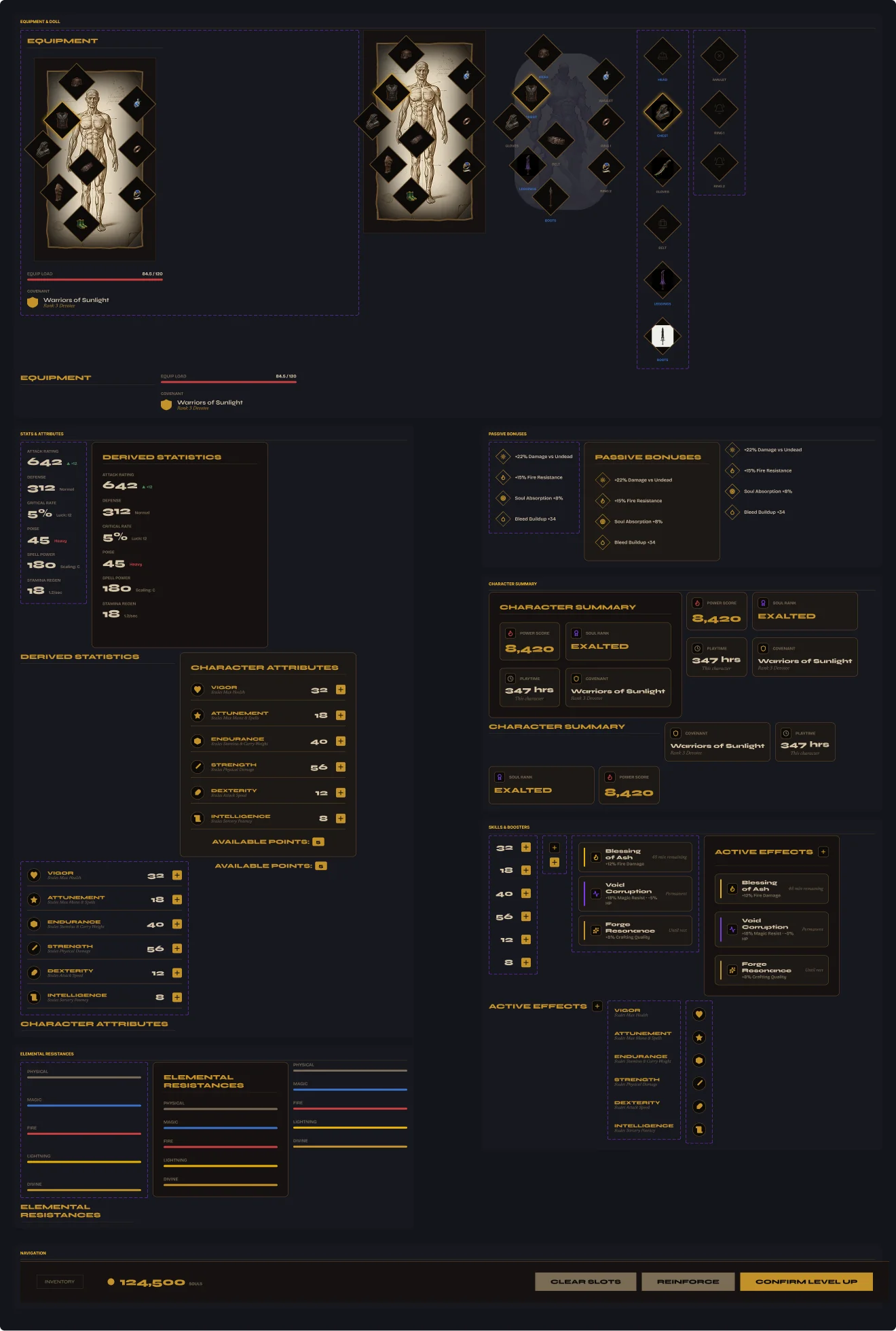
Valdüm Character sheet — full screen
Full character sheet — equipment doll (left), tabbed stat panels (right), character portrait with level and class.
Six panels. All of them designed.
Most RPG character screens design the pretty version of one panel and leave the rest to developers. Valdûm covers all six — every state, every transition, every edge case locked before handoff.
Equipment Doll
All slots — head, chest, legs, hands, feet, weapon, offhand, rings, amulet. Empty, equipped, hover states each designed.
Core Attributes
STR · AGI · INT · END · WIL · PER. Base value, equipment modifier, allocation controls. Remaining points tracked live.
Derived Stats
HP, Mana, Stamina, Defense, Crit — auto-calculated from attributes. Stat rows show base value and equipment bonus side by side.
Elemental Resist.
Fire, Ice, Lightning, Poison, Dark, Holy — resistance bars with percentage. Color-coded by element. Weaknesses visible at a glance.
Skill Bonuses
Active modifiers from gear and effects — compact bonus rows. Skill name, source, value. Expandable, no clutter by default.
Active Effects
Buffs, debuffs, status effects — icon, name, duration, source. Positive in green, negative in red. Designed as a live readout.
Character sheet — all components
Component Overview

51 components. Every panel self-contained.

Each of the six panels is its own component set. Developers implement one panel at a time — nothing is tangled together. Figma Variables handle the gold palette and spacing across all 51.

51 Components Auto Layout Figma Variables 6 Panels
Attributes — allocation with controls.
Each attribute has a base value, equipment modifier, and live allocation controls. The remaining point pool updates in real time. Developers get the full spec — no design gaps.
Attribute System

STR · AGI · INT · END · WIL · PER

Every attribute row shows: base stat, equipment bonus, current total, and +/− allocation buttons. The point budget tracks remaining points. Fully specced — no guessing on developer's end.
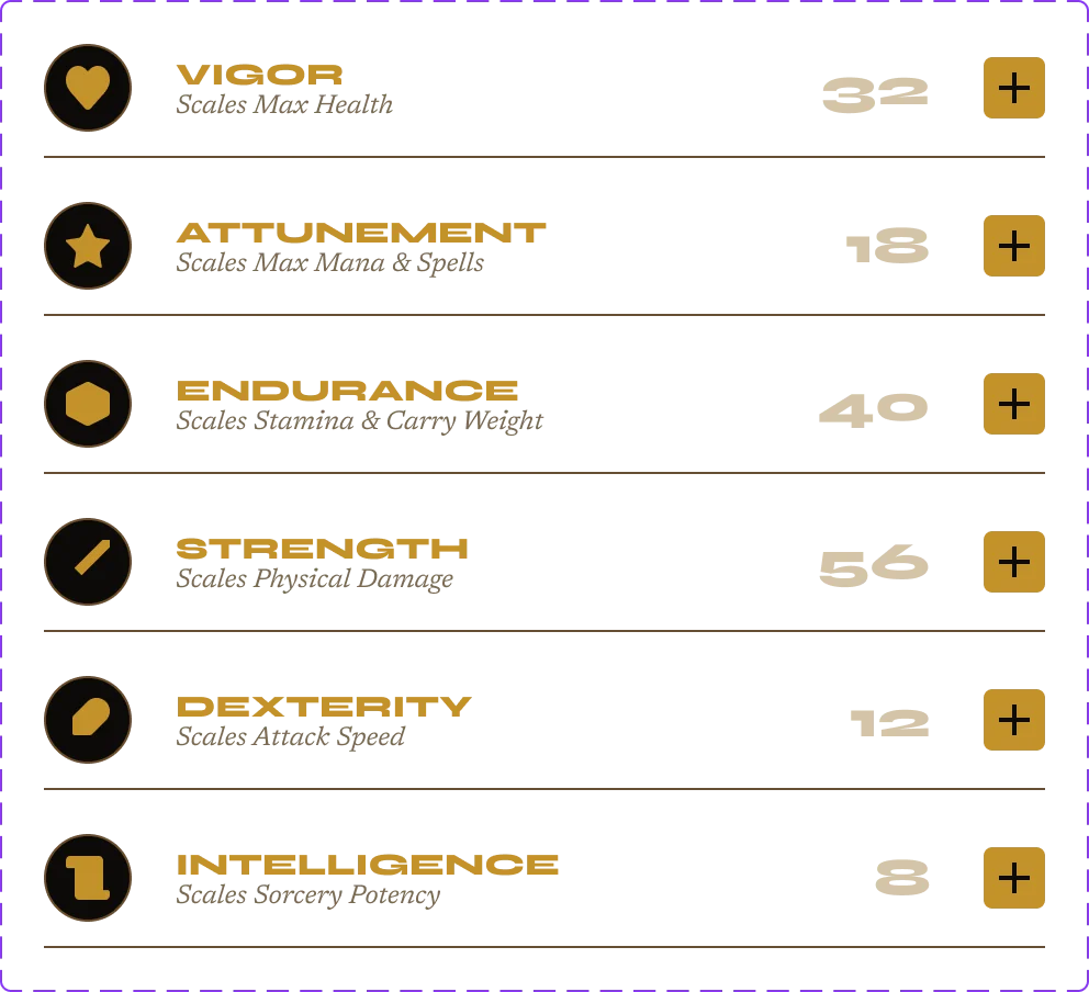
Base Value Equipment Bonus Allocation Controls Point Budget
Core attribute rows
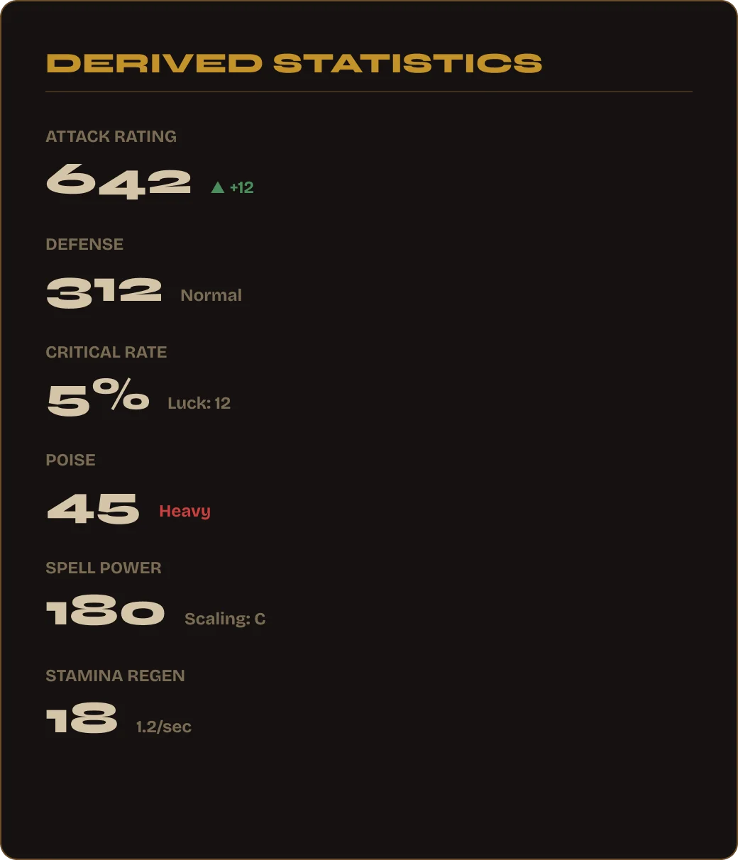
Derived stats — calculated, not guessed.
HP, Mana, Stamina, Defense, Crit — each stat row shows the base value and the equipment bonus side by side. Developers read the exact layout from the file. No interpretation required.
Derived stat panel
Derived stats panel — base value + equipment modifier on each row, five stats shown.
Equipment Doll Attribute Allocation Elemental Resistances Derived Stats Skill Bonuses Active Effects 51 Components Auto Layout Figma Variables
Live Figma Prototype
Open full screen →
Character Sheet — Dark Fantasy RPG Kit 03
$8.99 · Instant download · 51 components · 6 panels · Variables included
Screen 04
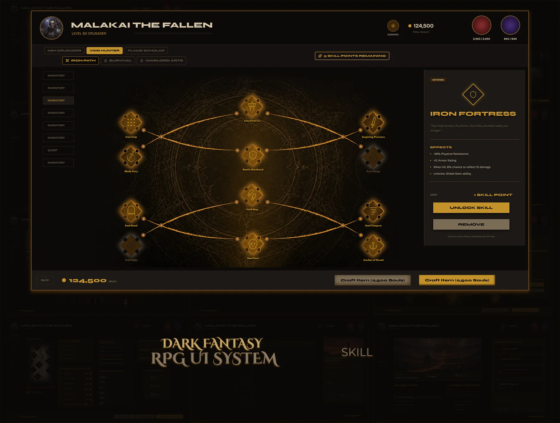
Skill Tree — Malakai the Fallen
Node-based skill progression across three tiers. 20+ nodes — each with Active, Available, and Disabled states. Skill detail panel opens on click. Every path designed, every connection drawn.
Design Principle Complex systems should feel approachable.
20+
Skill Nodes
3
Skill Tiers
6
Node States
Variables
Figma Variables
Problem

Skill trees look simple — until you design one. Node states, connection paths, tier progression, the detail panel — each is its own system. Most designers ship one state and leave the rest to imagination.

Goal

A complete skill tree where a developer can implement every node without making a single design decision. Six node states, a standalone detail panel, three tiers, one consistent visual language.
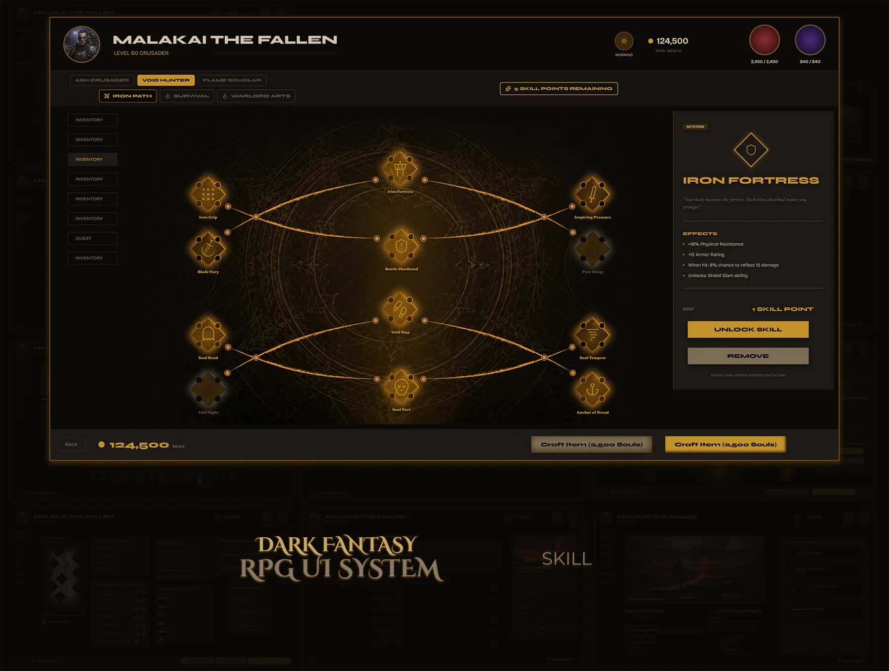

Valdüm Skill Tree — full screen
Six states. Zero ambiguity.
Each node has 6 fully designed states: Active (default + hover), Available (default + hover), and Disabled (default + hover). Active nodes glow gold. Available nodes are outlined and ready. Disabled nodes are dimmed — the path forward is always readable without explanation.
Skill node — Active
● Active — Unlocked
Skill node — Available
● Available — Can Unlock
Skill node — Disabled
● Disabled — Locked
Detail panel — one component, every skill.
Click any node — the detail panel opens. Skill name, tier badge, effect description, unlock cost. Three clear action buttons. One standalone component works for the entire tree.

Skill Detail Panel

Tier badge, skill name, description, cost to unlock, and current level — all in one panel. Developers drop it in and swap the data. The design doesn't change.
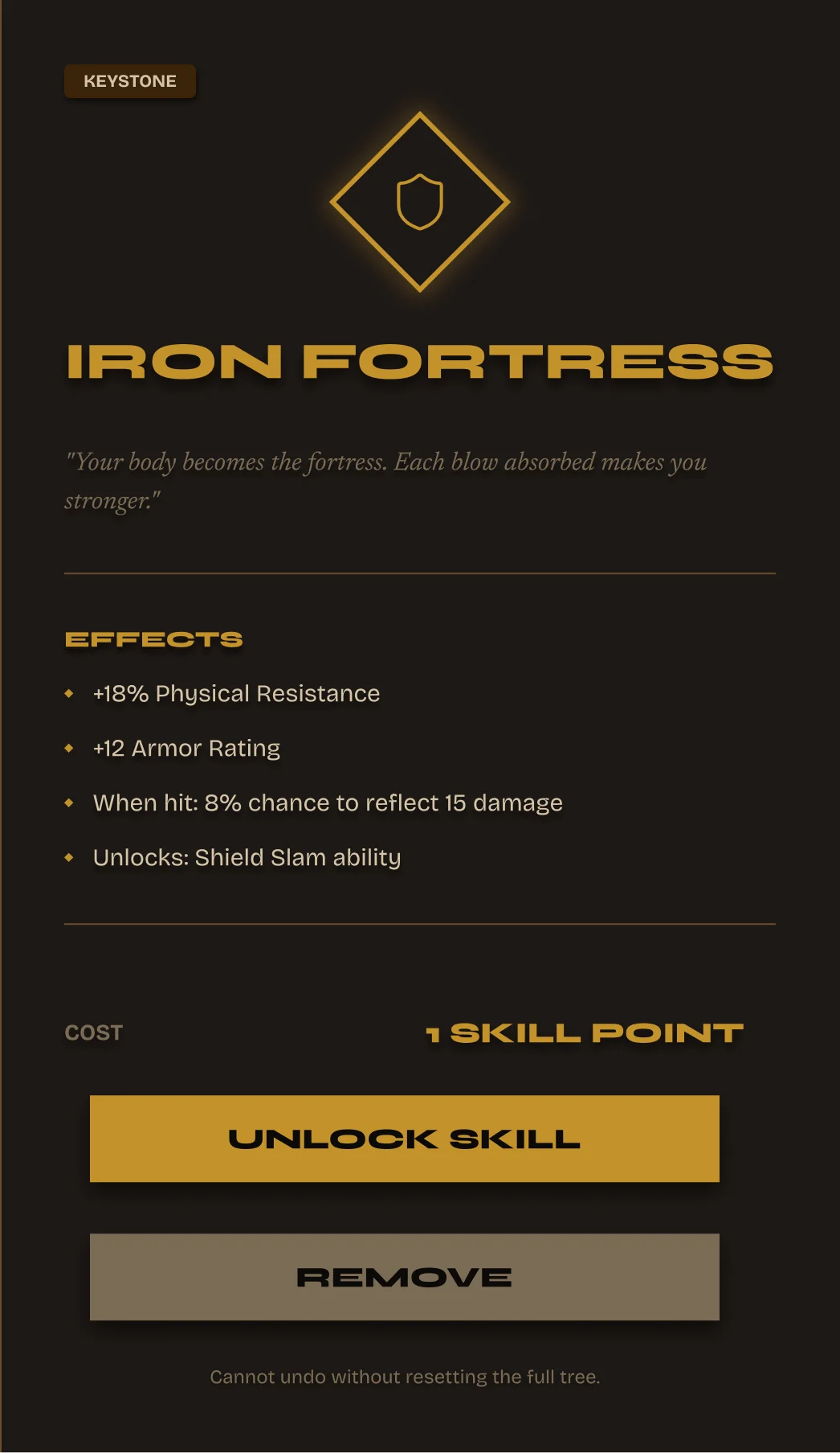
Skill Name + Icon Tier Badge Unlock Cost 3 Action Buttons
Skill detail panel
20+ Skill Nodes 3 Tiers Detail Panel Active State Available State Disabled State Auto Layout Figma Variables
Live Figma Prototype
Open full screen →
Skill Tree — Part of the Valdûm Complete System
20+ nodes · 6 states · Detail panel · Available in the complete UI8 bundle
Screens 05 – 06
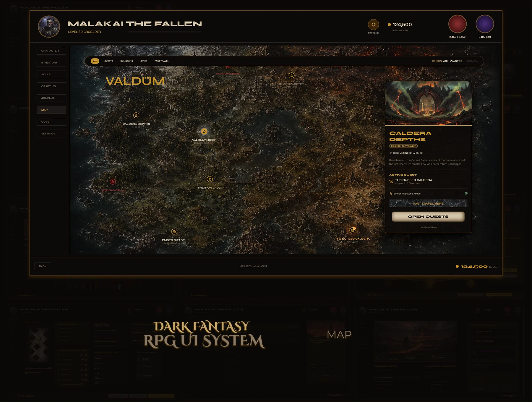
World Map — Valdûm
Two map screens — area map and world map. Location markers with discovery states, fast travel UI, location detail popup. Parchment aesthetic, illustrated region art, every marker a component.
Design Principle Navigation before decoration.
2
Map Screens
3
Marker States
Fast Travel
UI Included
Variables
Figma Variables
Problem

World maps carry heavy UX weight — discovery states, fast travel gating, active location feedback. Most map UI kits deliver a pretty background image and nothing else. No components, no states, no logic.

Goal

A map UI that communicates discovery, exploration, and navigation clearly. Location markers in three states, a detail popup component that works on every location, fast travel gating built into the visual design.
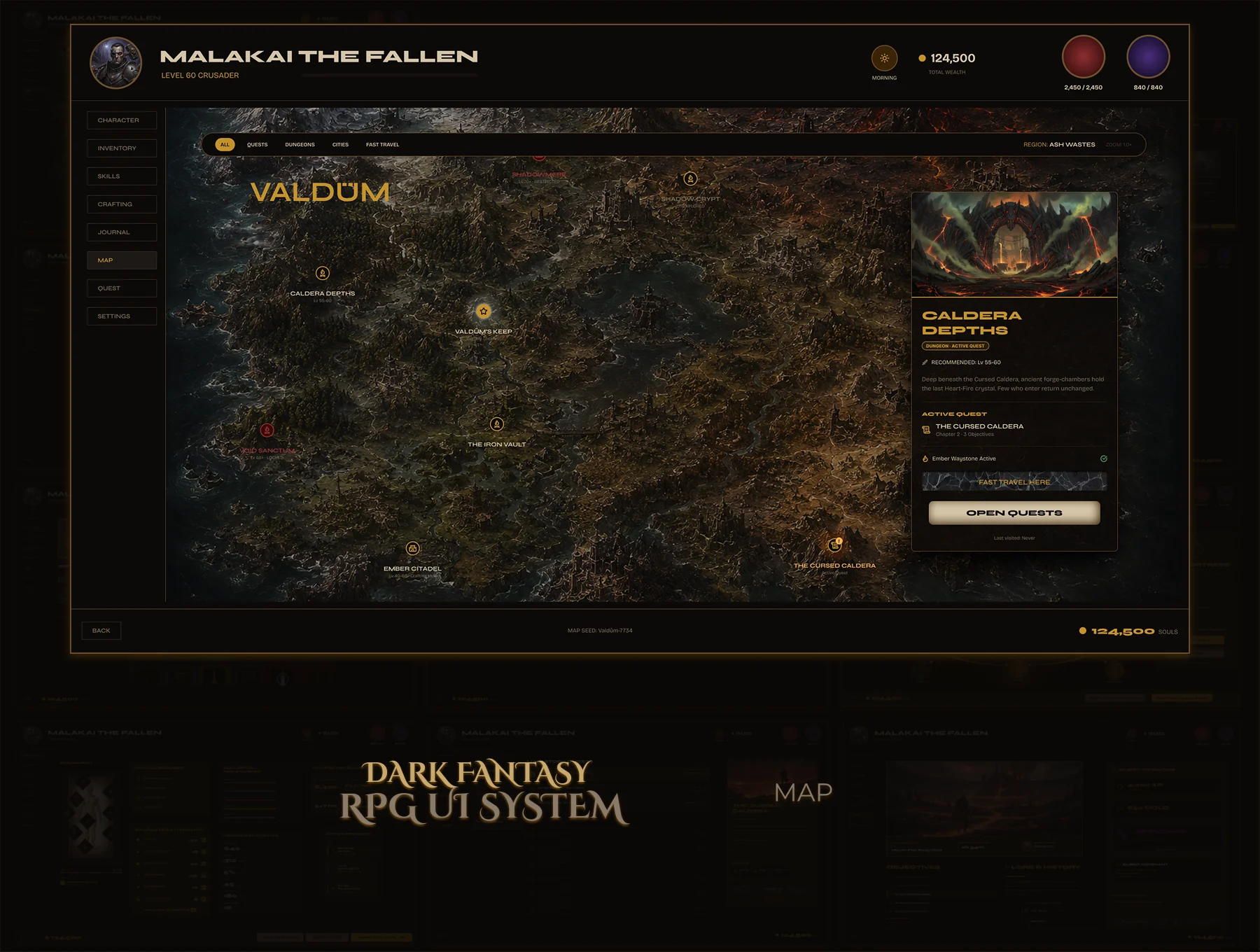
Valdüm World Map — full screen
Location detail — one component, every location.
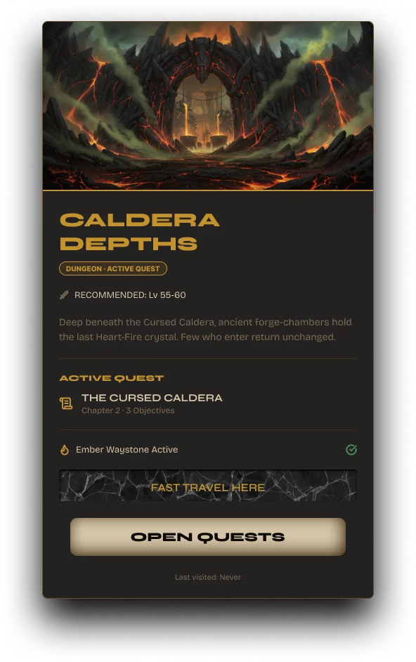
Click any marker — the detail panel appears. Location name, region tag, discovery status, lore, and a fast travel button. Same component for every location in the game. Developers swap data, design stays locked.
Location detail popup

Location Detail Panel

Name, region, lore text, fast travel CTA. Dark parchment texture, gold title — consistent with Valdûm's world. The fast travel button only activates when the location is already discovered. The visual rule is the design rule.


Location Name Discovery State Fast Travel Lore Text
Location markers — 3 states, one component.
Map marker — undiscovered
State: Default
Map marker — default
State: Default
Map marker — hover
State: Hover
Discovery State
Undiscovered, explored, fully cleared — three marker states. Players read the map without opening any panel.
Fast Travel Gating
The fast travel CTA activates only on discovered locations. No additional rule text needed — the button state IS the rule.
World Atmosphere
Parchment texture, aged edges, illustrated region art. The map feels like an object that belongs in the world — not a screen overlay.
2 Map Screens Location Markers Detail Popup 3 Marker States Fast Travel UI Region Navigation Figma Variables
Live Figma Prototype
Open full screen →
World Map — Part of the Valdûm Complete System
2 screens · location markers · detail popup · fast travel · available in the complete UI8 bundle
Screens 07 – 08
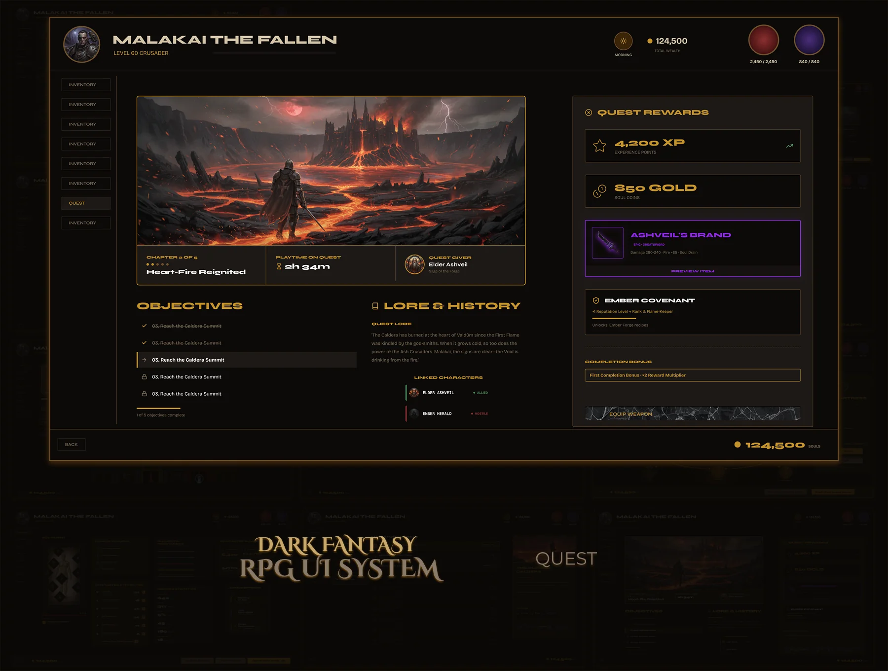
Quest Journal & Detail
Two-screen quest system — scrollable journal with category filters and all quest states, plus a dedicated detail view with objectives, rewards, lore, and track action. One component language, both screens complete.
Design Principle Information first.
2
Screens
4
Quest States
Rewards
Panel Included
Variables
Figma Variables
Problem

Quest systems are usually the last UI to get designed — and it shows. A single static list with no states, no detail view, no rewards panel. Developers guess the rest.

Goal

Two complete quest screens. The journal covers every state — active, completed, failed, locked. The detail view is fully specced: objectives, rewards, lore, track and abandon actions. Nothing left to interpret.
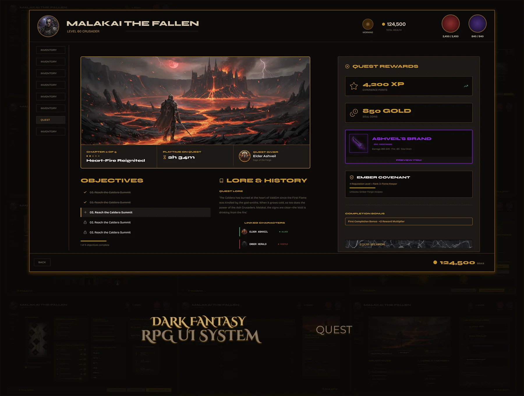
Quest Journal — full screen
Quest Journal — scrollable quest list, category filters, active/completed/failed states, quest preview sidebar.
Quest List
Active, completed, failed, locked — all states listed. Category tabs filter by story, side, and faction quests. One selected quest populates the sidebar.
Quest Preview
Sidebar shows name, short description, active objective, and a link to the detail view. Player gets orientation without leaving the journal.
State Filters
All quests, Active, Completed, Failed — filter tabs let players find what they need without scrolling the entire list.
Quest Journal overview panel
Quest Overview Panel

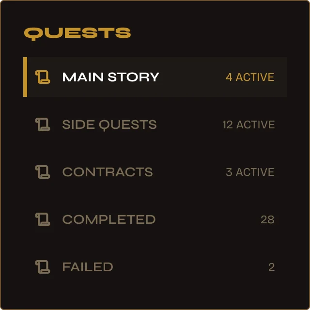
Category navigation — built in.

Main Story, Side Quests, Contracts, Completed, Failed — each as a panel row with live count. One tap filters the list. The navigation IS the component — no separate menu needed.
Main Story Side Quests Contracts Completed / Failed
Quest Info Card
Quest Info Card

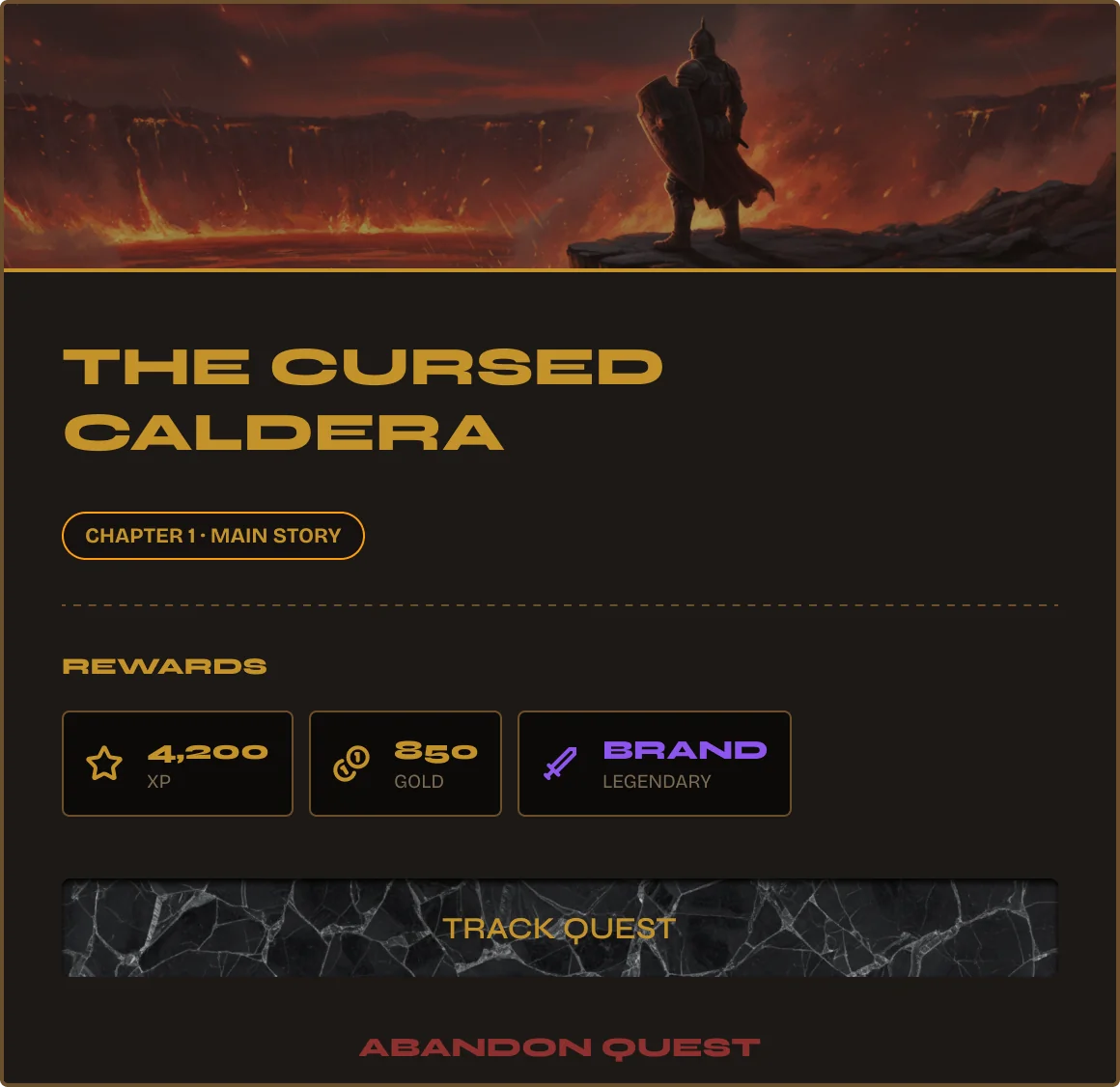
Hero image. Chapter. Rewards. CTA.

Chapter tag, main story badge, reward breakdown — XP, Gold, Item with rarity colour. Track Quest and Abandon Quest as primary actions. Everything a player needs to commit or skip, in one card.
Chapter Tag Reward Preview Track / Abandon
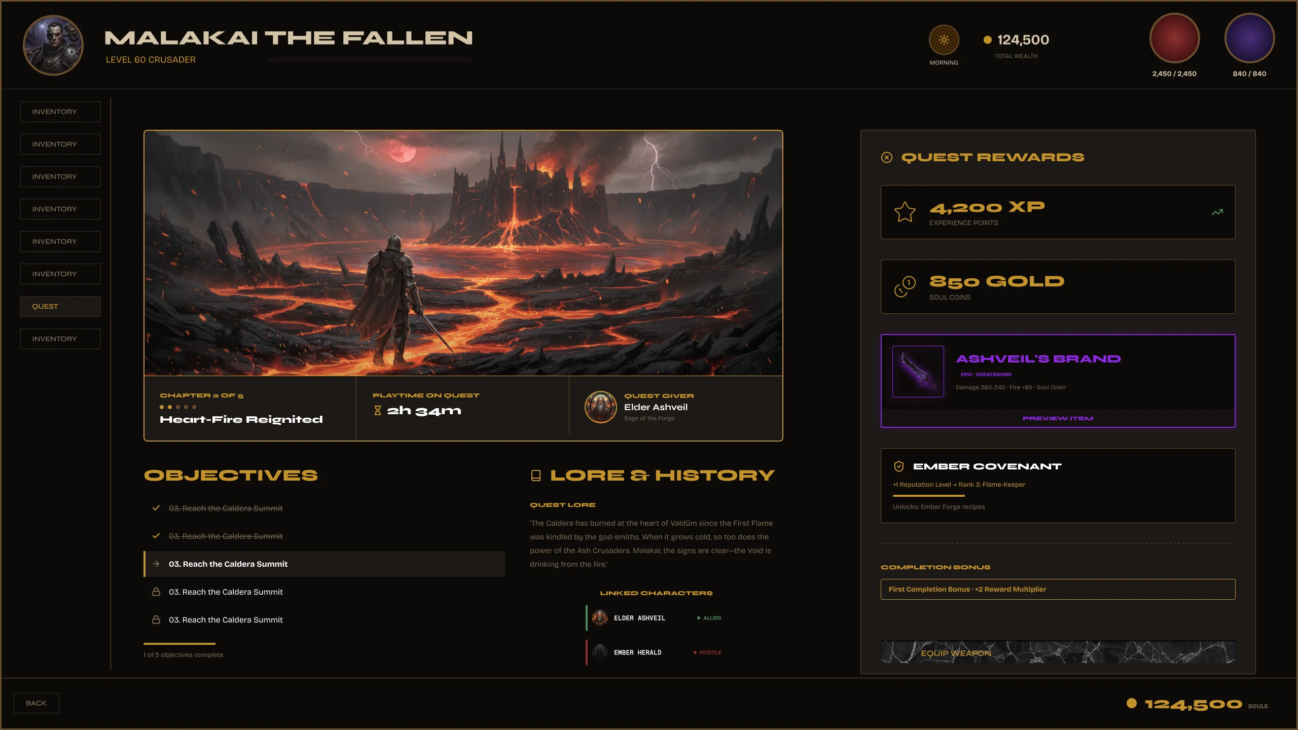
Quest Detail — full screen
Quest Detail — objectives breakdown, rewards panel, lore text, track and abandon actions.
Objectives
Every objective listed — completed ones struck through, active ones highlighted. Multi-step quests, optional tasks, branching paths — all readable at a glance.
Rewards Panel
XP, gold, and item rewards — each with rarity indicator. Players know exactly what they're working toward before committing.
Lore Panel
Quest backstory and context. Parchment texture, aged typography — the world-building happens in the UI, not just in dialogue.
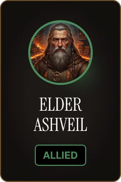
NPCs & Factions — 3 display modes, one component.
NPC card — vertical portrait
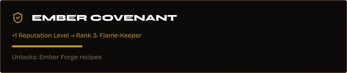
NPC card — expanded row Covenant / Faction card
Vertical Portrait
Expanded HUD Row
Covenant / Faction
2 Screens Quest List Quest Detail 4 Quest States Objectives Rewards Panel Lore Text Figma Variables
Live Figma Prototype
Open full screen →
Quest Journal & Detail — Part of the Valdûm Complete System
2 screens · 4 quest states · objectives + rewards panel · available in the complete UI8 bundle
Screens 09 – 11
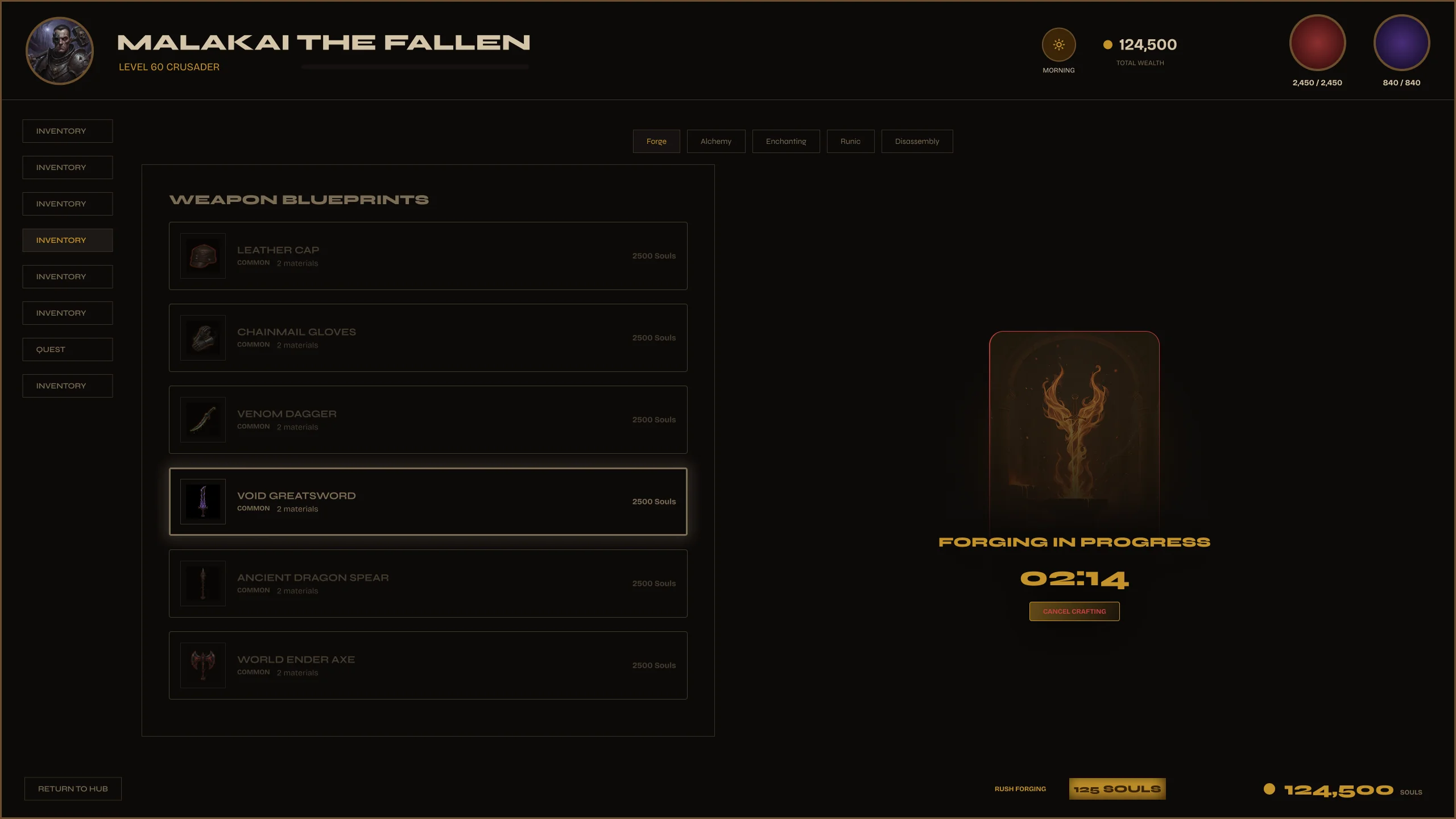
Crafting — Forge System
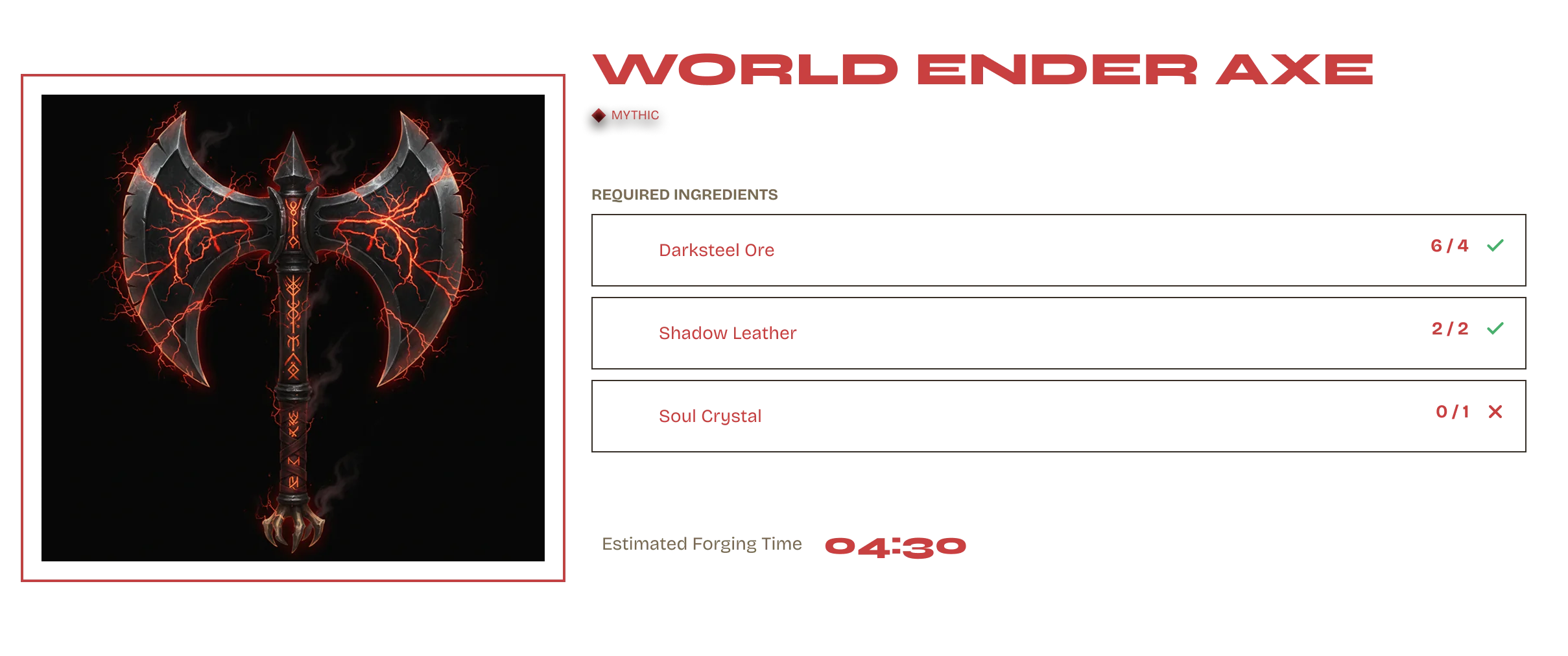
Three screens: station selection, blueprint browser, and the active forge. Ingredient slots, forging timer, rarity outcome preview, item forged overlay — the full crafting flow, nothing left to improvise.
Design Principle Reduce complexity through structure.
3
Screens
6
Rarity Tiers
4
Forge States
Variables
Figma Variables
Problem

Crafting UIs are deceptively complex. You need a station selection, a blueprint browser with rarity outcomes, ingredient management, a forging state with timer, and a completion overlay. Most kits show one of these.

Goal

The complete forge flow across three screens — station select, blueprint browser, active forge. Every state designed: browsing, forging in progress, item forged. One system, zero gaps.
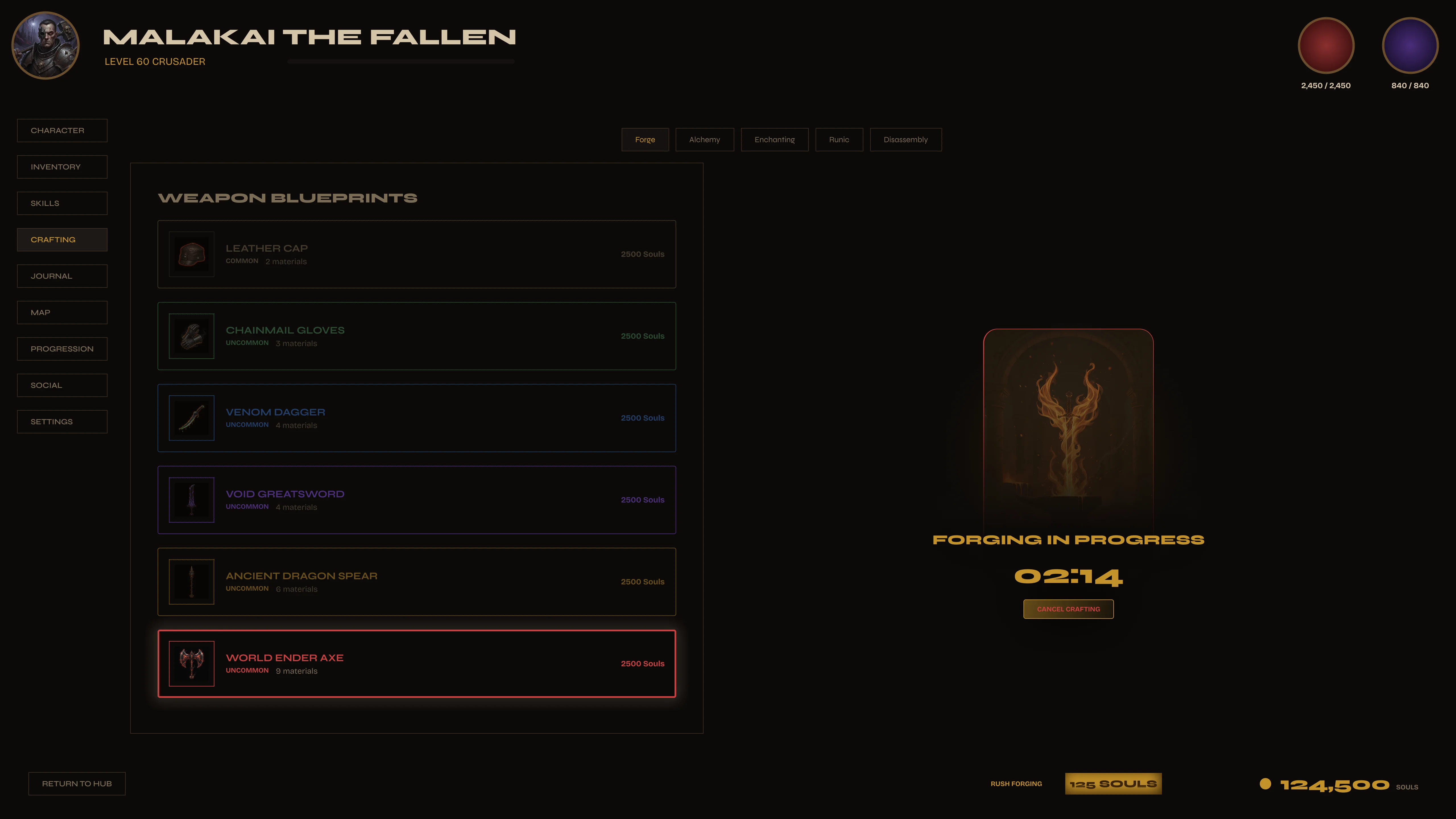
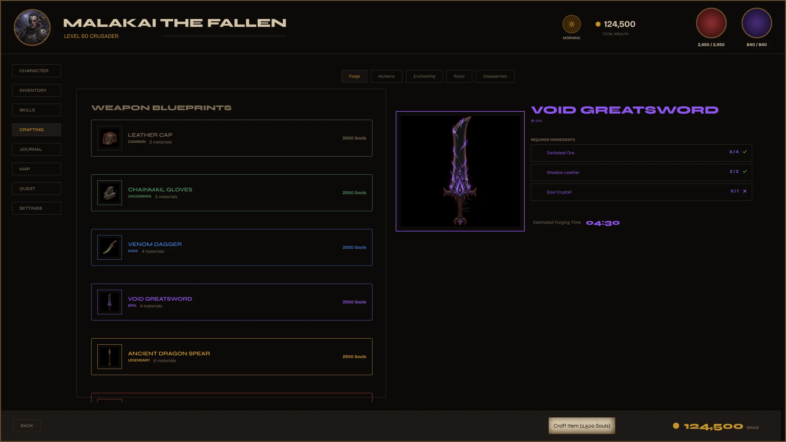
Crafting Forge — main screen
Active forge — ingredient slots filled, blueprint selected, forging state active.
Four states. All designed.
Idle, forging in progress, forging complete, item forged overlay. Every state is a component — developers implement each one independently. The timer, the glow, the overlay — all specced.
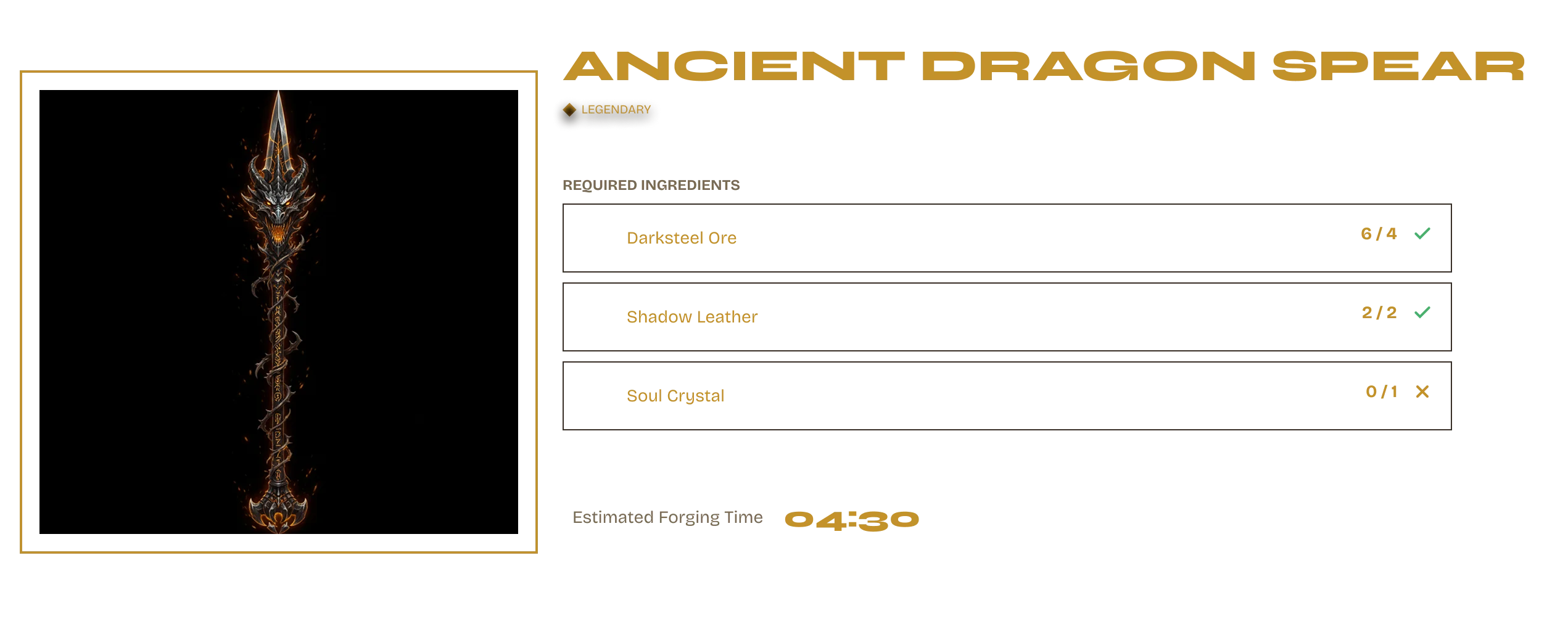
Forging — in progress with timer
Forging State

The forge is alive when it's working.

Ingredients locked in. Timer running. The screen dims and the forge animation plays. Players can't miss that something is happening — the visual design carries the state, no text required.
Forging Timer Screen Dim Animation Slot
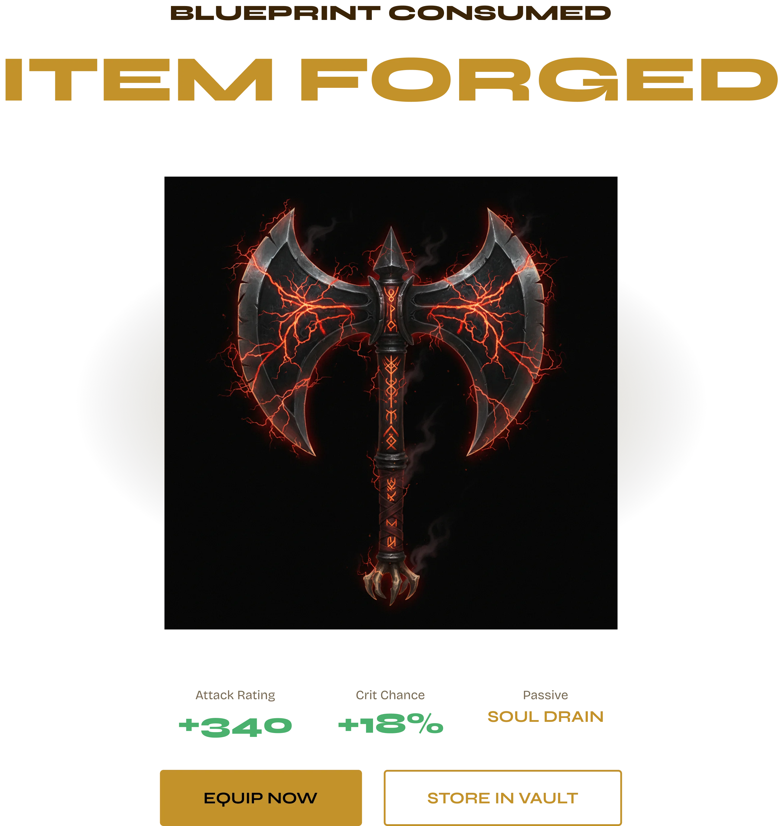
Item forged — the payoff screen.
Forging complete. The item forged overlay takes the screen — rarity reveal, item artwork, stats unlocked. This is the AAA moment every crafting UI needs and most kits skip.
Item forged overlay — Mythic reveal
Item Forged overlay — rarity border glows at Mythic. Item artwork, name, core stats. One moment of drama, fully specced.
Rarity outcomes — attribute cards.
Every rarity tier has a distinct attribute card design. The crafting system communicates outcome quality before and after forging. Mythic gets the full gold treatment.
Legendary attribute card
Legendary — purple border
Mythic attribute card
Mythic — full gold glow
Ingredient Slots Forging Timer Item Forged Overlay Rarity Attribute Cards Screen Dim State Auto Layout
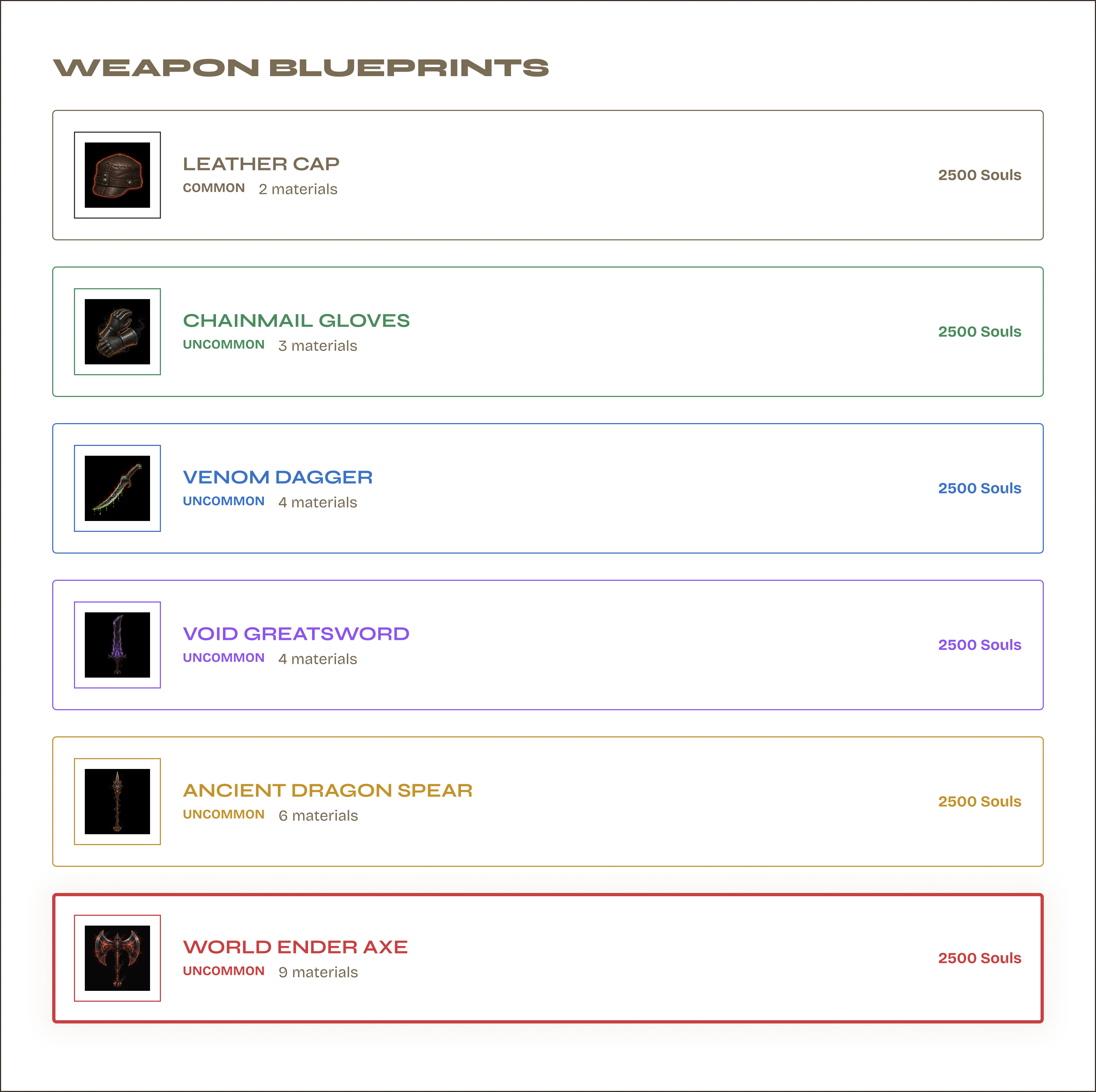
Blueprint browser
Blueprint browser — all recipes listed with ingredient requirements, rarity outcome, and unlock status.
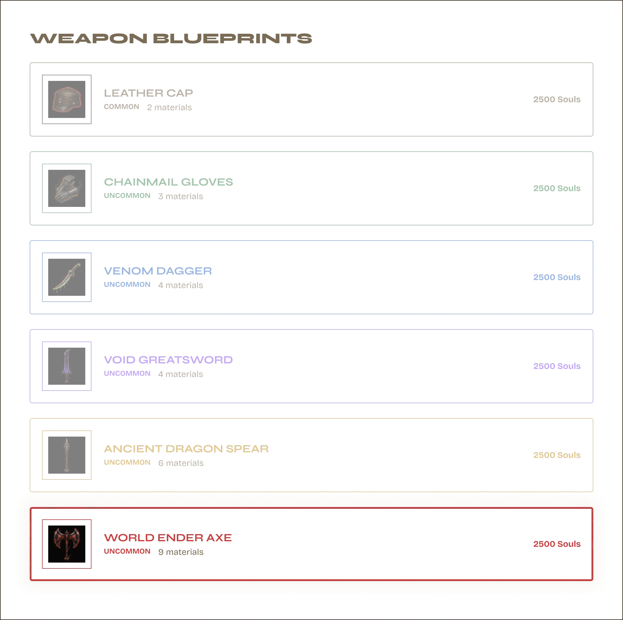
Blueprint rarity — all tiers designed.
Every blueprint shows its outcome rarity before the player commits ingredients. Common through Mythic — the rarity system is woven into the crafting UI, not bolted on after. One Figma Variable swap changes the entire card.
Blueprint cards — all rarity tiers
Blueprint cards — all rarity tiers shown. Same component, different Variable state.
Blueprint List Rarity Outcome Preview Ingredient Requirements Unlock Status Category Filter Figma Variables
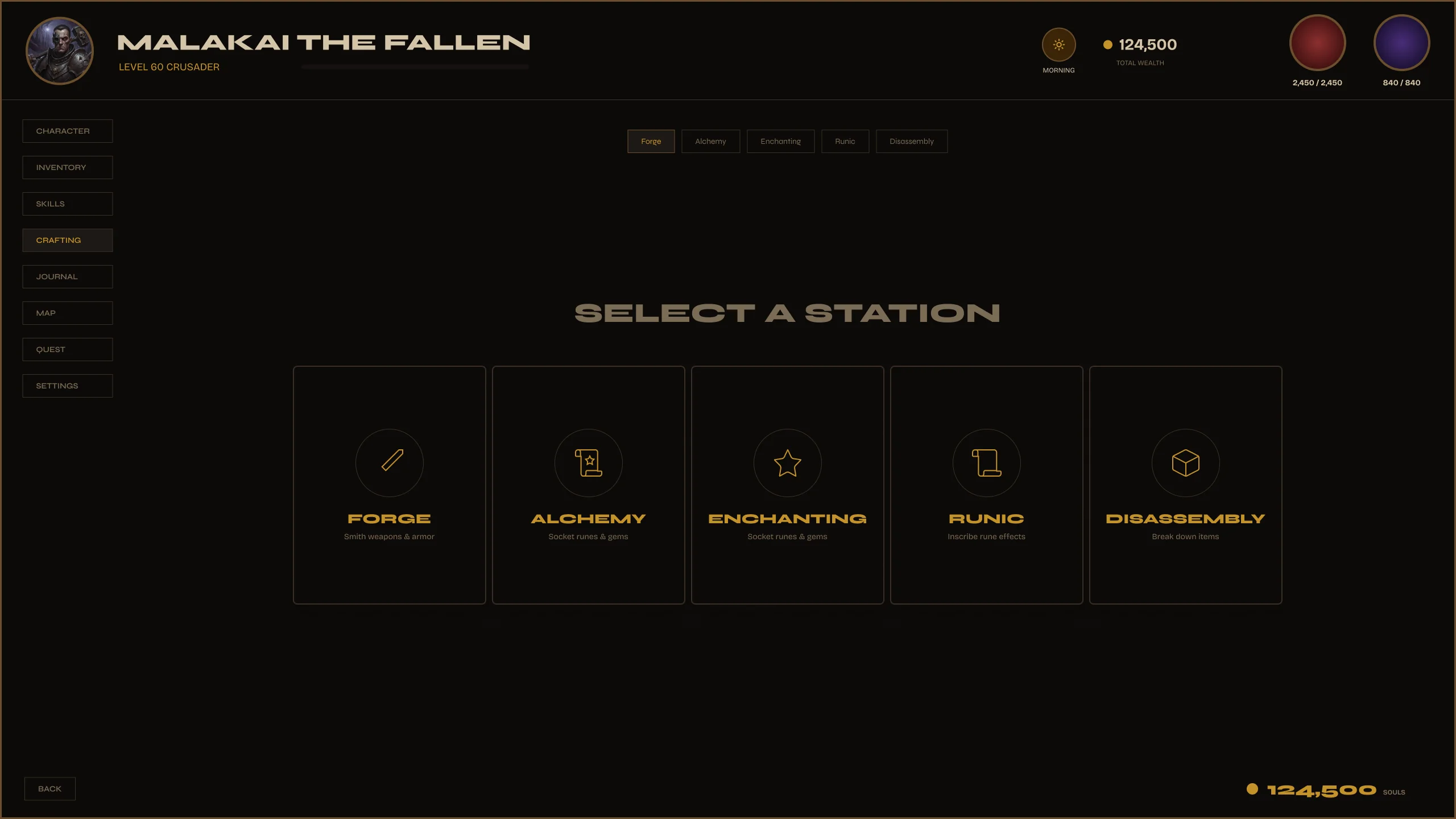
Station Select screen
Station Select — choose a crafting station. Each station unlocks different blueprint categories.
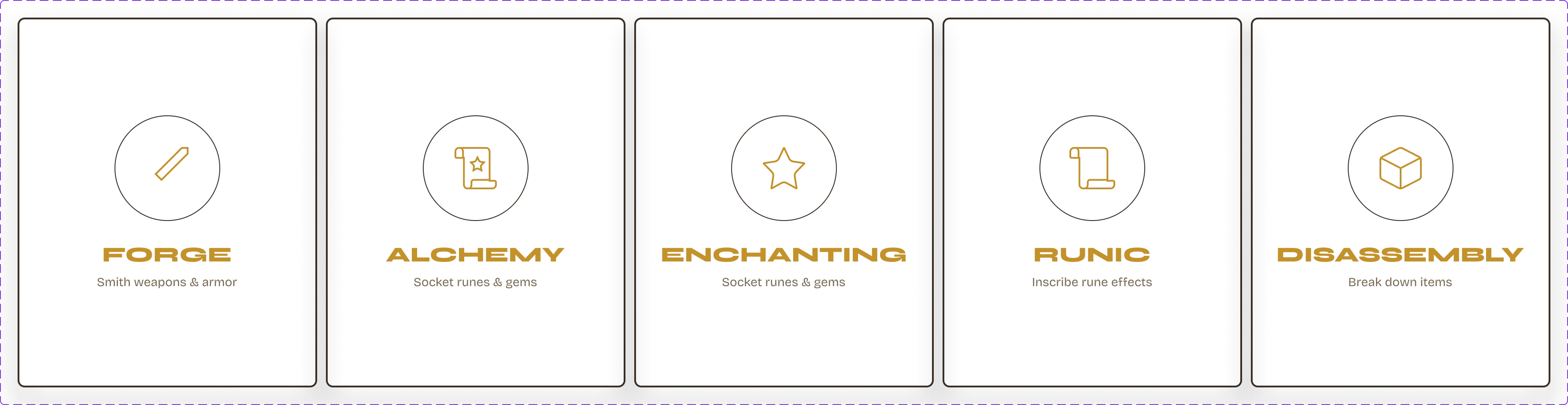
Station select cards
Station Cards

Station Select → Blueprint → Forge.

Each station card shows: name, icon, recipe category, and availability state. Select one and the blueprint browser filters to match. The station determines what the player can craft — visual design communicates the rule, no tooltip needed.

Forge Armory Alchemist Category Gating Selected State
Station Cards Category Lock Selected State Auto Layout Figma Variables
Live Figma Prototype
Open full screen →
Crafting — Forge Kit
$8.99 · Instant download · 3 screens · 4 forge states · 6 rarity outcomes · Variables included
Screens 12 – 15
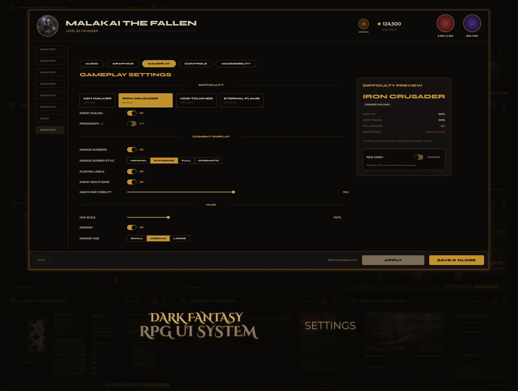
Settings — 4 Screens
Complete settings system — Graphics, Audio, Gameplay, and Accessibility. Consistent sidebar navigation, toggle and slider components reused throughout. All Auto Layout. All states. No settings screen left as an afterthought.
Design Principle Consistency over creativity.
4
Screens
Shared Nav
Sidebar
Reused
Component Set
Variables
Figma Variables
Problem

Settings screens are never the priority — they get one layout late in production. No consistent sidebar, mismatched component styles, toggles and sliders designed ad-hoc. Players feel the neglect immediately.

Goal

Four settings screens with one shared sidebar nav and one shared component set. Sliders, toggles, dropdowns, and presets — all reused, all consistent. Settings that feel like the rest of the game, not an export from another project.
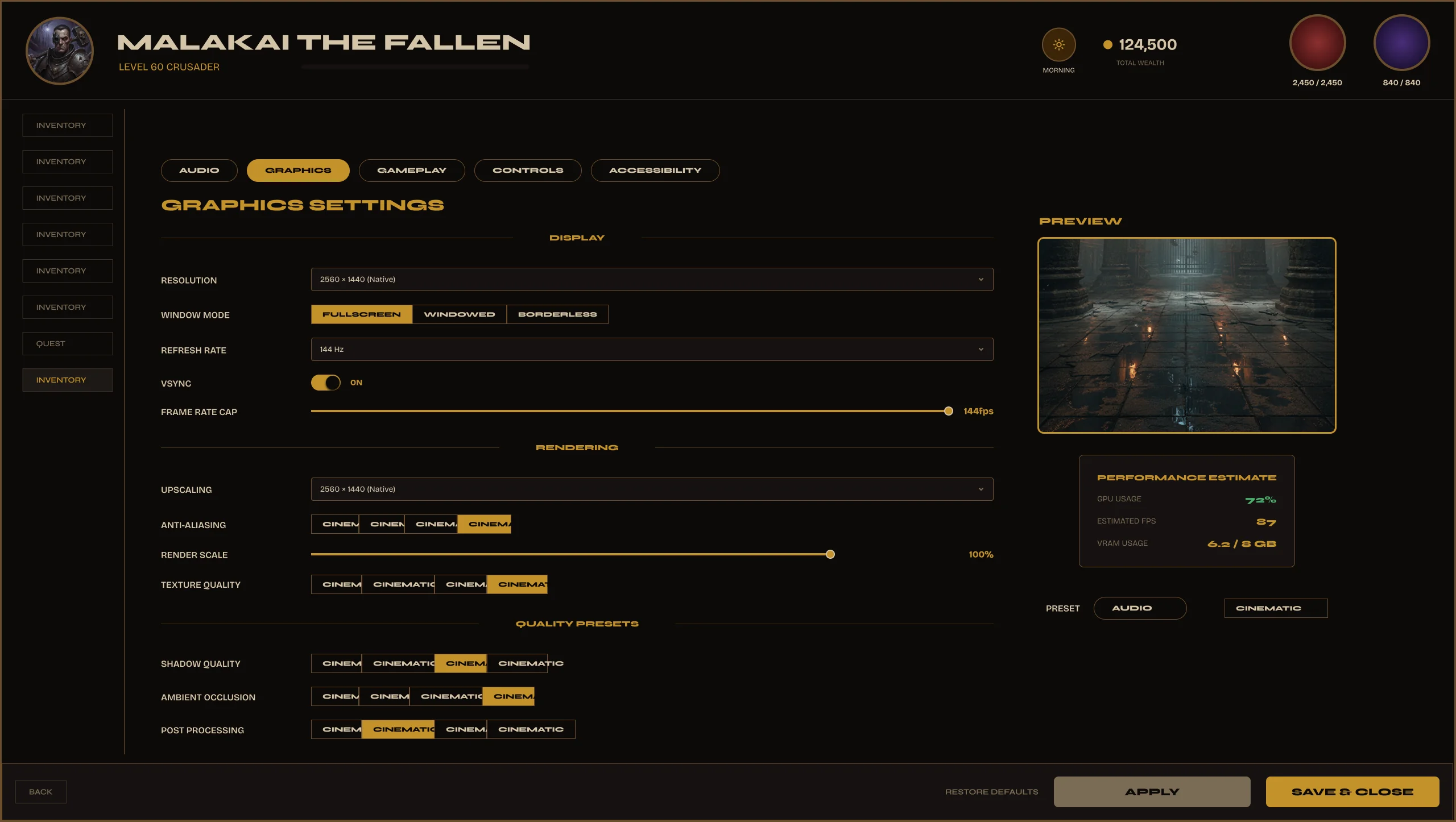
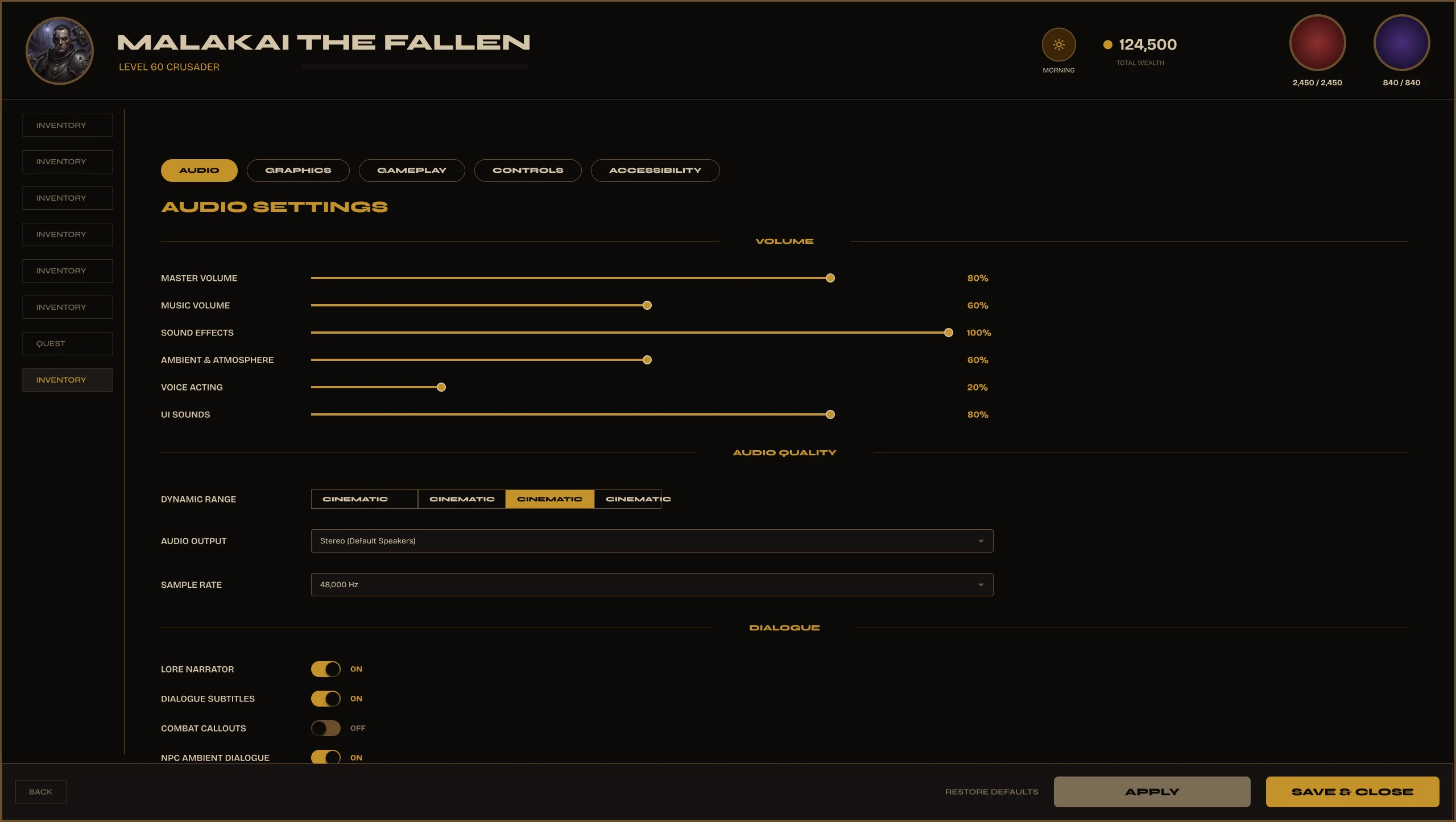
4 screens. One component language.
Settings — Graphics
Graphics
Settings — Audio
Audio
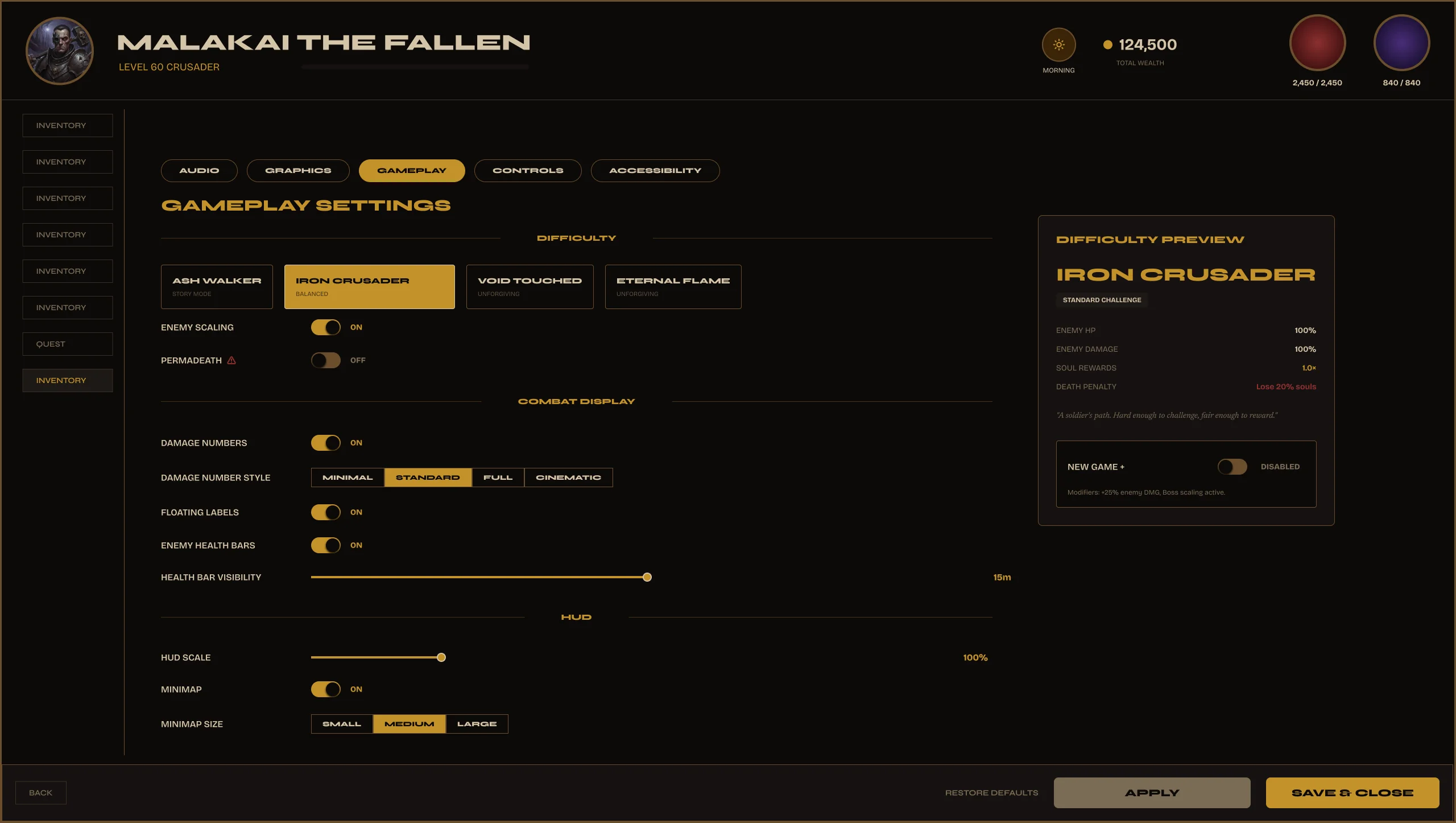
Settings — Gameplay
Gameplay
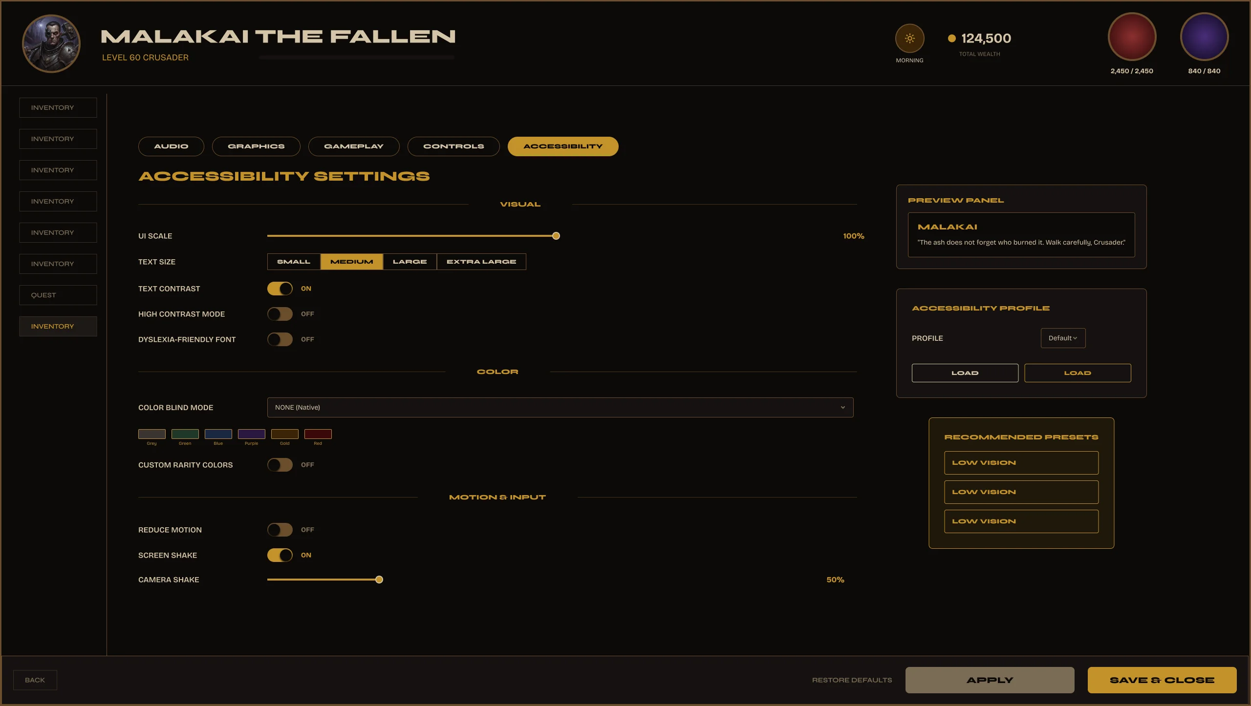
Settings — Accessibility
Accessibility
Settings — Graphics
Graphics settings — resolution, quality presets, shadow detail, anti-aliasing, FOV slider.
Quality Presets
Low / Medium / High / Ultra preset selector. One click updates all related sliders. The presets are a component — not hardcoded states.
Individual Sliders
Shadow detail, draw distance, anti-aliasing, texture quality — each as a standalone slider component with value display and reset option.
Resolution + FOV
Dropdown for resolution, slider for FOV. Both reuse the same component family as every other settings screen.
Quality PresetsResolutionFOV SliderShadow Detail
Settings — Audio
Audio settings — master, music, SFX, voice, ambient volume. Spatial audio toggle, output device.
Volume Hierarchy
Master → Music → SFX → Voice → Ambient. Each as a labeled slider. The hierarchy is visual — master sits above the rest, sub-channels indented.
Spatial Audio
Toggle component with state label — enabled / disabled. Same toggle used in Gameplay and Accessibility. One component, consistent behavior.
Output Device
Dropdown selector for audio output — headphones, speakers, system default. Dropdown component reused from Graphics resolution selector.
Volume SlidersSpatial AudioOutput DeviceMaster Control
Settings — Gameplay
Gameplay settings — difficulty, HUD visibility, tutorial hints, autosave, camera sensitivity.
Difficulty
Four difficulty tiers as a segmented selector — Story, Normal, Hard, Nightmare. Same selector component as quality presets in Graphics.
HUD Options
Minimap, health bar, quest tracker, damage numbers — each a toggle. Players build their own HUD without the game needing multiple HUD modes.
Camera + Autosave
Sensitivity slider, autosave frequency dropdown, lock camera toggle. All reused components — nothing built custom for this screen.
Difficulty SelectorHUD TogglesCamera SensitivityAutosave
Settings — Accessibility
Accessibility settings — colorblind mode, font scale, motion reduce, subtitle size, high contrast. Built in from day one.
Colorblind Modes
Protanopia, Deuteranopia, Tritanopia — selector with color preview. Not a hidden option — given its own full settings screen.
Font Scale + Contrast
Font size slider from 80% to 150%. High Contrast UI toggle. Both designed to be testable in the settings screen itself — preview updates live.
Motion Reduce
Reduces screen animations, particle effects, and camera shake. One toggle. Often the most requested accessibility feature — it's here, visible, and clearly labeled.
Colorblind ModesFont ScaleHigh ContrastMotion Reduce
Live Figma Prototype
Open full screen →
Settings System (4 Screens) — Part of the Valdûm Complete Bundle
Graphics · Audio · Gameplay · Accessibility · shared component set · Auto Layout · UI8 exclusive
Component System

Built once.
Reused everywhere.

Every screen in Valdûm is built from the same reusable component library. Update one component — every instance across the system stays consistent.

14 Screens
255 Components
44 Variables
One Design System
Change one component. Update every screen.
Built with Auto Layout, Component Properties, and Variables.
Foundations
Colors · Typography
Radius · Spacing
Effects · Materials
Navigation
Top Bar
Bottom Bar
Tab Systems
Inventory
Item Slot
Equipment Slot
Detail Panel
Character
Stat Rows
Attribute Cards
Equipment Doll
Shared — Every Screen
Buttons · Inputs
Cards · Badges
Dropdowns · Tooltips
+ 11 More Groups
Quest · Map · Skill Tree
Crafting · Bazaar
Settings · Journal
255
Components
16
Component Groups
44
Variables
100%
Auto Layout
Production Ready
Designed as a system. Not a collection of screens.
Typography
Cinzel Decorative
Screen titles · Weapon names · Hero text
Cinzel
Section headers · Labels · Navigation
Montserrat
Body text · Stats · UI copy · Tooltips
All fonts free via Google Fonts
Spacing System
4px base grid
Every value is a multiple of 4
8 · 12 · 16 · 24 · 32 · 48px
Primary spacing scale
1440px base canvas
All screens designed at 1440×900 minimum
Shape & Effects
14px radius
Cards · Panels · Modals
8px radius
Tags · Buttons · Small components
Gold glow · Parchment texture · 3-level depth
Atmosphere without sacrificing readability
Naming Convention
Screen / Component / State
e.g. Inventory/ItemCard/Hover
16 sections — one per screen group
Find any component in under 30 seconds
Consistent across all 255 components
No exceptions, no one-offs
Color Variables
22 Primitive tokens
Raw values — hex codes, brand colors, rarity palette
22 Semantic tokens
Purpose-named — bg/surface/text/border/accent
6 rarity tiers — one variable swap
Common · Uncommon · Rare · Epic · Legendary · Mythic
Icon & Material System
Consistent icon weight
All icons at 24px, same stroke, same visual weight
Dark parchment material
Textured panels, aged edges — consistent across all screens
Gold as the only accent color
One accent. No competing highlights.
Auto Layout — Throughout
Every component, every panel, every screen. Add an item to a grid — it grows. Add an objective — the list extends. No broken layouts on resize.
Figma Variables — 44 Tokens
Change one token and every component that references it updates instantly. No hunting through layers. No manual overrides.
Variant Architecture
Every state covered — Default, Hover, Active, Disabled, Empty, Selected. Developers get what they need without asking for extra frames.
Nested Components
Complex screens built from atomic parts. Swap one nested component and every parent that uses it updates. True design system architecture.
Desktop-First Constraints
All components constrained and tested at 1440px and above. No mobile compromises baked in. Built for the platform it belongs to.
Self-Contained File
No external libraries. No shared dependencies. Open the file — everything is inside. Read Me, Screens page, Components page. Nothing missing.
Problem

Most UI kits dump all components in one flat list. Finding what you need takes longer than building it yourself. Naming conventions are inconsistent, states are missing, and Auto Layout breaks when you scale.

Goal

255 components organized by screen, named consistently, and built to scale. Every component has variants for all its states. Auto Layout throughout — resize and the component stays intact.
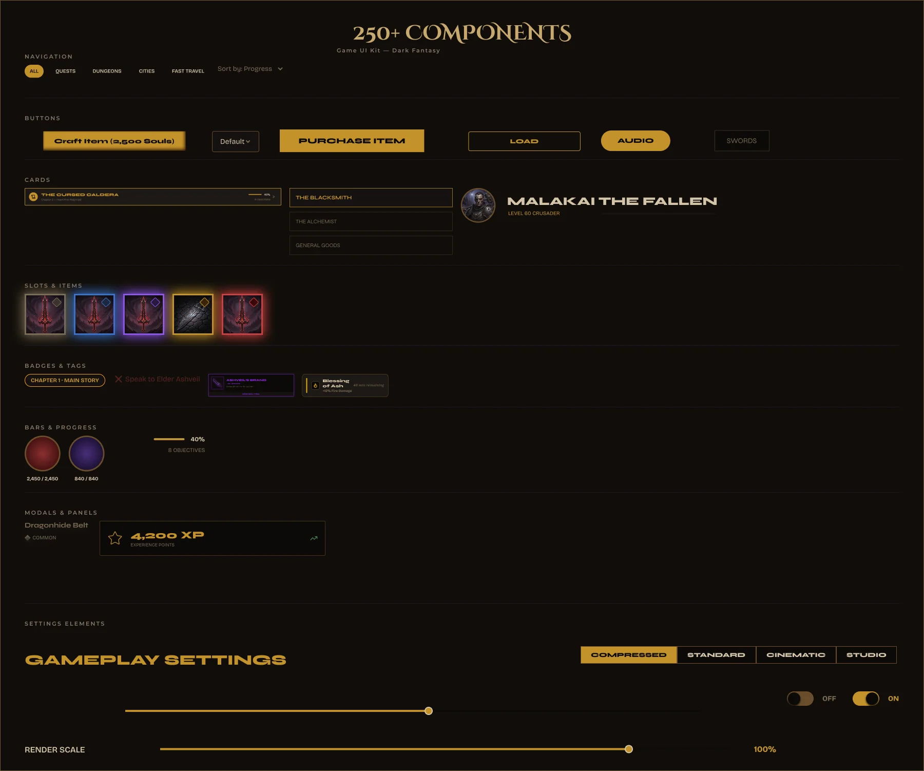
Valdüm — full component sheet
16 Sections
One section per screen — Inventory, Bazaar, Character, Crafting, Settings, and more. Find any component in under 5 seconds.
Every State
Default, hover, active, disabled, selected, empty — every component has the variants a developer needs. No states missing, no improvisation required.
Auto Layout
Every component resizes cleanly. Add an item to the grid, the grid grows. Add an objective to the quest list, the list extends. No broken layouts.
255 Components 16 Screen Sections All States Included Auto Layout Consistent Naming Figma Variables
Valdûm — Complete RPG UI System
255 components · 14 screens · 16 sections · Auto Layout · Figma Variables · available on UI8
Design System
Color Variables — 44 Tokens
22 semantic tokens + 22 primitive tokens. Page background, section layers, text hierarchy, gold accents, rarity colors — all variables, all swappable.
#07050A — Page BG
#110E0A — Section BG
#C8A96E — Gold
#E8D5B0 — Text Primary
Common
Uncommon
Rare
Epic
Legendary
Mythic
44 Color Tokens — Part of the Valdûm Complete Bundle
22 semantic + 22 primitive tokens · swappable variables · rarity system colors · get the full system on UI8
Ready to build your next RPG?
Valdûm
Complete PC RPG UI System
14 Screens · 255 Production-Ready Components · Complete Variable System · Designed for Desktop RPGs
One system.
Every screen.
Production ready.
Get it on UI8 — $69 →