Valdüm — Dark Fantasy RPG UI System
14 complete PC game screens. 250+ production-ready components, auto layout, complete variable system. The only full-system dark fantasy RPG UI kit built specifically for desktop — one world, one design language, every screen covered.
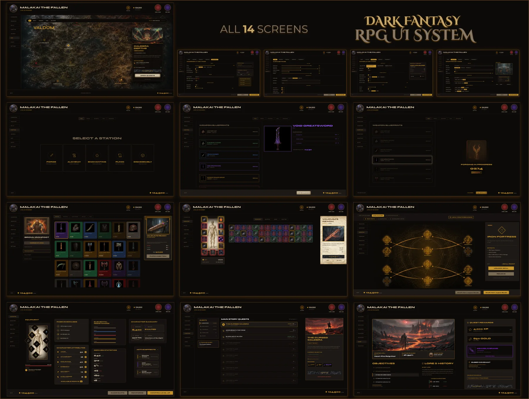
Built for PC.
Not for mobile.
Every game UI kit currently on UI8 is built primarily for mobile. Valdûm is different. This is a complete, production-quality Dark Fantasy RPG UI system designed from the ground up for desktop — complex layouts, information-dense screens, and a scalable component architecture inspired by Elden Ring, Diablo IV, and Baldur's Gate 3.
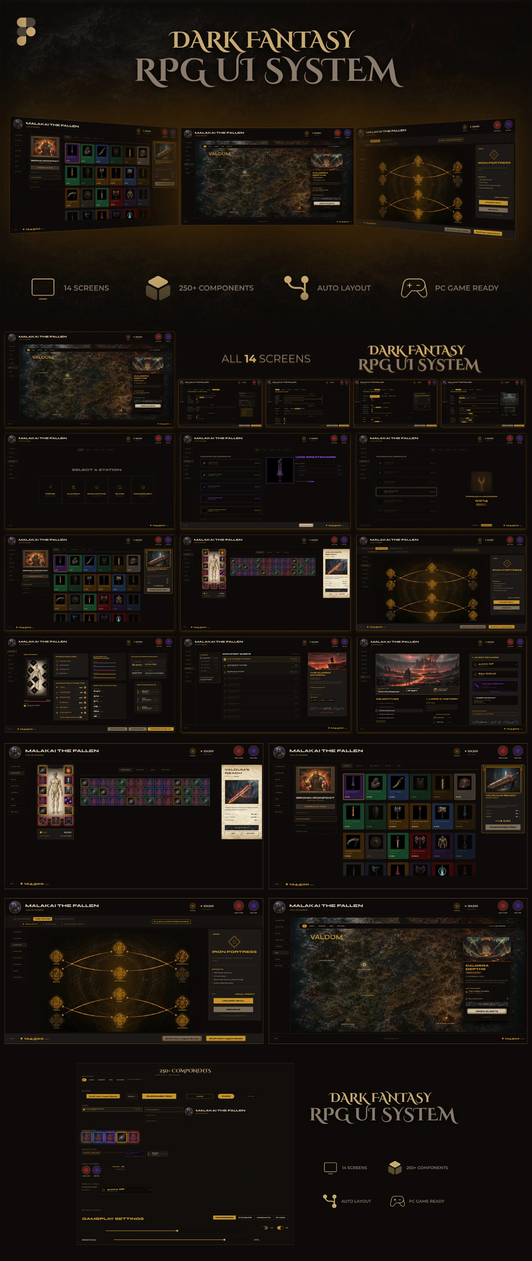
Not a concept. A handoff-ready system.
Every state covered. Every edge case designed. Nothing left for the developer to guess, rebuild, or improvise.
Built for keyboard and mouse. Not thumbs.
Designed for 1440×900 and above. Information-dense layouts that would break on mobile — intentionally.
Not 14 isolated screens. One visual language.
Every element — every border radius, every gold accent, every panel depth — serves the whole system, not just the screen it lives on.
One component swap. Every screen updates.
255 components built on the same variable foundation. Change a token, and the entire system responds — no hunting through layers.
Atmosphere without noise.
The parchment textures, gold glows, and dark materials are there. But they never compromise readability or the developer's ability to extend the system.
Open the file. Navigate without instructions.
Semantic naming, organized layers, page-by-page structure. A developer who has never seen the file can find any component in under 30 seconds.
↑ Click any tab above to dive into that screen's full case study
Guided walkthrough. Some interactions are intentionally limited.
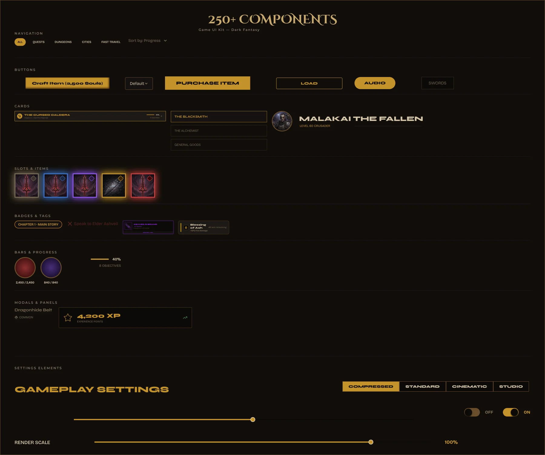
250+ reusable components organized into 16 sections. Every component follows a semantic naming structure, uses Auto Layout, and is connected to a complete color variable system.
- Auto Layout throughout — every component
- 22 Primitive + 22 Semantic color variables
- 250+ reusable components
- Semantic component naming
- Organized design system — 16 sections
- Premium dark fantasy visual language
- 6 rarity tiers — one variable swap
- Interactive prototype included
📖 Read Me — Setup guide, file structure, font links
🖥 14 Complete Screens — All screens in one organized Figma file
🧩 250+ Components — Organized by screen section, semantic naming
Fonts (all free via Google Fonts): Cinzel Decorative · Cinzel · Montserrat
Building an RPG inventory from scratch takes weeks — and most existing kits are missing states, skip the detail panel, or don't come close to dev-ready. You end up rebuilding half of it anyway.
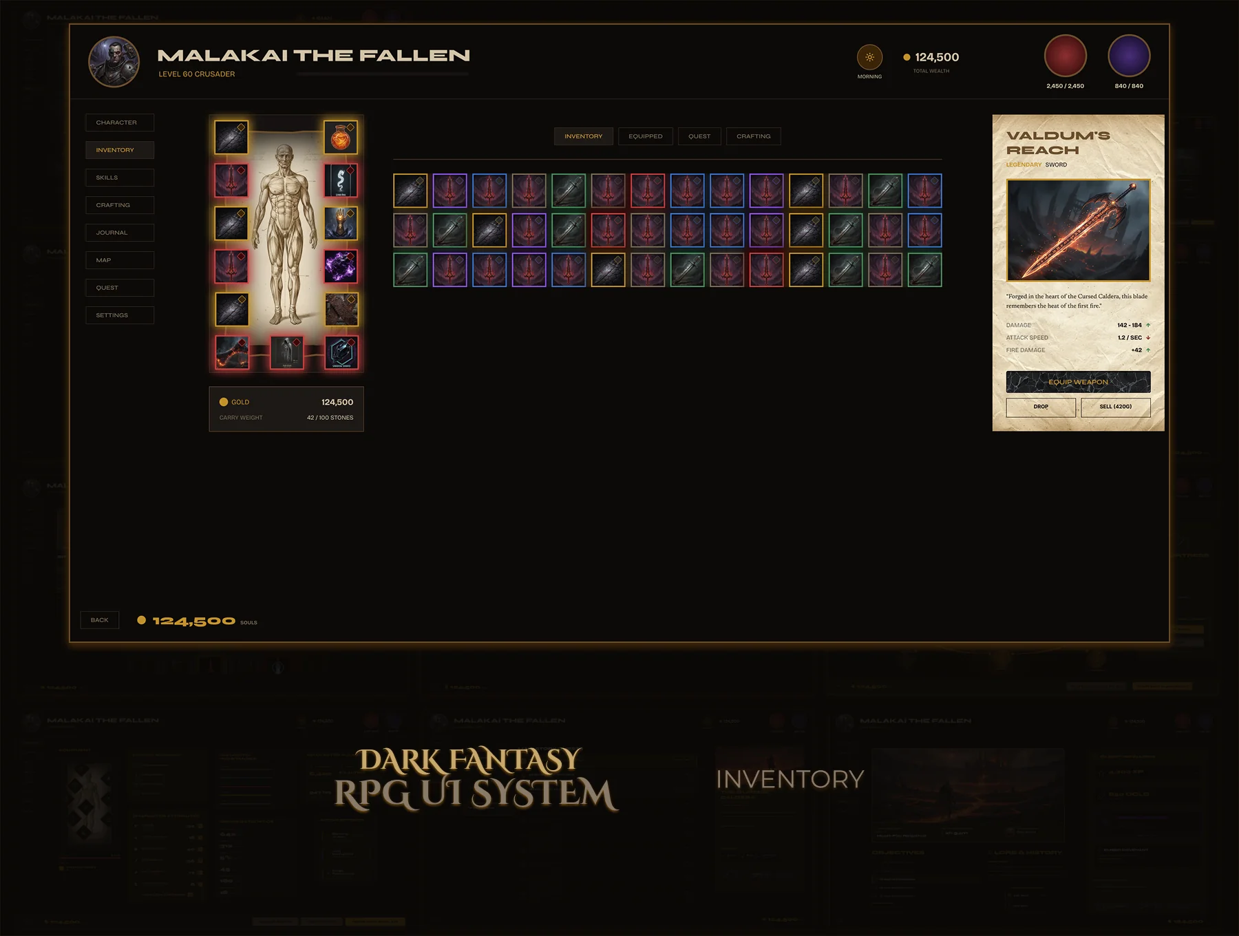
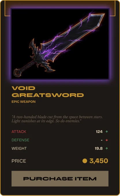
A complete, production-ready inventory — character doll, item grid, detail panel, full rarity system. Every component and state a developer needs. Nothing to guess. Nothing to rebuild.
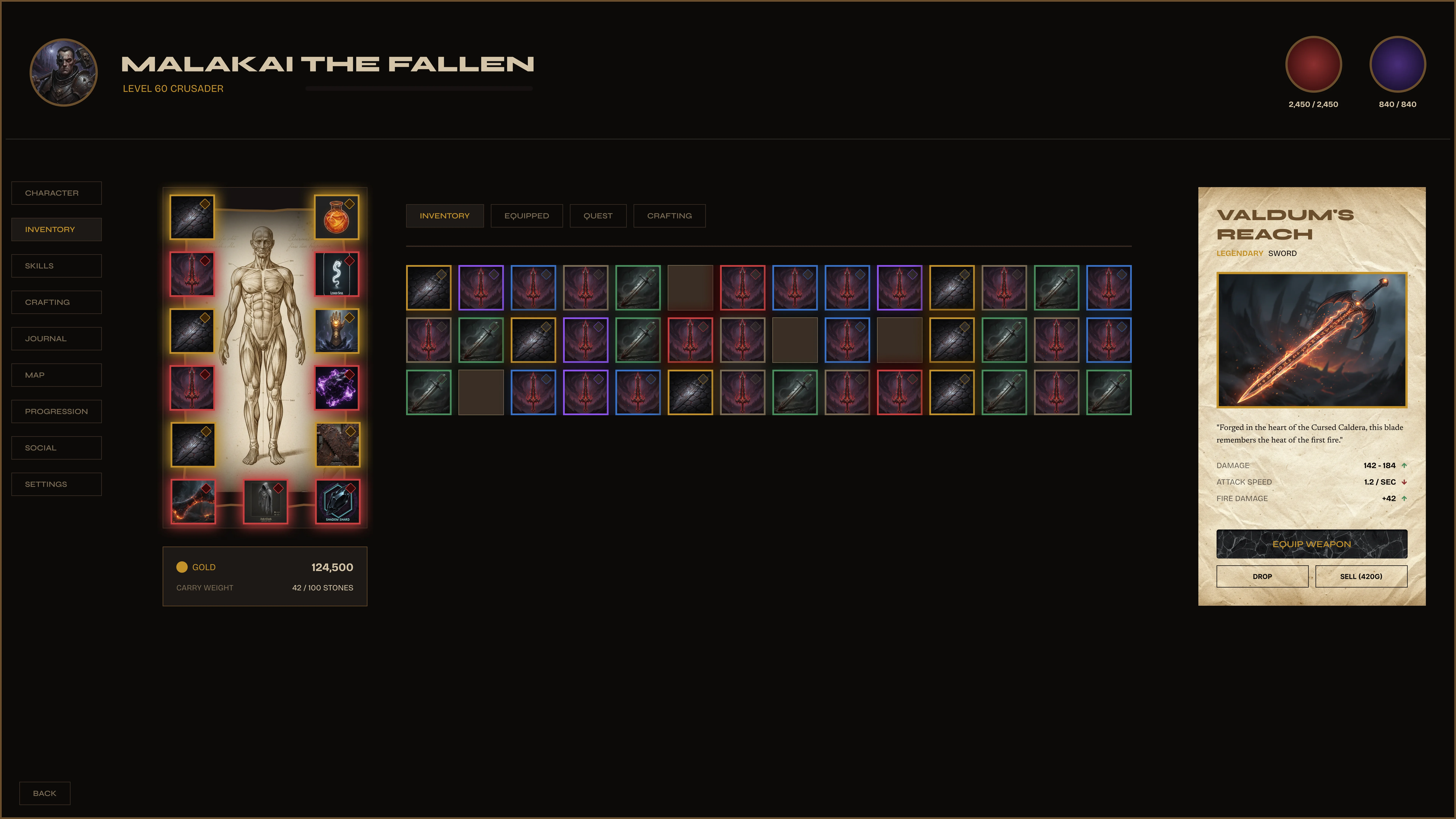
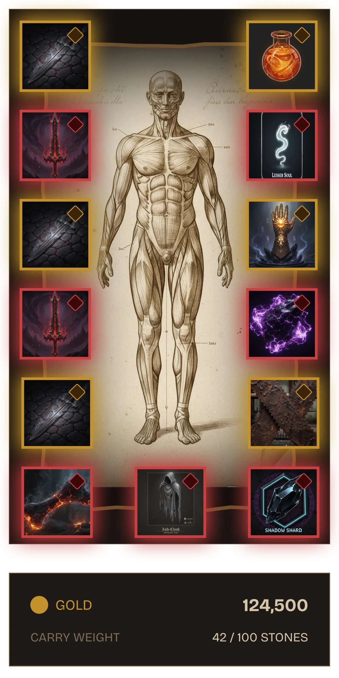
Fully specced. Zero decisions left for the developer.
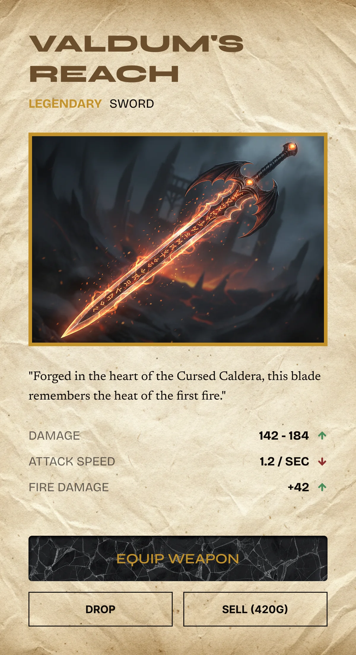
Damage range, elemental affinity, attack speed. Rarity border glows at the correct tier. Three action buttons. The developer swaps the data — the design stays locked.
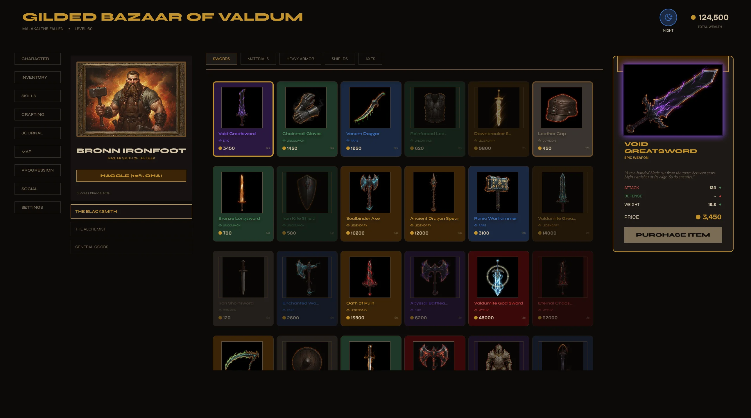
Most shop UIs are a grid and a buy button. No merchant identity, no item detail, no rarity logic. You spend more time building the kit than designing your game — and it still looks generic.
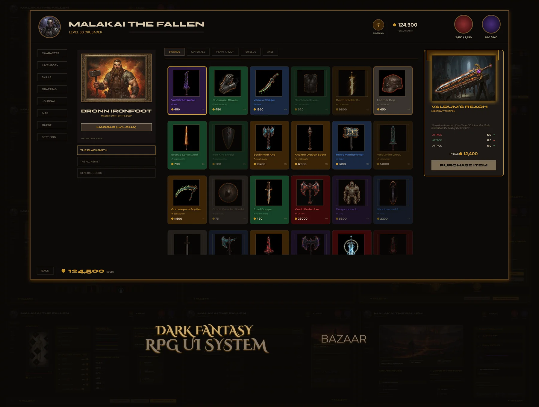
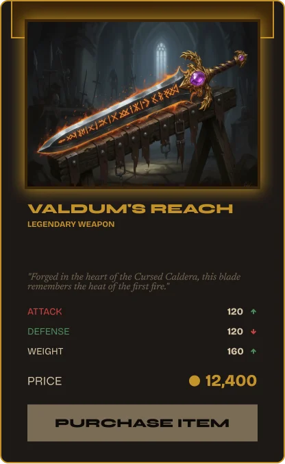
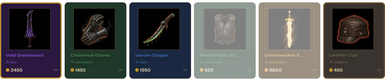
A shop that feels like a character's domain. Merchant portrait panel, browsable item grid, full item detail with stats and lore, rarity system baked in. 50+ components — drop in, play.
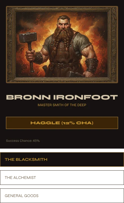
A character, not just a vendor.
The merchant card carries portrait, name, reputation level, and specialty. Product rows below show icon, name, rarity badge, and price — four tiers visually distinct at a glance. No tooltip required to read the hierarchy.
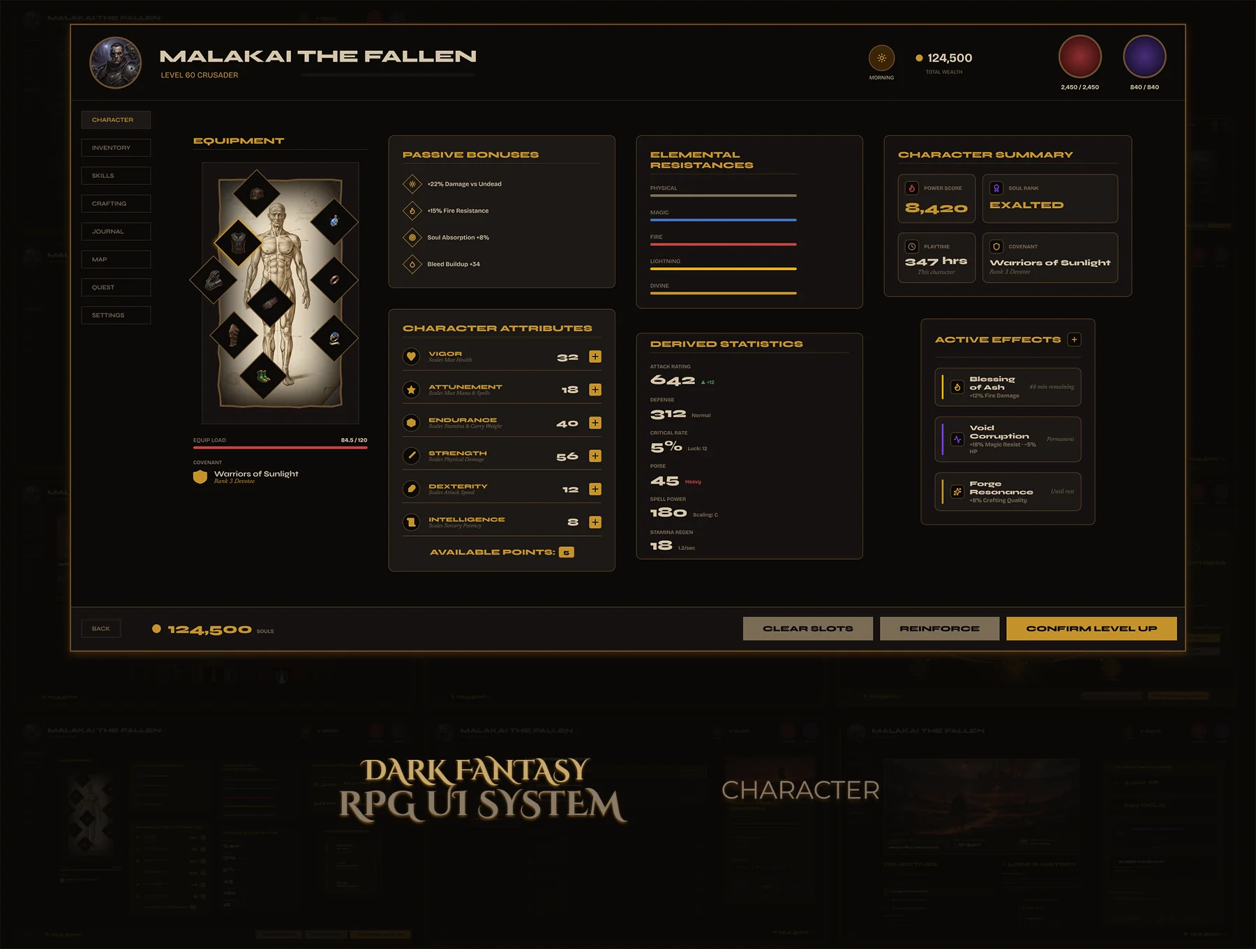
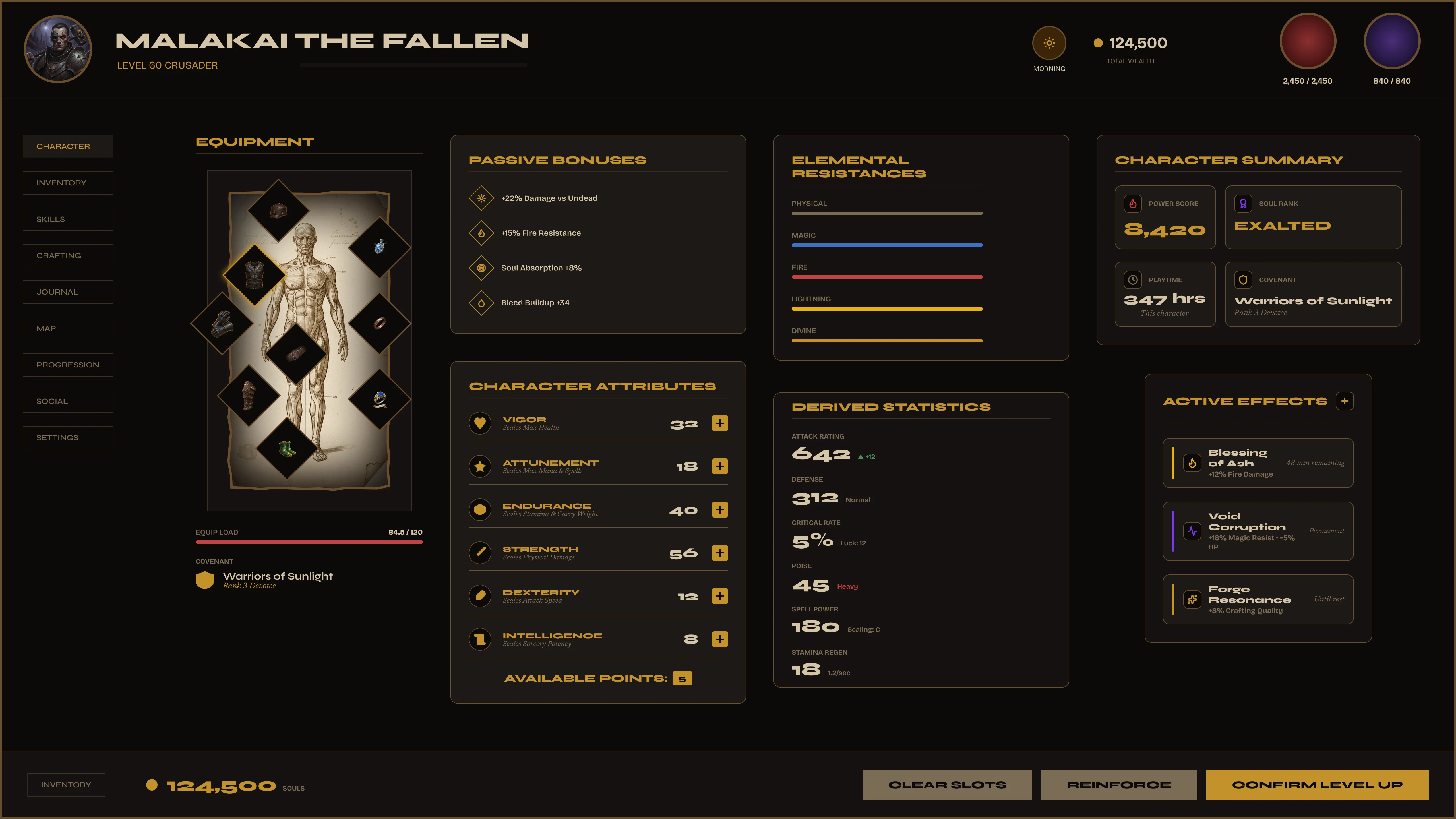
Character screens are one of the hardest UI systems in RPG design. Five to six distinct panels, each with their own logic. Most kits show the pretty version of one panel and skip the rest.
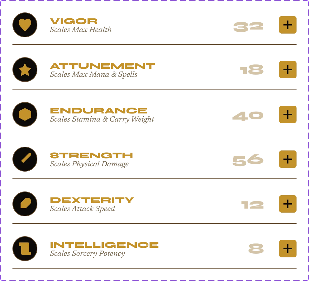
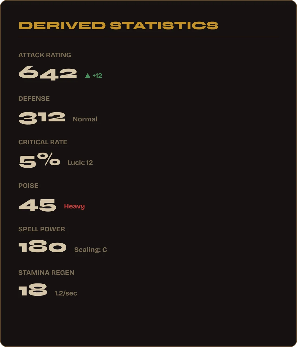
Every panel fully designed — equipment slots with all states, attribute allocation with controls, elemental resistances with color coding, derived stats, skill bonuses, active effects. One file, six panels, 51 components.
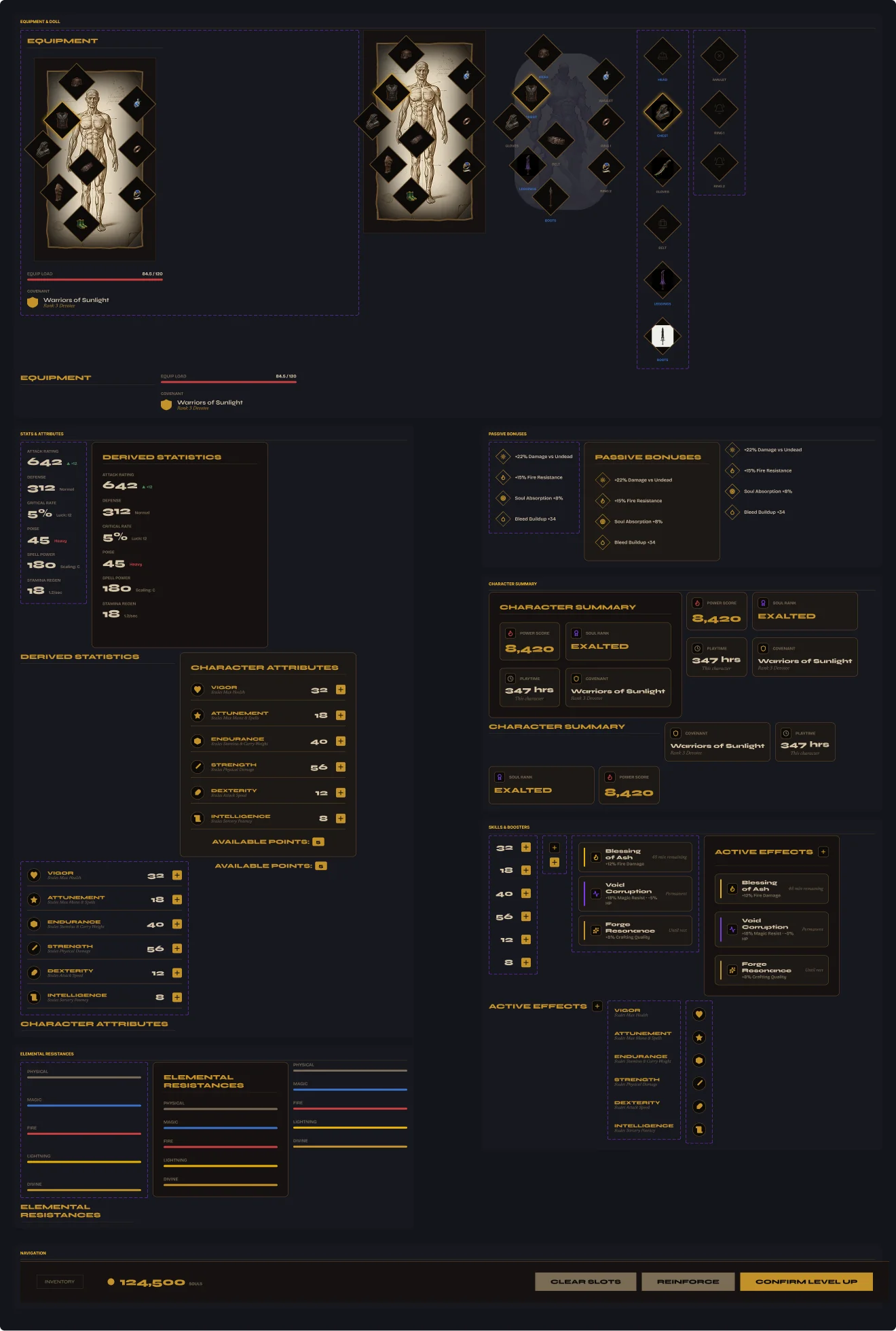
51 components. Every panel self-contained.
Each of the six panels is its own component set. Developers implement one panel at a time — nothing is tangled together. Figma Variables handle the gold palette and spacing across all 51.
STR · AGI · INT · END · WIL · PER
Every attribute row shows: base stat, equipment bonus, current total, and +/− allocation buttons. The point budget tracks remaining points. Fully specced — no guessing on developer's end.
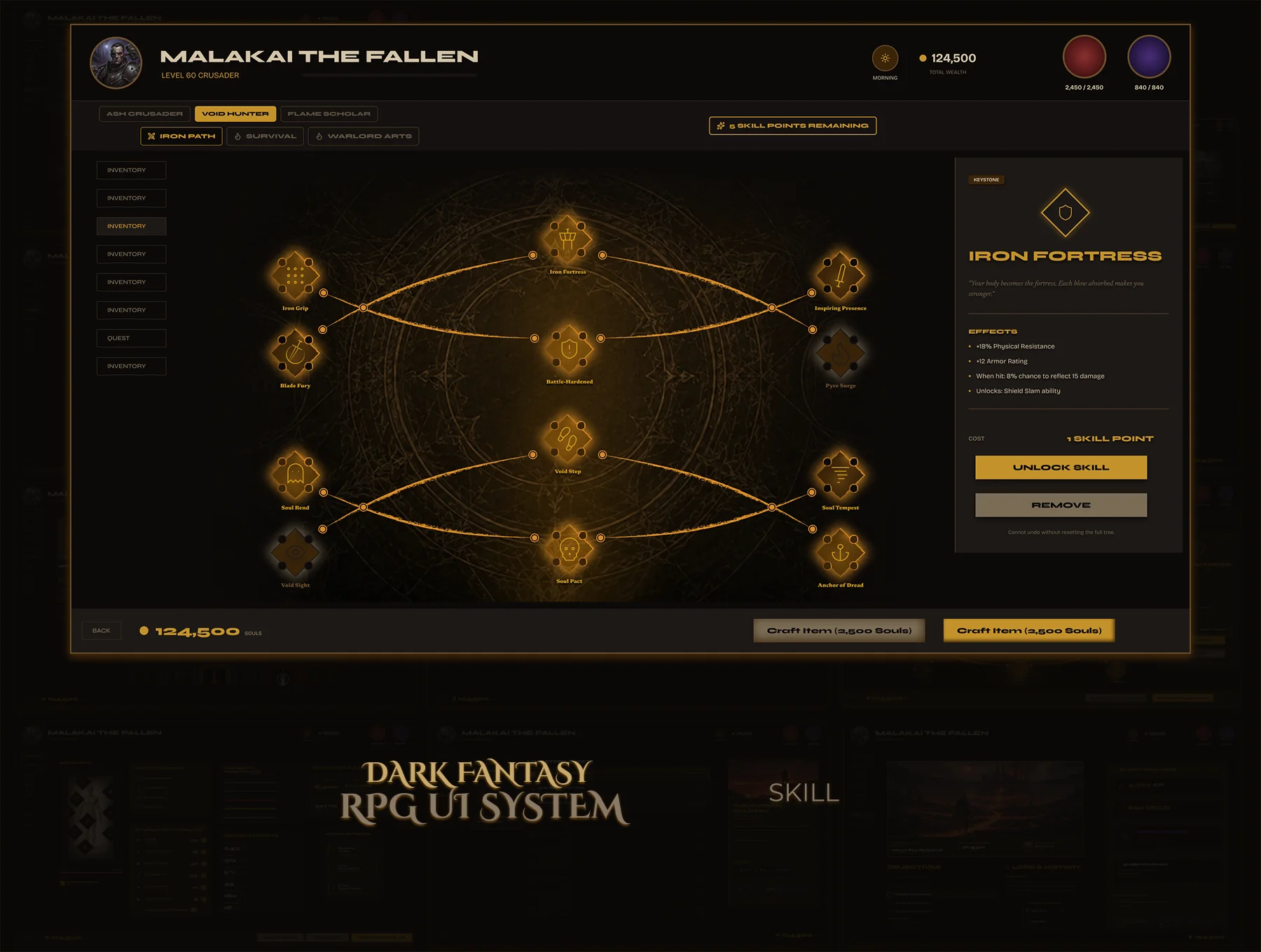
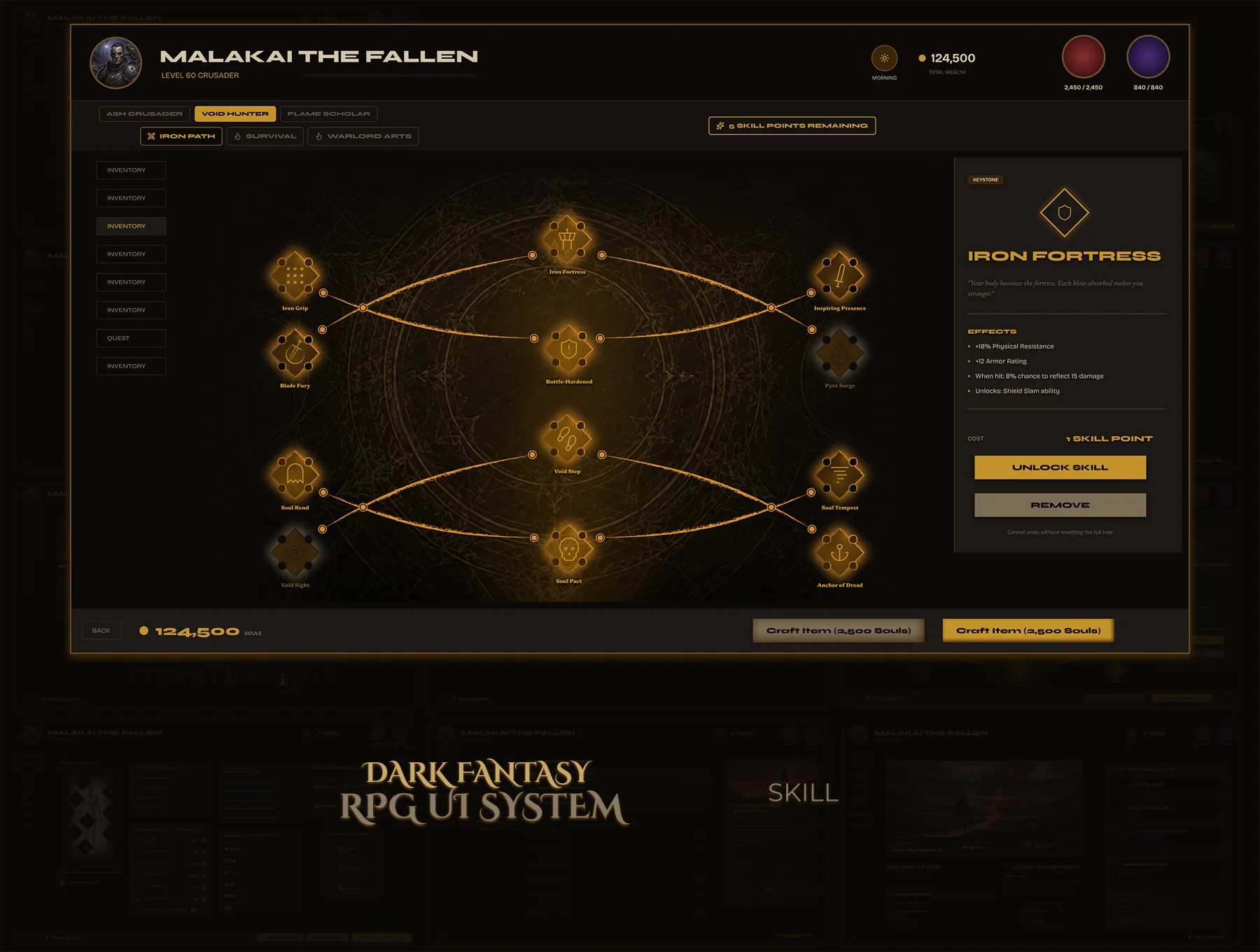
Skill trees look simple — until you design one. Node states, connection paths, tier progression, the detail panel — each is its own system. Most designers ship one state and leave the rest to imagination.
A complete skill tree where a developer can implement every node without making a single design decision. Six node states, a standalone detail panel, three tiers, one consistent visual language.

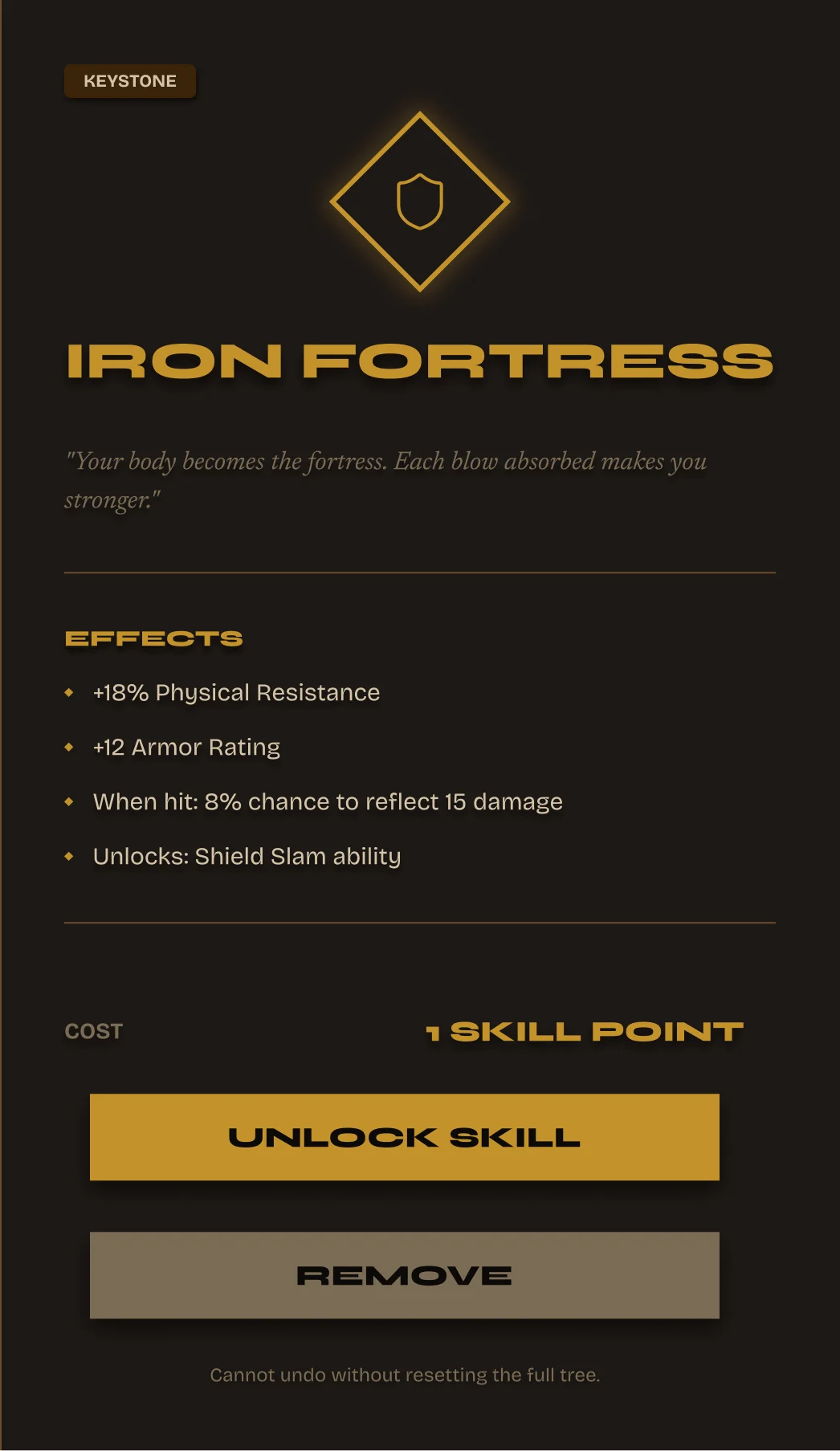
Skill Detail Panel
Tier badge, skill name, description, cost to unlock, and current level — all in one panel. Developers drop it in and swap the data. The design doesn't change.
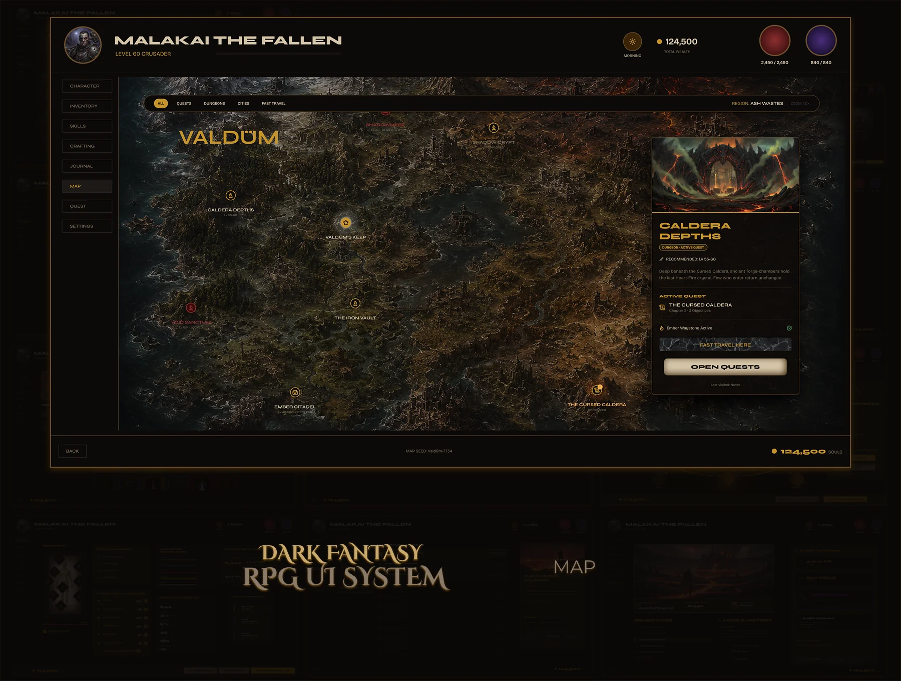
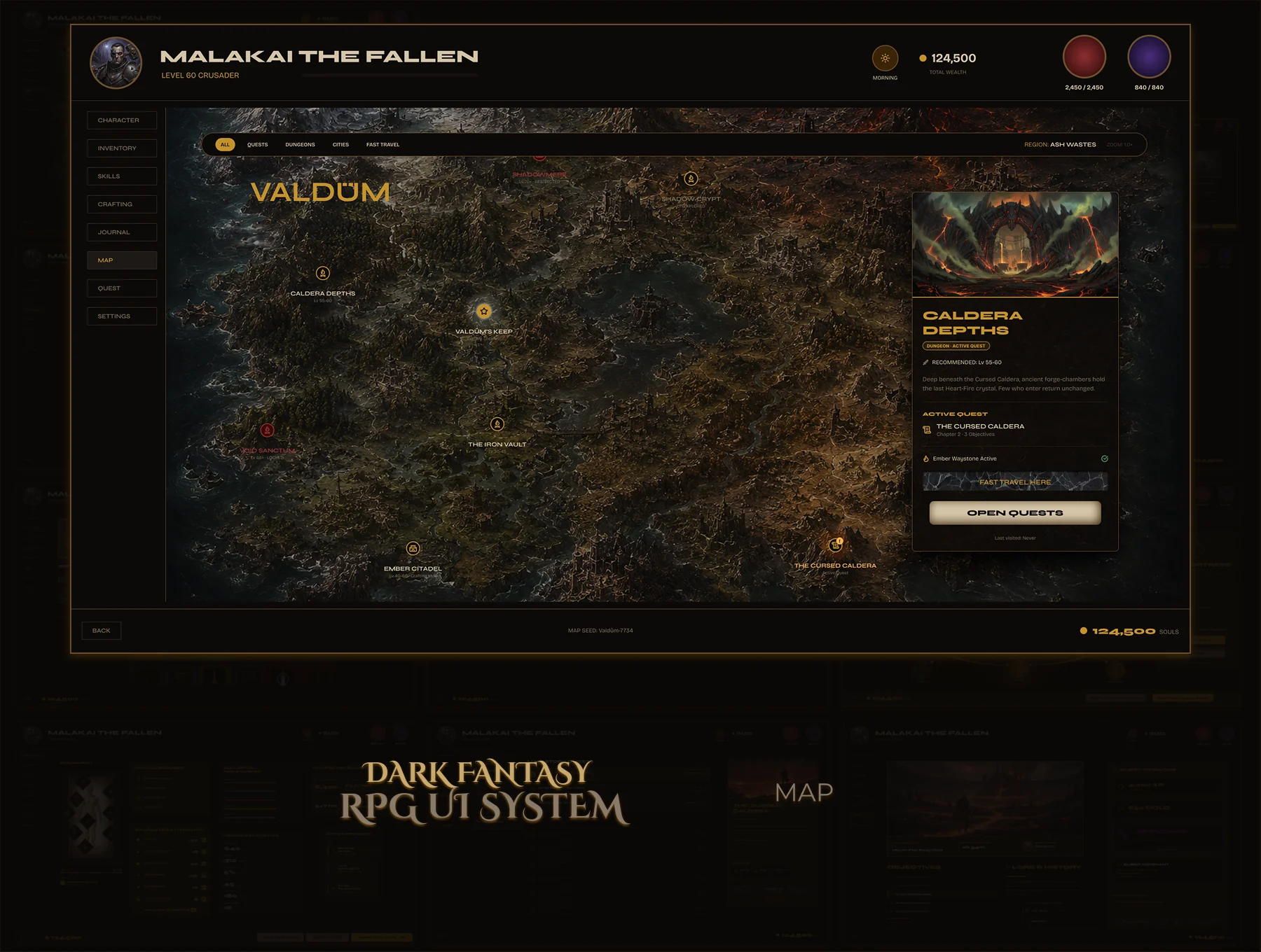
World maps carry heavy UX weight — discovery states, fast travel gating, active location feedback. Most map UI kits deliver a pretty background image and nothing else. No components, no states, no logic.
A map UI that communicates discovery, exploration, and navigation clearly. Location markers in three states, a detail popup component that works on every location, fast travel gating built into the visual design.
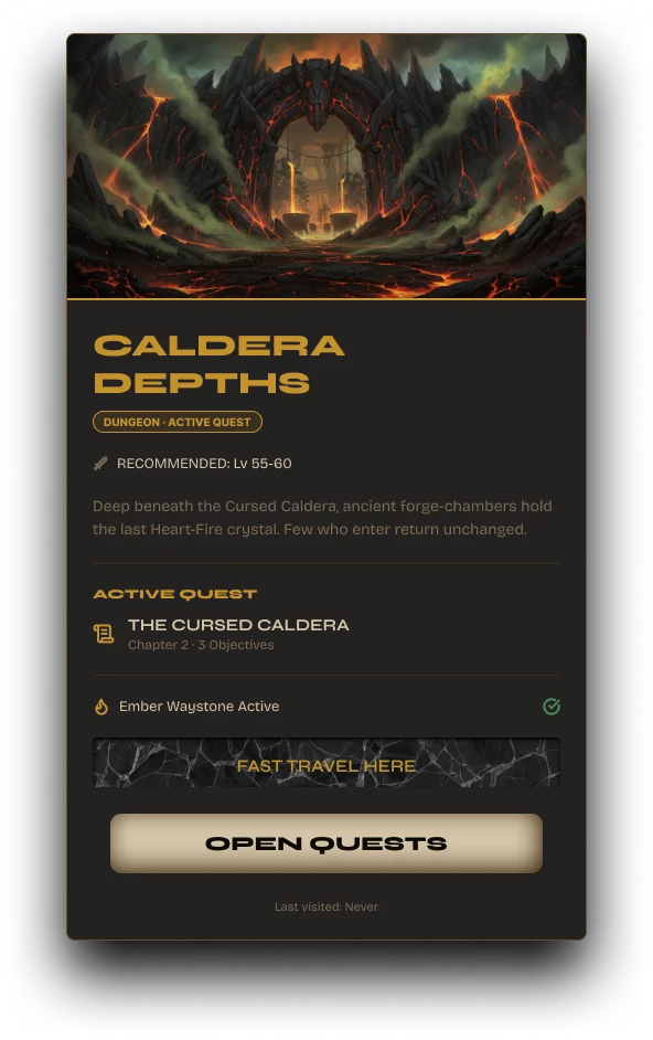
Location Detail Panel
Name, region, lore text, fast travel CTA. Dark parchment texture, gold title — consistent with Valdûm's world. The fast travel button only activates when the location is already discovered. The visual rule is the design rule.



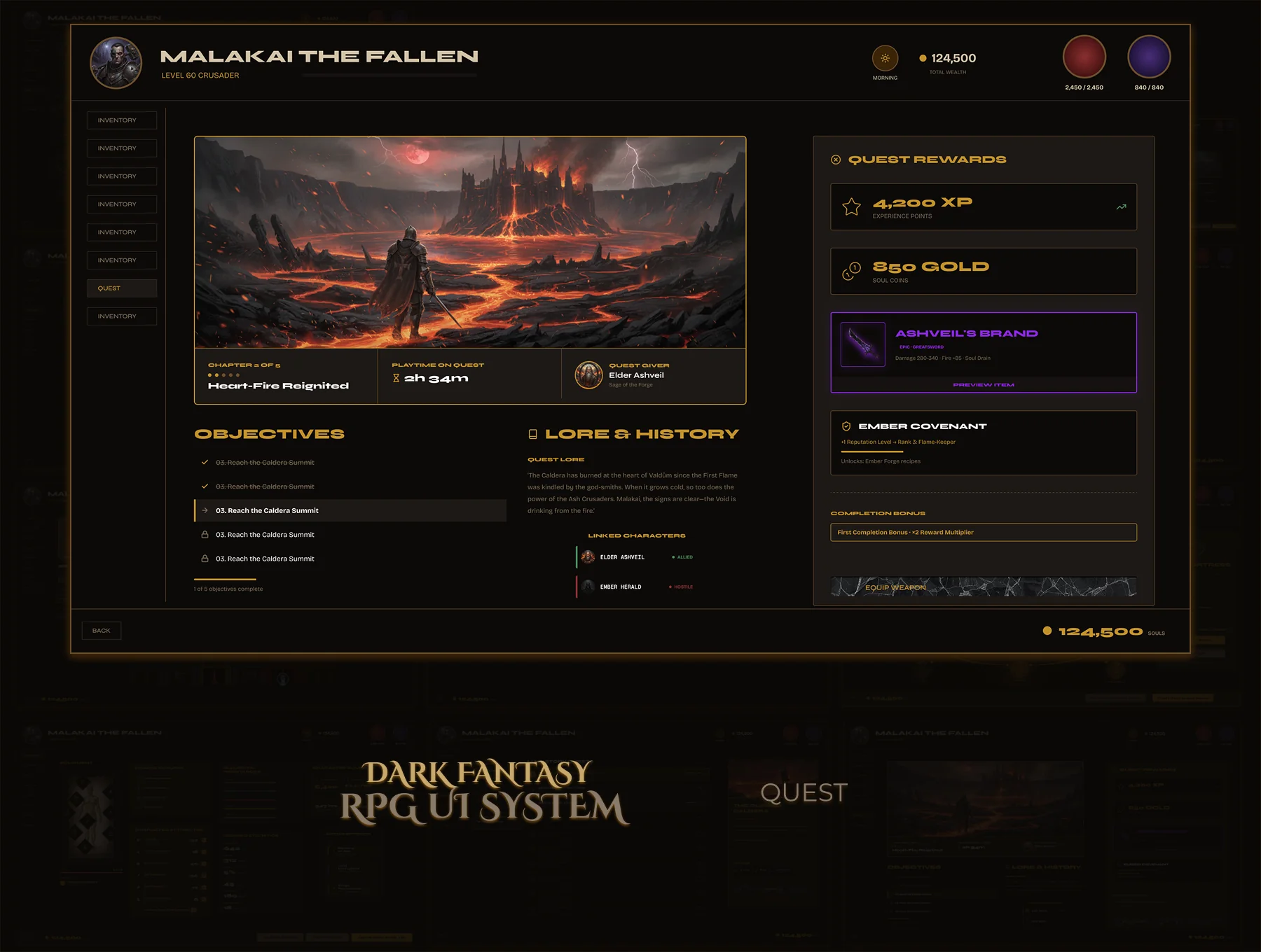
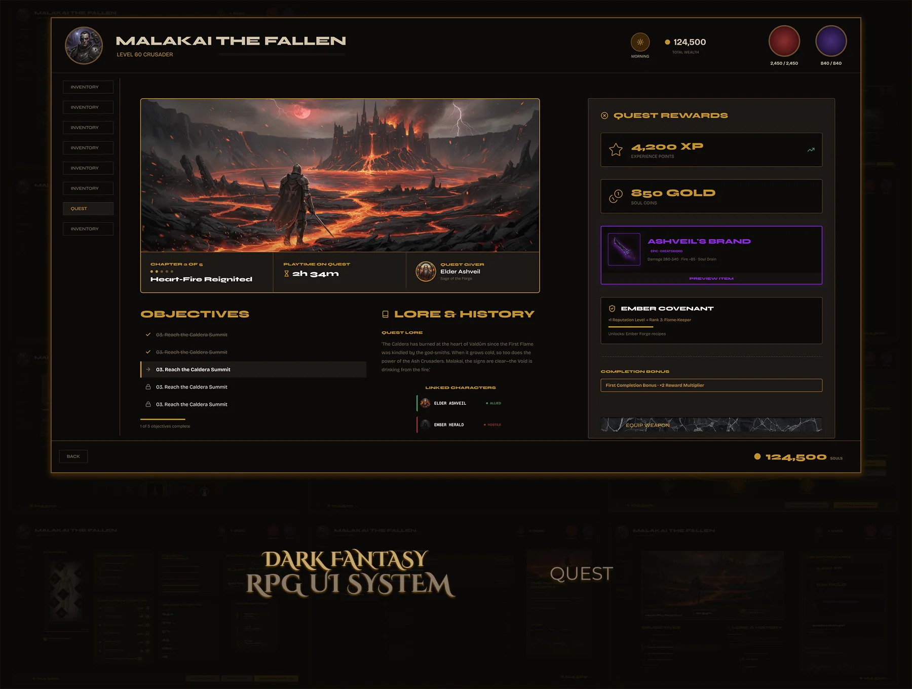
Quest systems are usually the last UI to get designed — and it shows. A single static list with no states, no detail view, no rewards panel. Developers guess the rest.
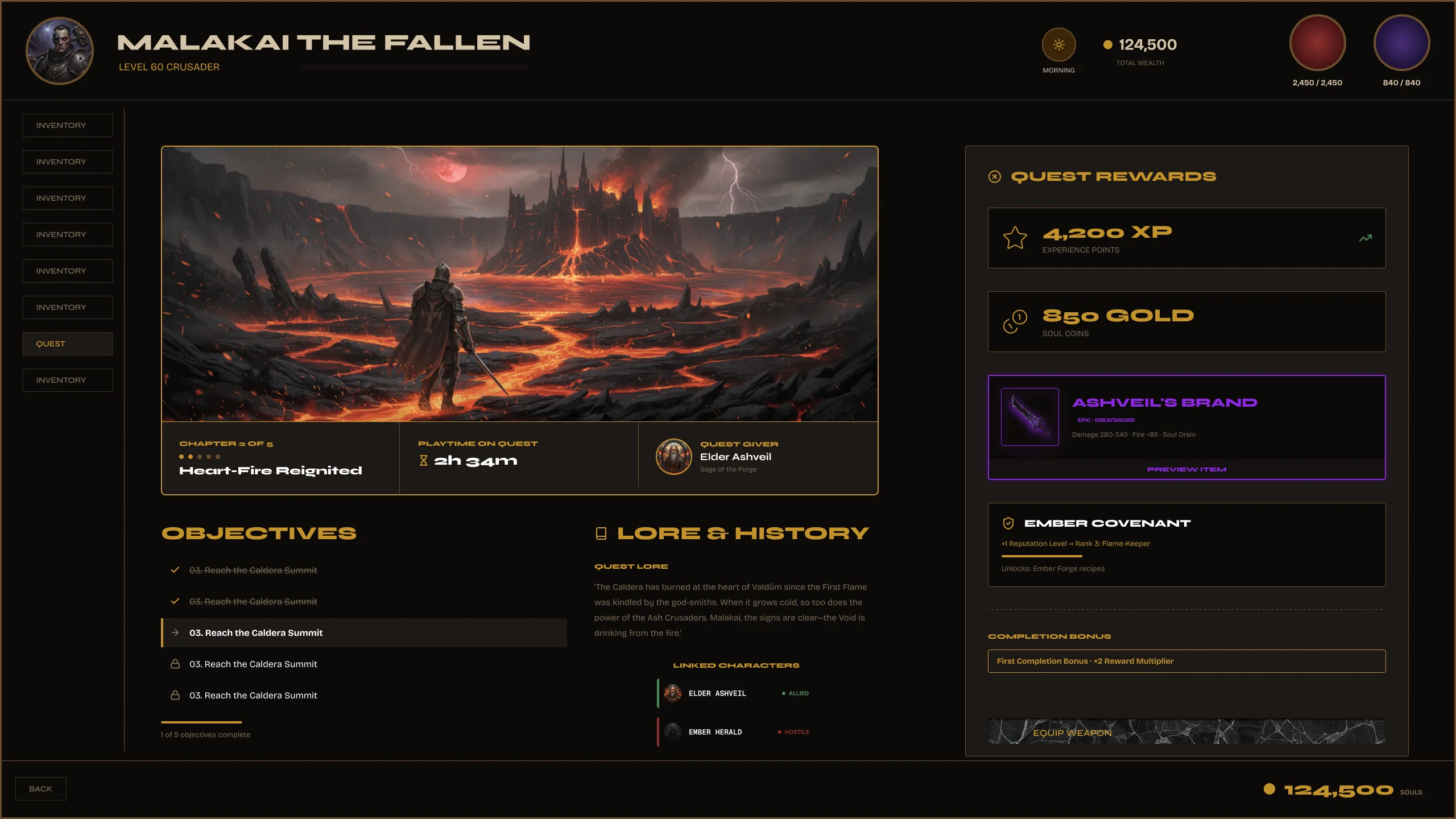
Two complete quest screens. The journal covers every state — active, completed, failed, locked. The detail view is fully specced: objectives, rewards, lore, track and abandon actions. Nothing left to interpret.
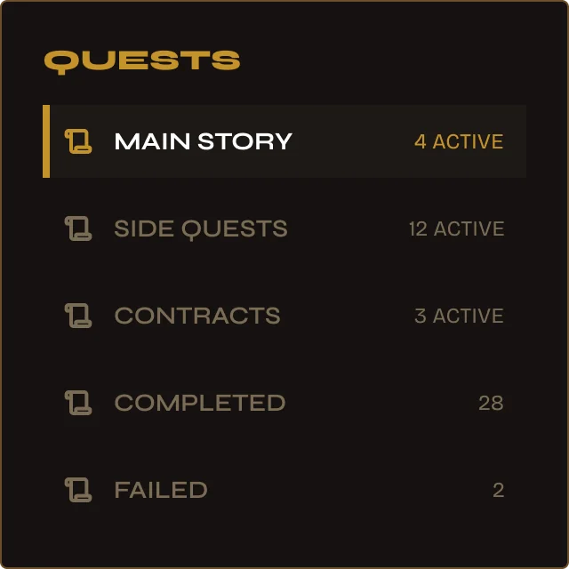
Category navigation — built in.
Main Story, Side Quests, Contracts, Completed, Failed — each as a panel row with live count. One tap filters the list. The navigation IS the component — no separate menu needed.
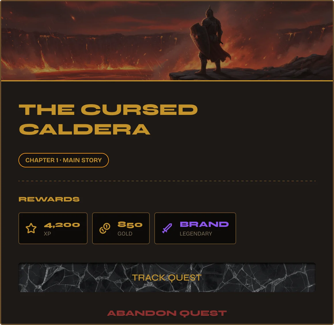
Hero image. Chapter. Rewards. CTA.
Chapter tag, main story badge, reward breakdown — XP, Gold, Item with rarity colour. Track Quest and Abandon Quest as primary actions. Everything a player needs to commit or skip, in one card.
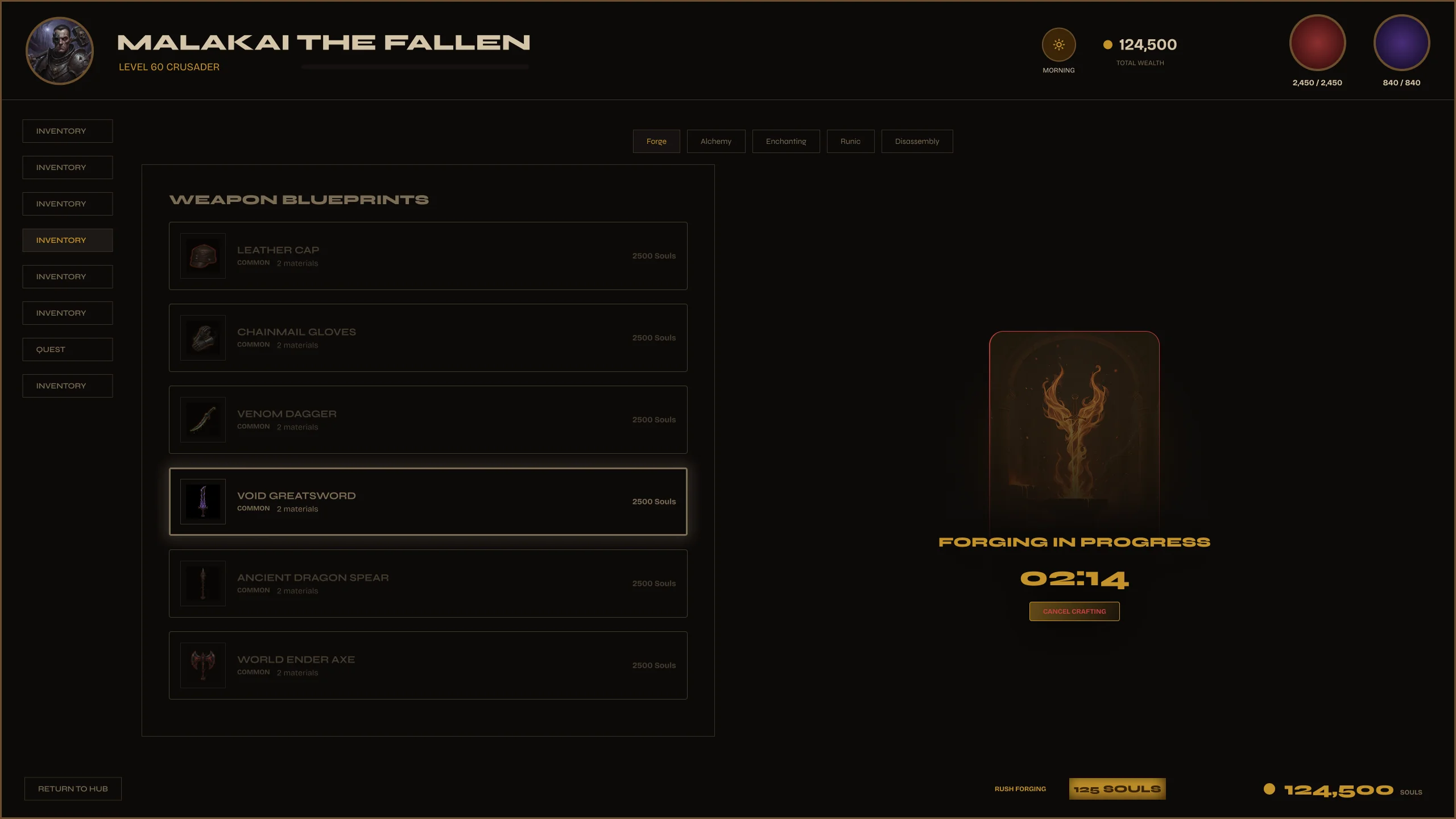
Crafting UIs are deceptively complex. You need a station selection, a blueprint browser with rarity outcomes, ingredient management, a forging state with timer, and a completion overlay. Most kits show one of these.
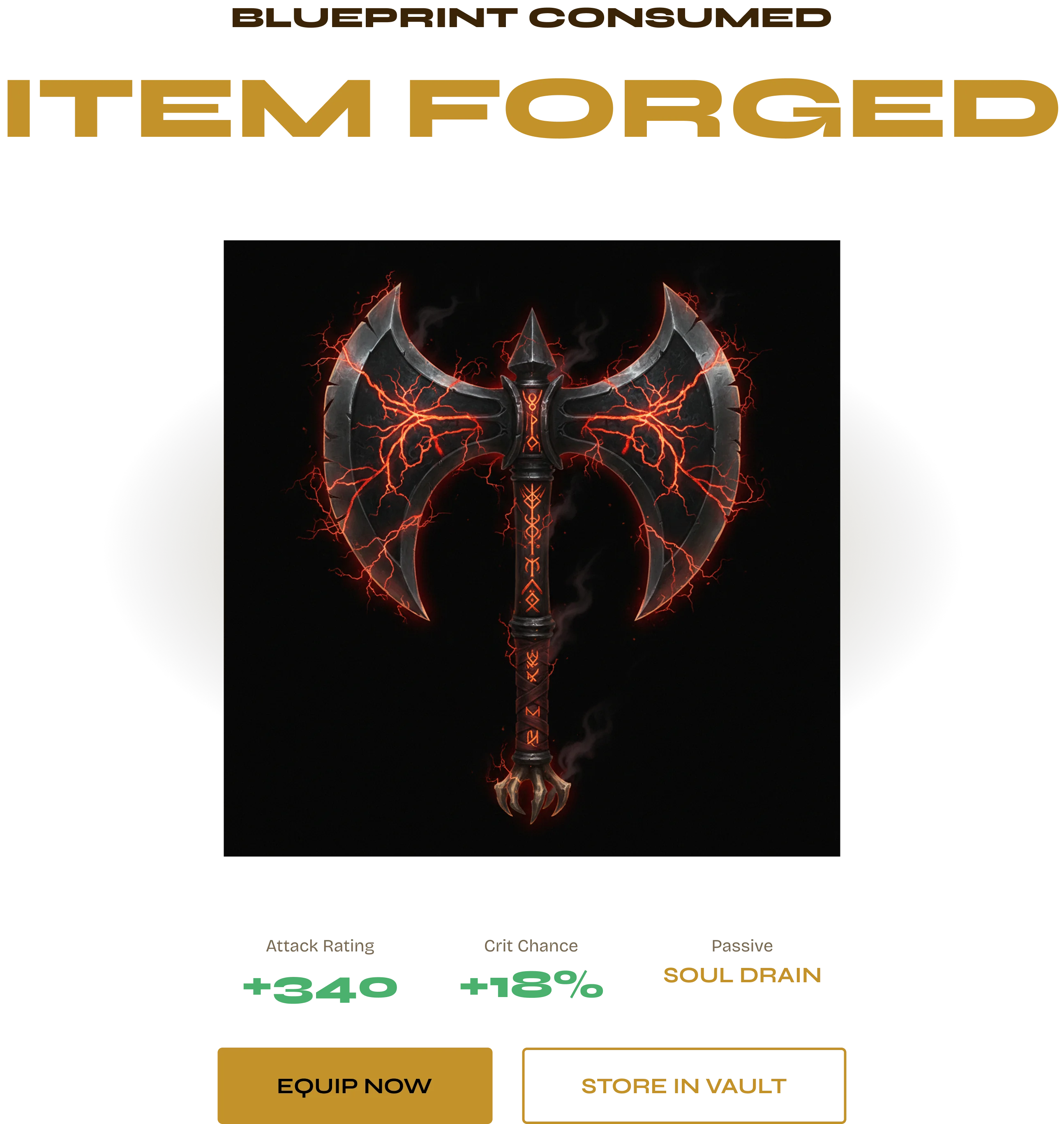
The complete forge flow across three screens — station select, blueprint browser, active forge. Every state designed: browsing, forging in progress, item forged. One system, zero gaps.
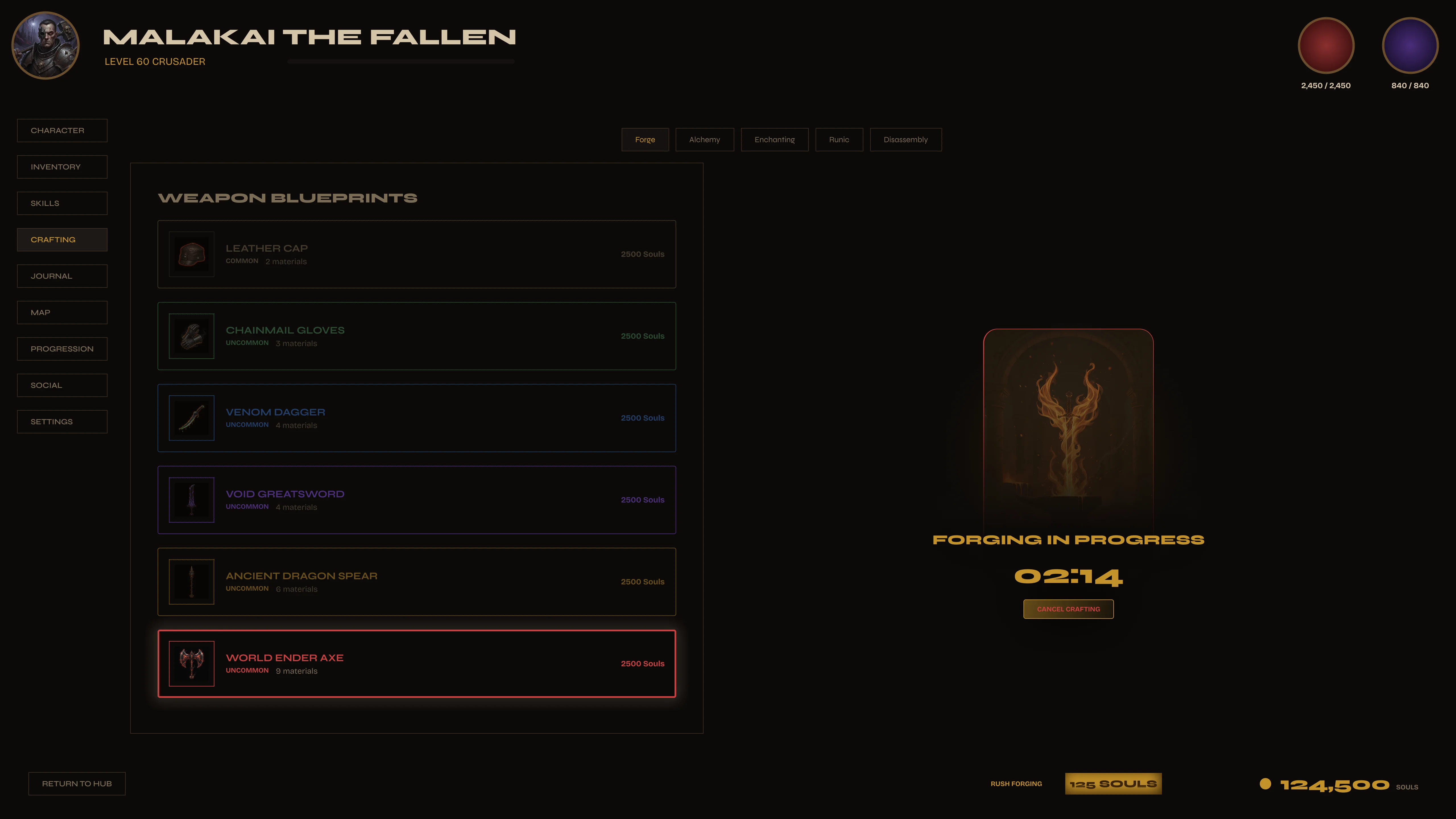
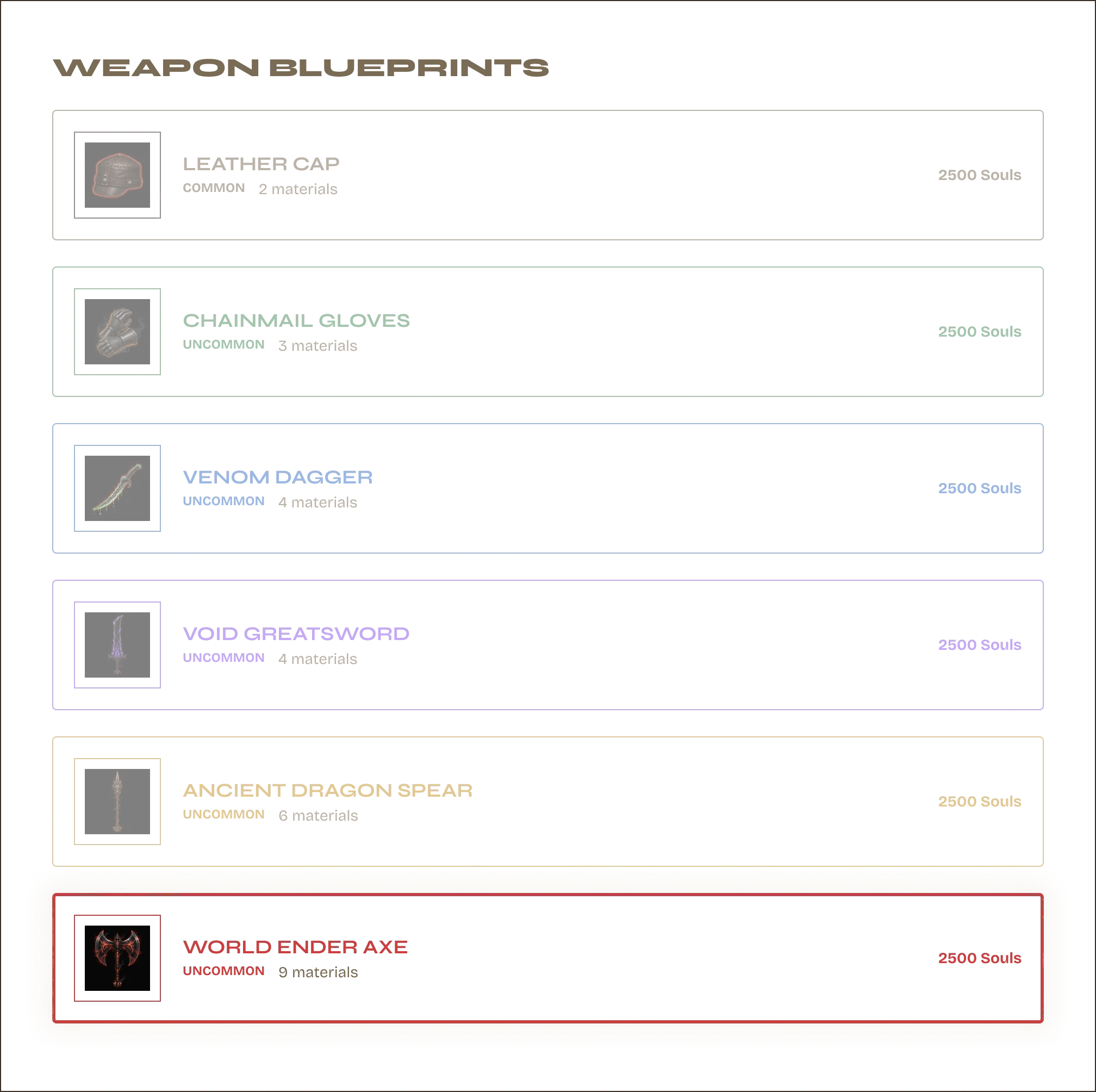
The forge is alive when it's working.
Ingredients locked in. Timer running. The screen dims and the forge animation plays. Players can't miss that something is happening — the visual design carries the state, no text required.
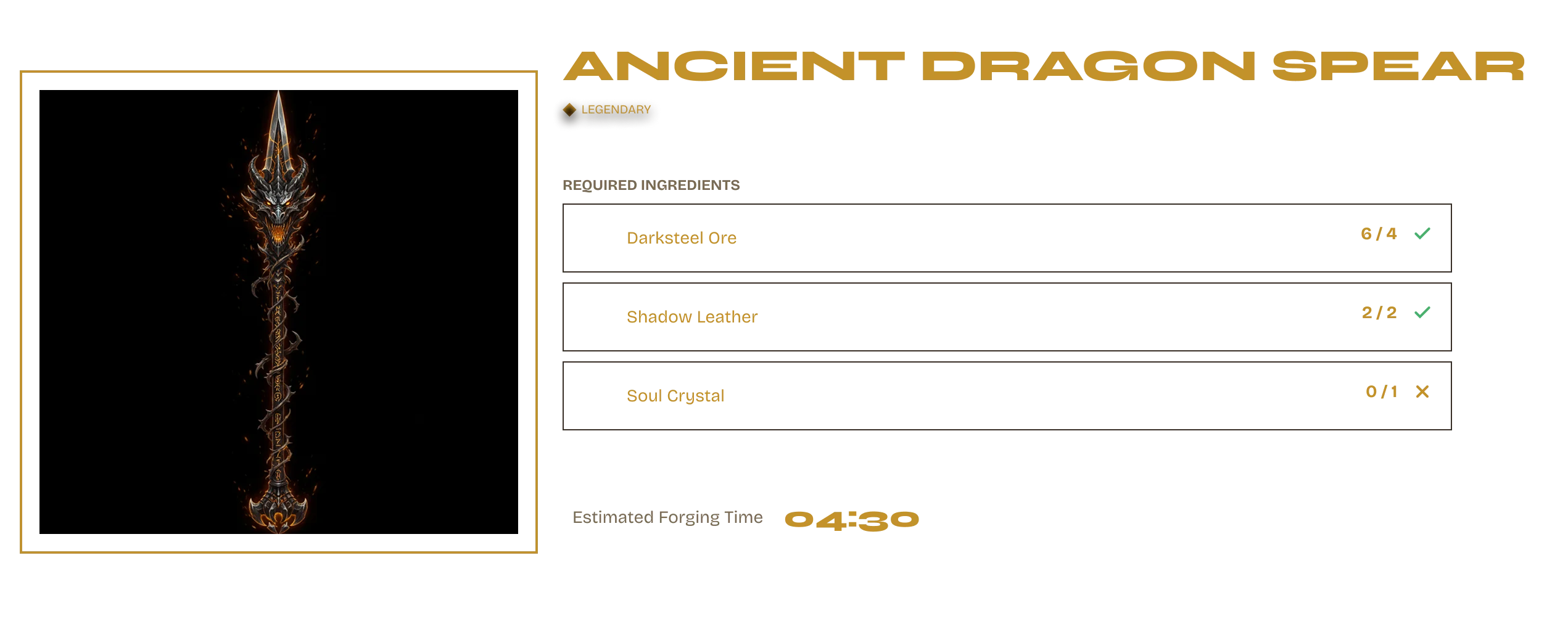
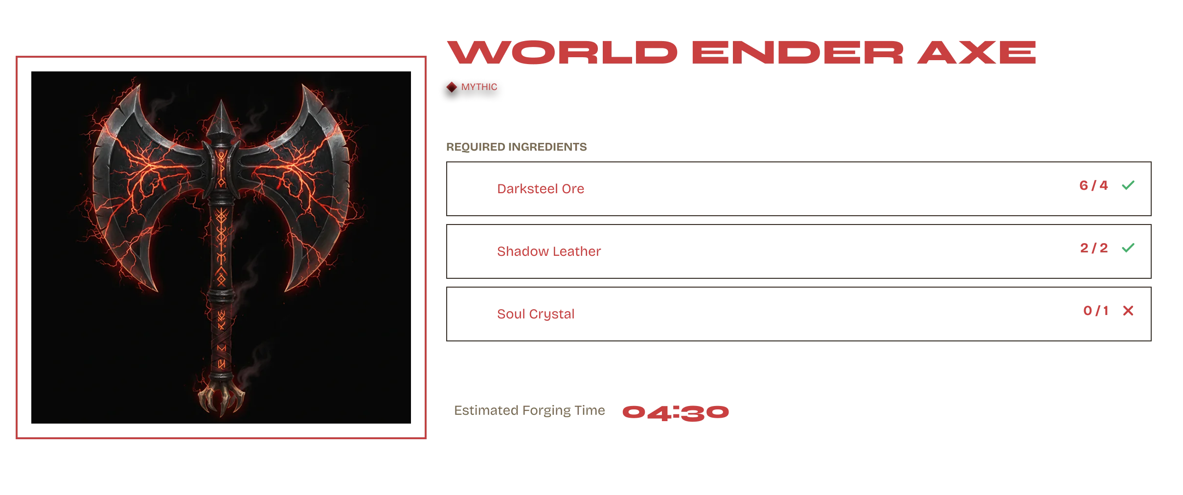
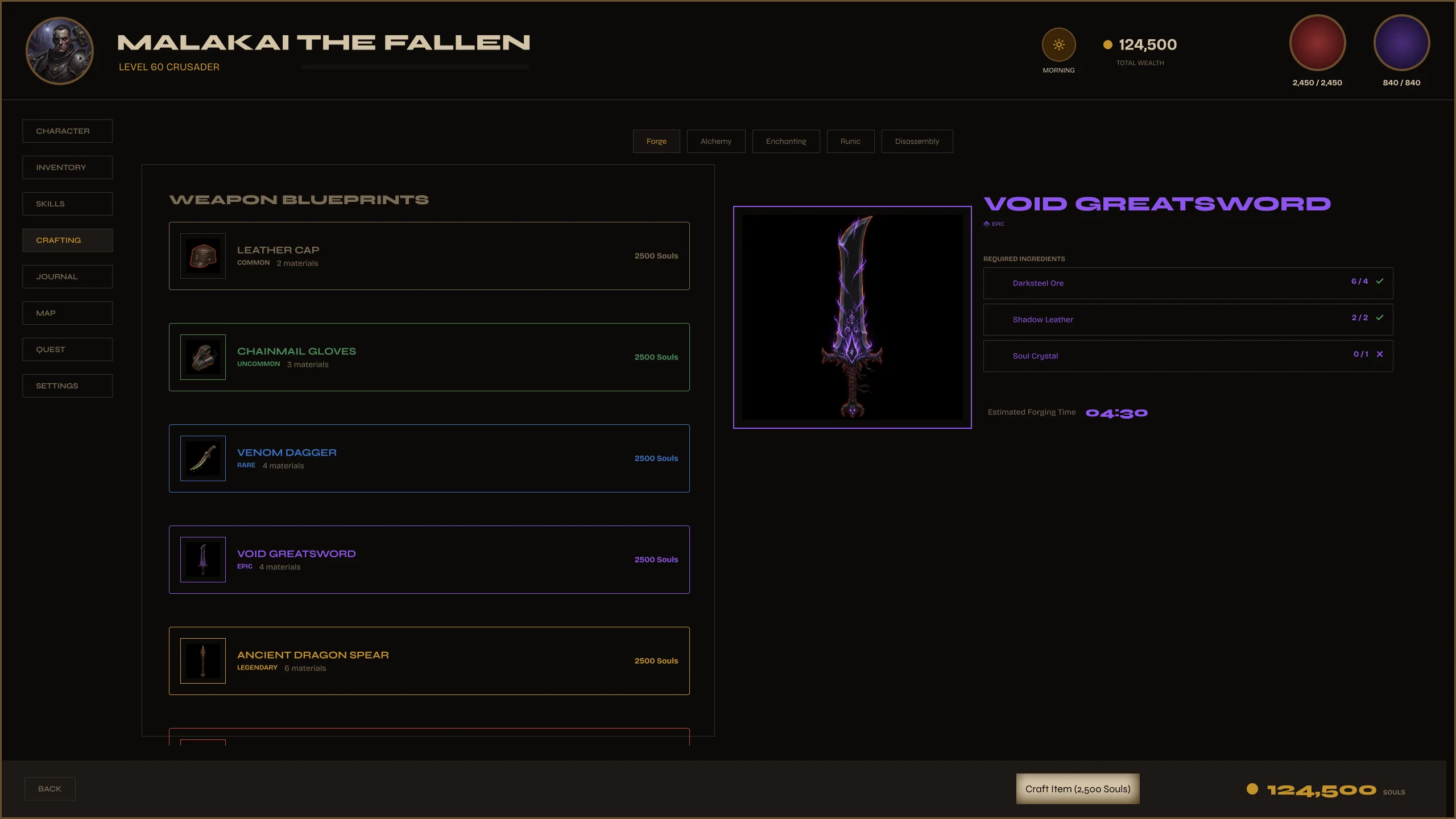
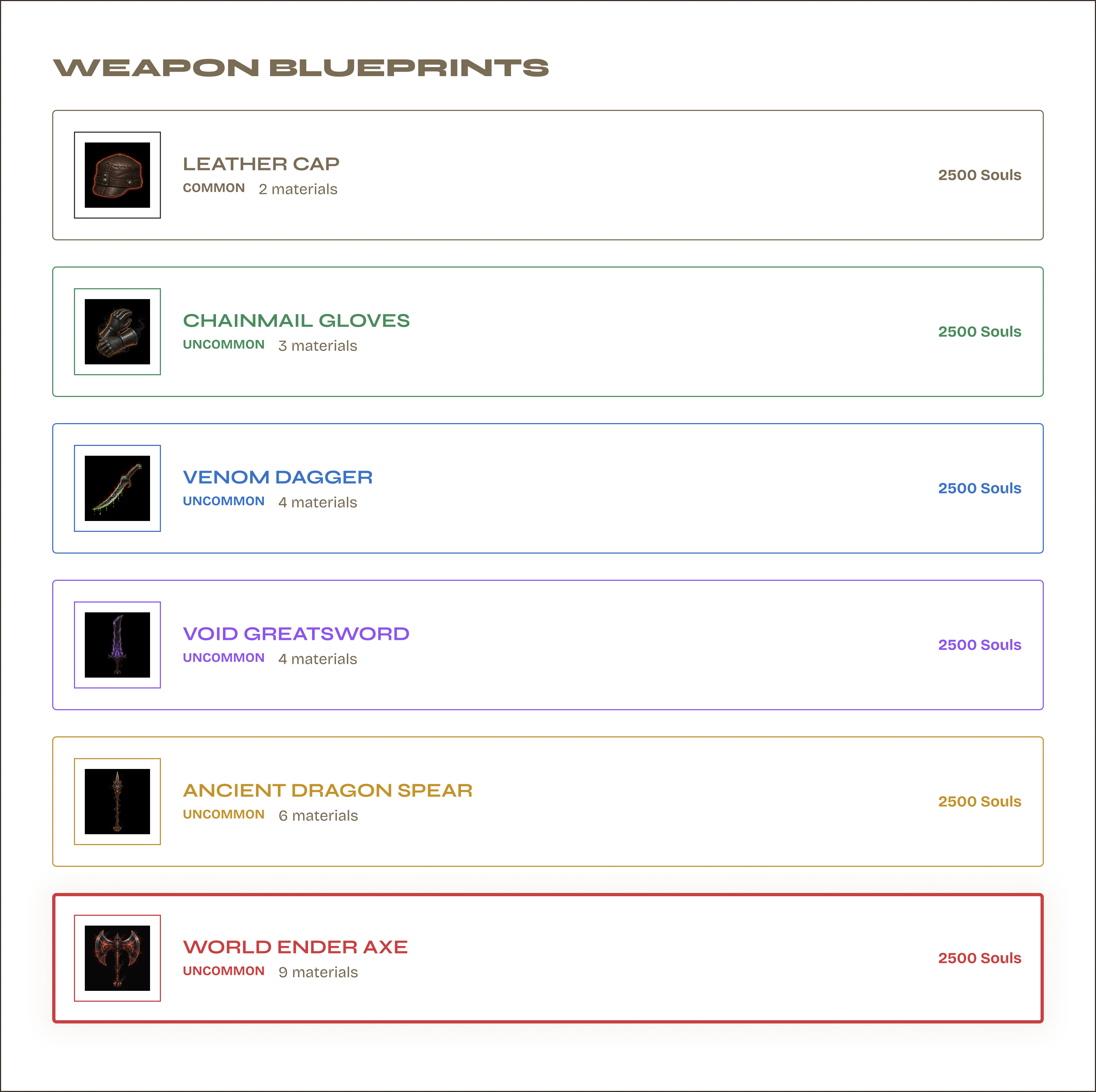
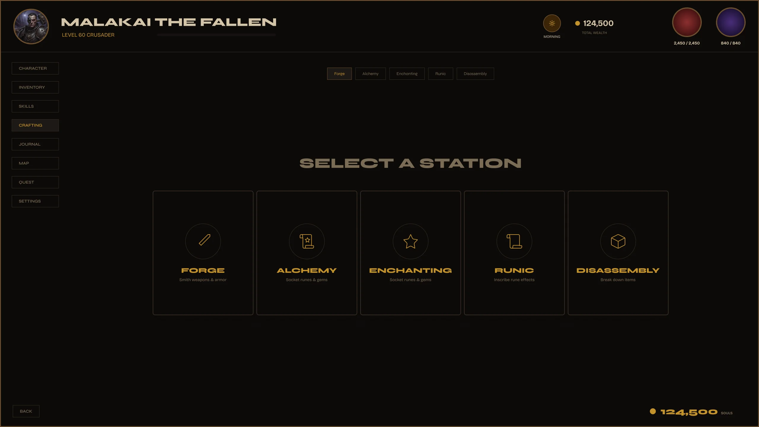
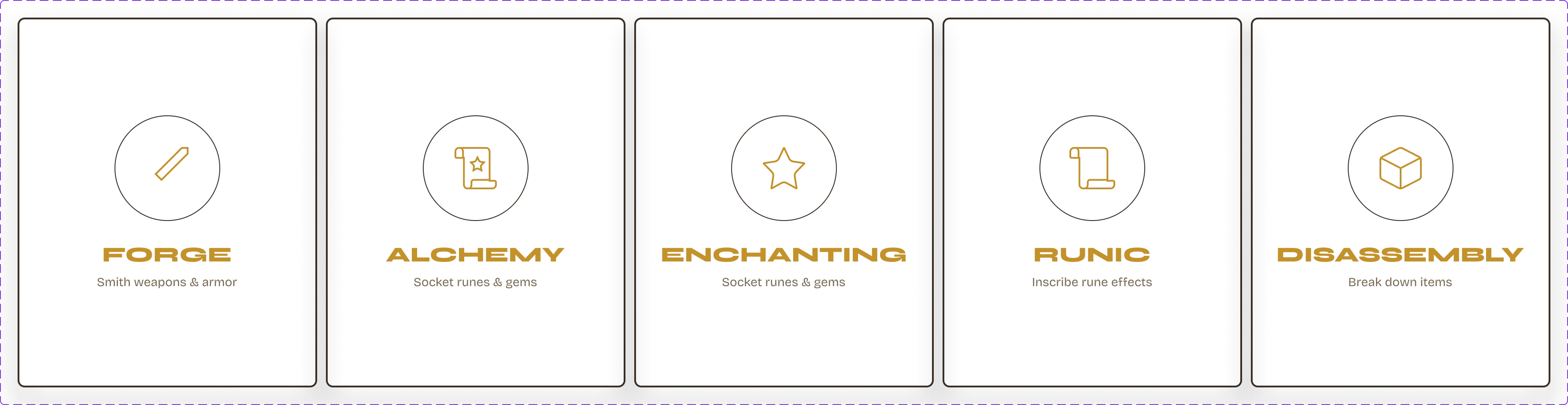
Station Select → Blueprint → Forge.
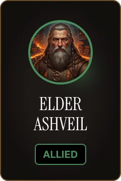
Each station card shows: name, icon, recipe category, and availability state. Select one and the blueprint browser filters to match. The station determines what the player can craft — visual design communicates the rule, no tooltip needed.
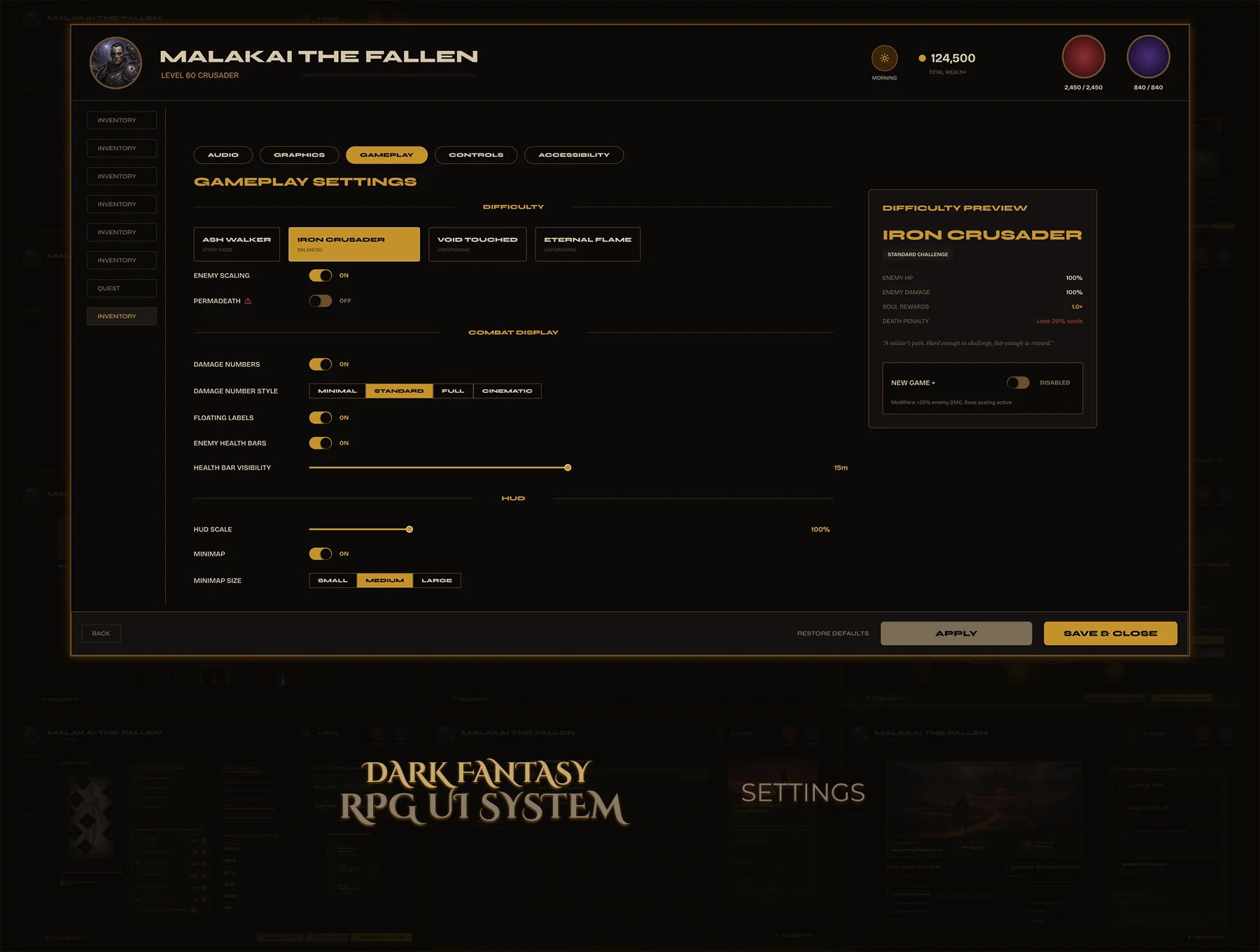
Settings screens are never the priority — they get one layout late in production. No consistent sidebar, mismatched component styles, toggles and sliders designed ad-hoc. Players feel the neglect immediately.
Four settings screens with one shared sidebar nav and one shared component set. Sliders, toggles, dropdowns, and presets — all reused, all consistent. Settings that feel like the rest of the game, not an export from another project.
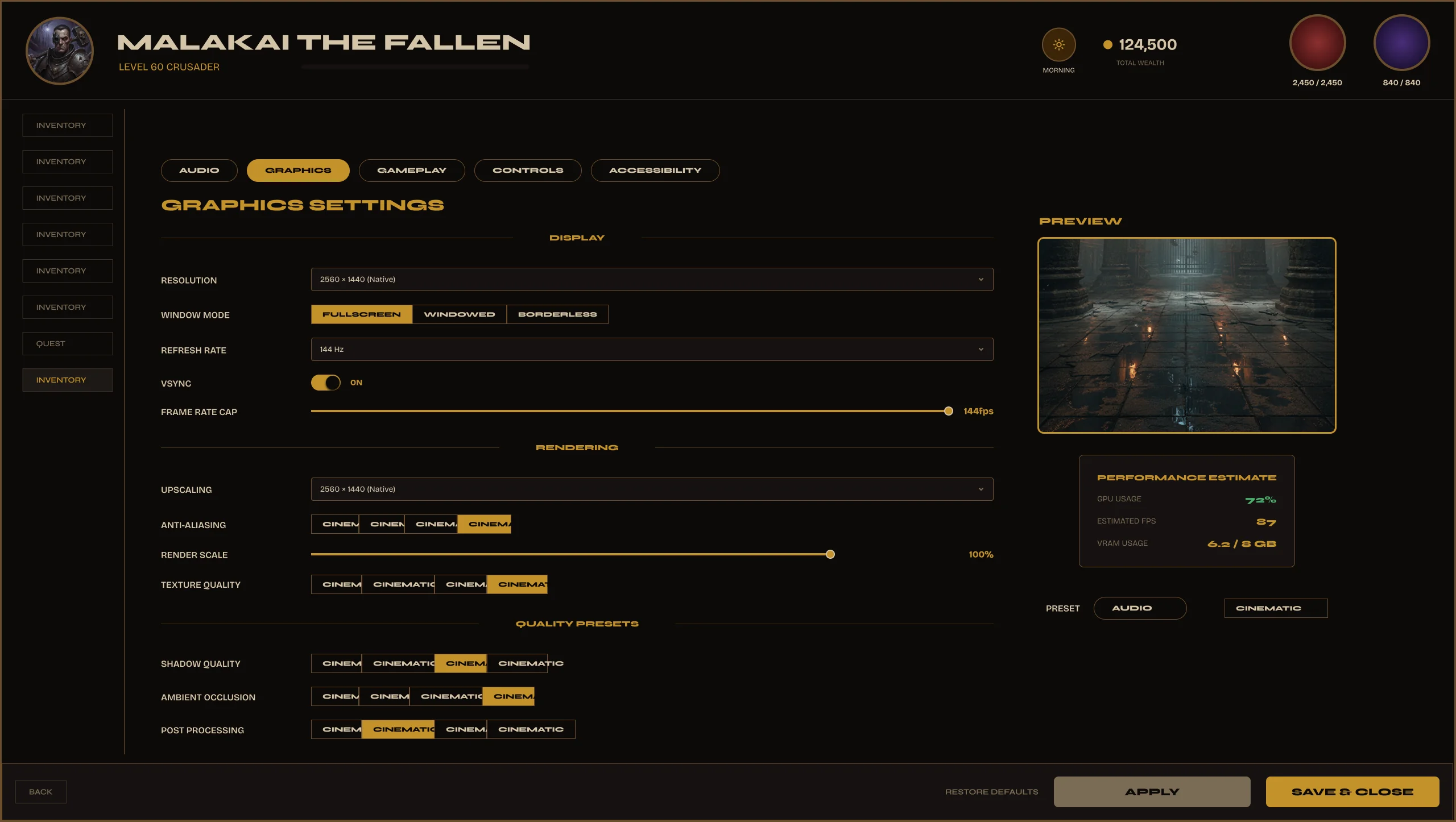
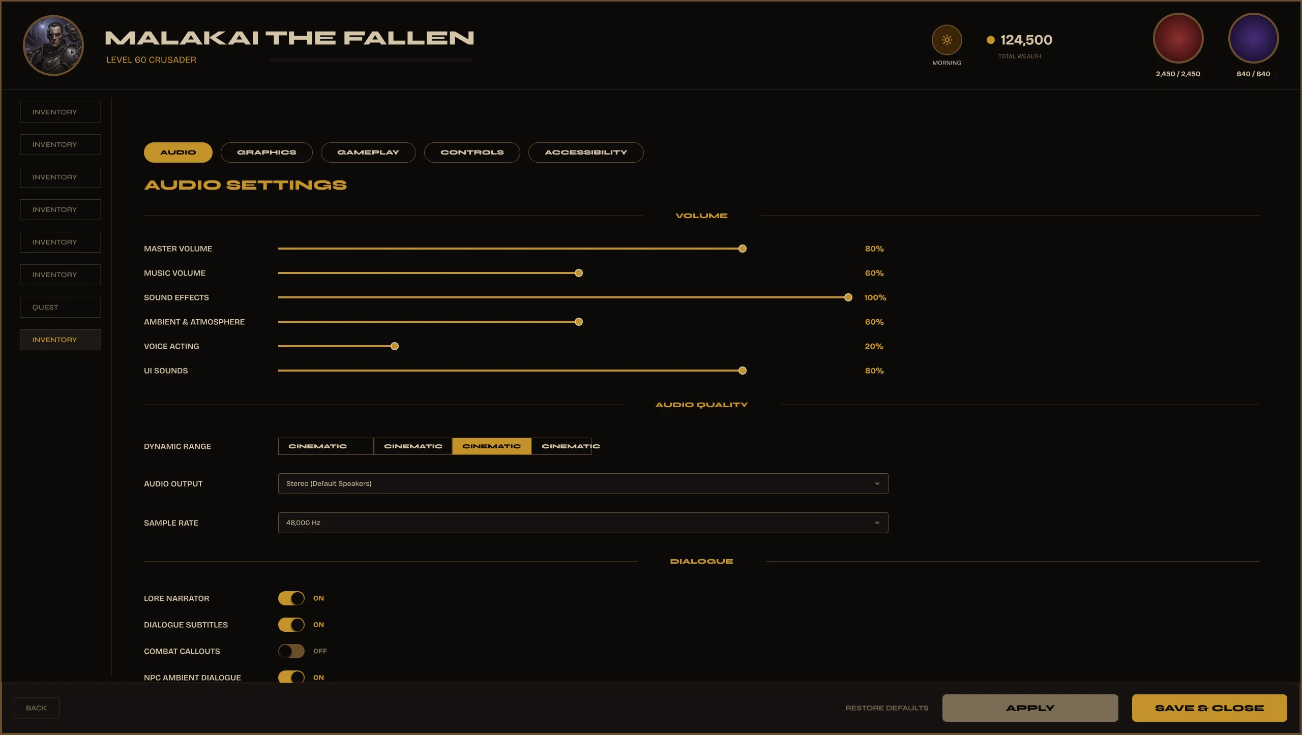
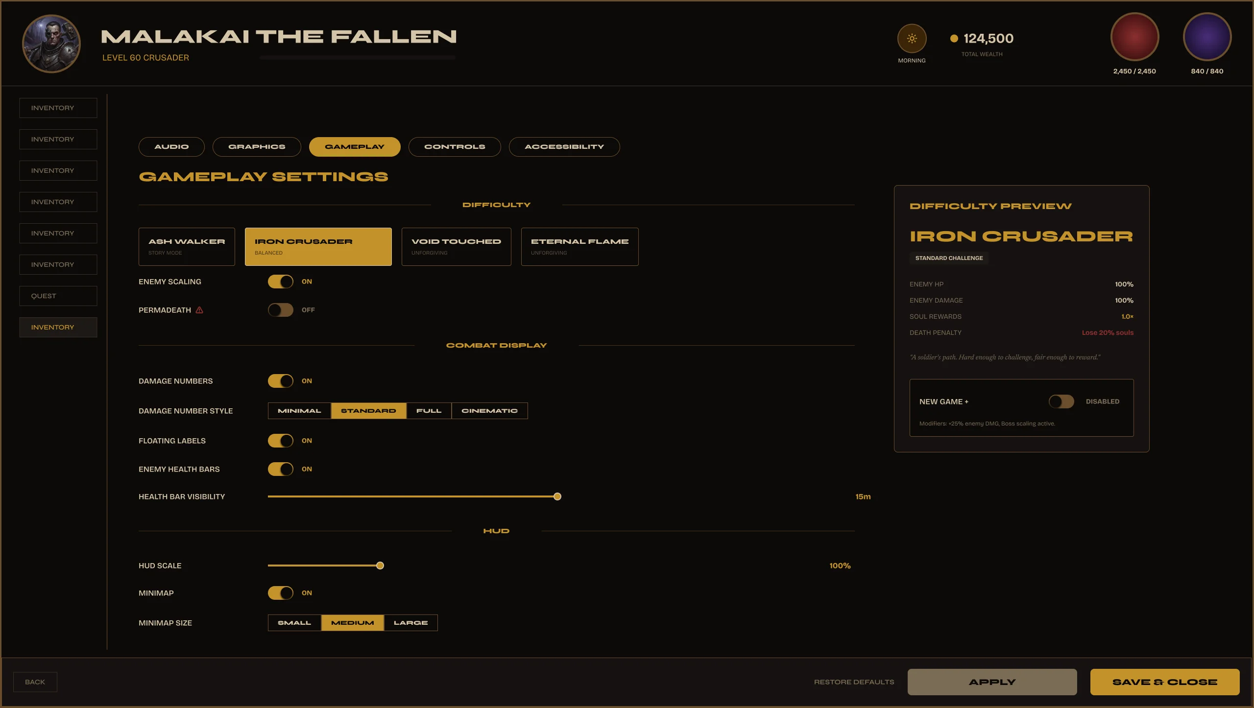
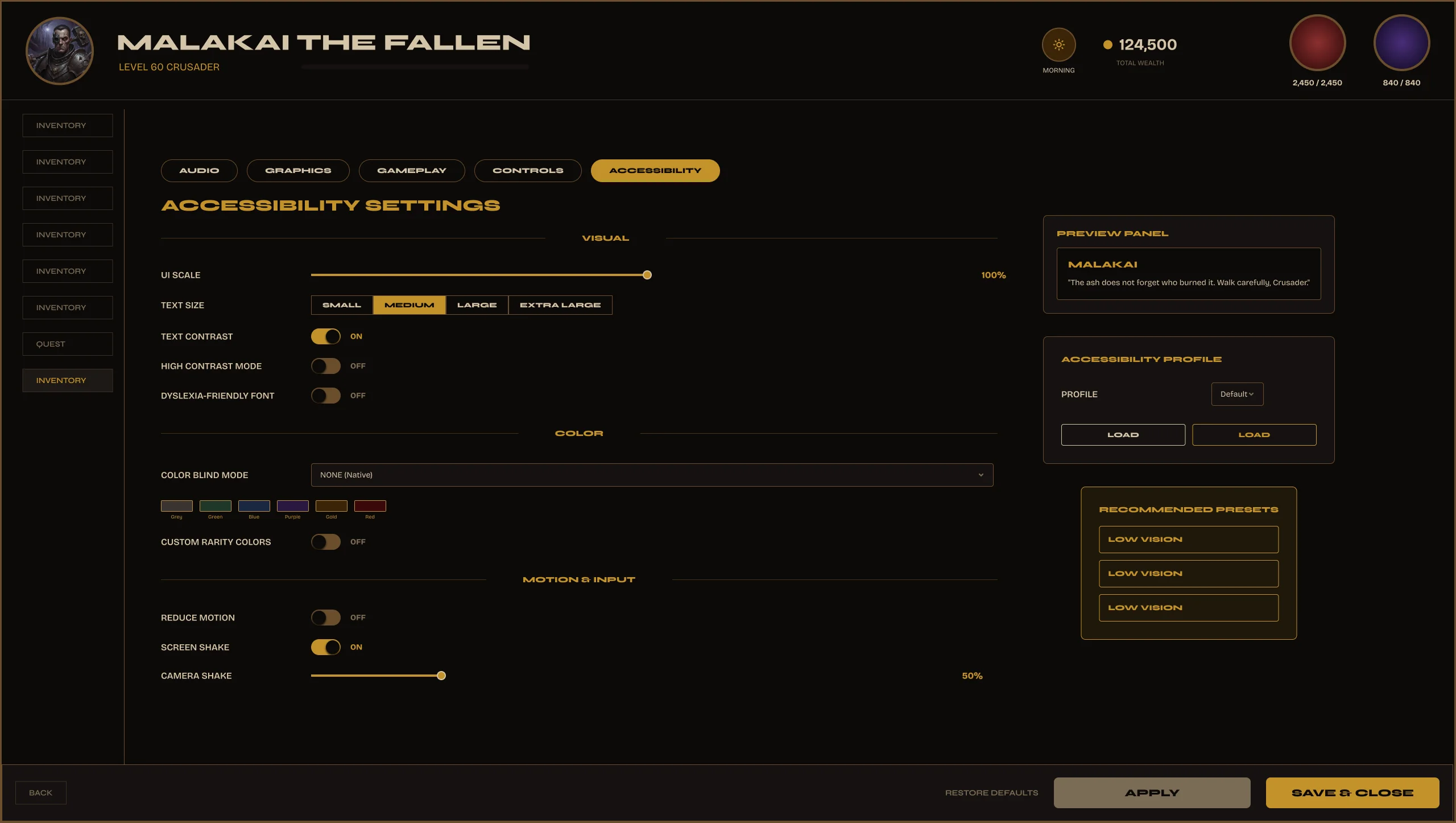
Built once.
Reused everywhere.
Every screen in Valdûm is built from the same reusable component library. Update one component — every instance across the system stays consistent.
Most UI kits dump all components in one flat list. Finding what you need takes longer than building it yourself. Naming conventions are inconsistent, states are missing, and Auto Layout breaks when you scale.
255 components organized by screen, named consistently, and built to scale. Every component has variants for all its states. Auto Layout throughout — resize and the component stays intact.
Every screen.
Production ready.