Elbhaar — Hair Salon Website
Light-theme website for a Hamburg hair salon. Clean, conversion-focused, mobile-first. One goal: book an appointment.
The brief
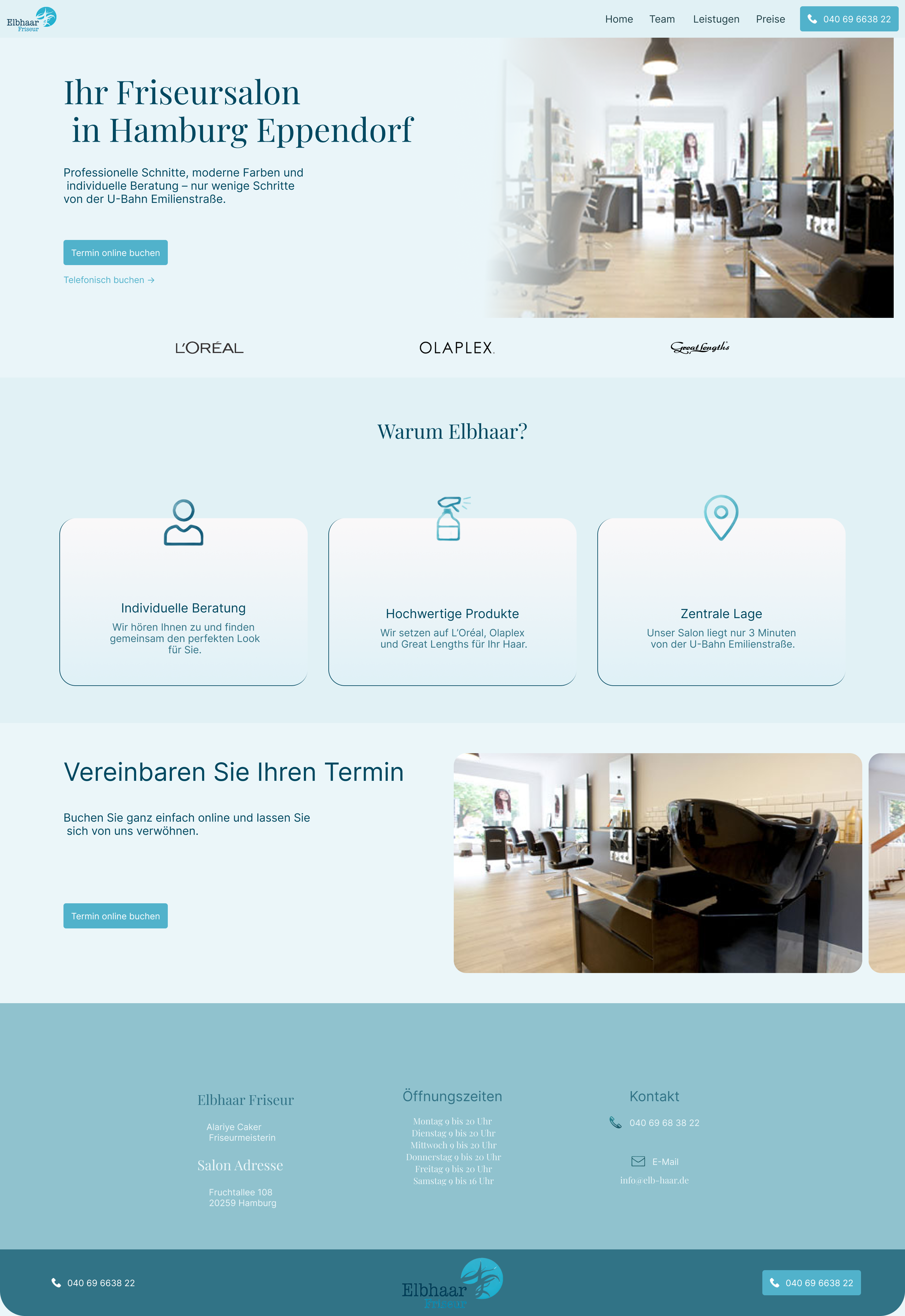
Self-initiated concept. The scenario: a new hair salon opening in Hamburg's Altona district. No reputation yet, competing against established salons that already have reviews and regulars. The website needs to do the trust-building that word-of-mouth hasn't had time to do yet.
One goal, one CTA: book an appointment. Every design decision was evaluated against that single question — does this make someone more or less likely to book?
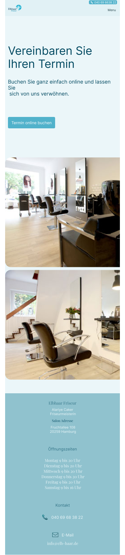
Design decisions
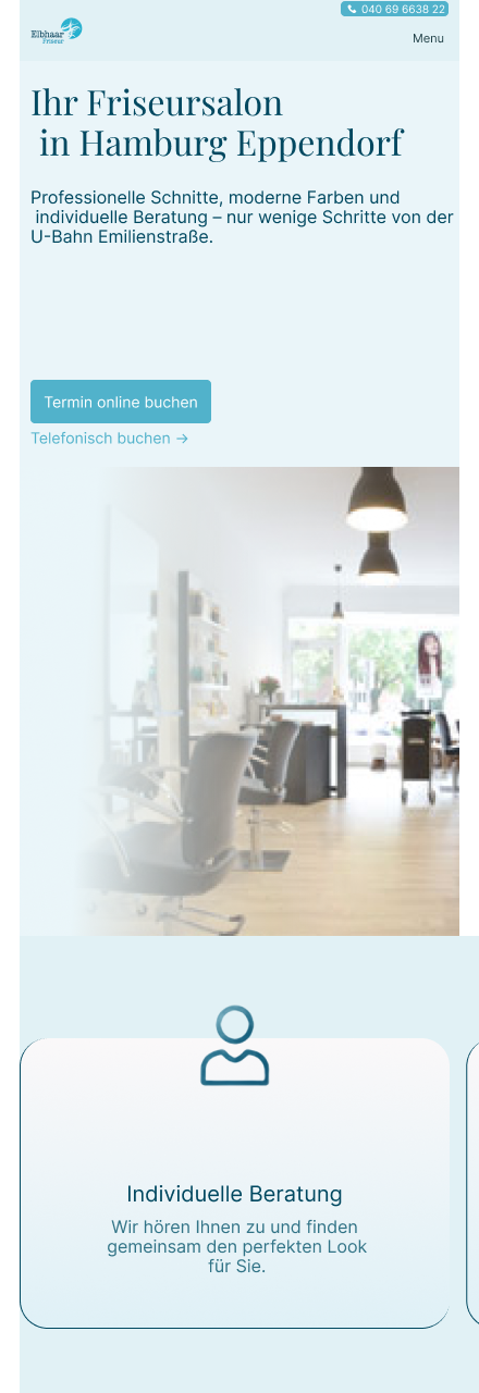
Teal accent over the gold or black that dominates salon websites — distinctive enough to be remembered, calm enough to feel premium. Mobile-first from frame one: salon bookings happen on phones, often on the way to work. The CTA had to be reachable in one scroll on a 375px screen. Team cards with individual booking CTAs came early in the structure — personalizing the service before the first visit builds trust faster than a generic "Book Now" ever could.
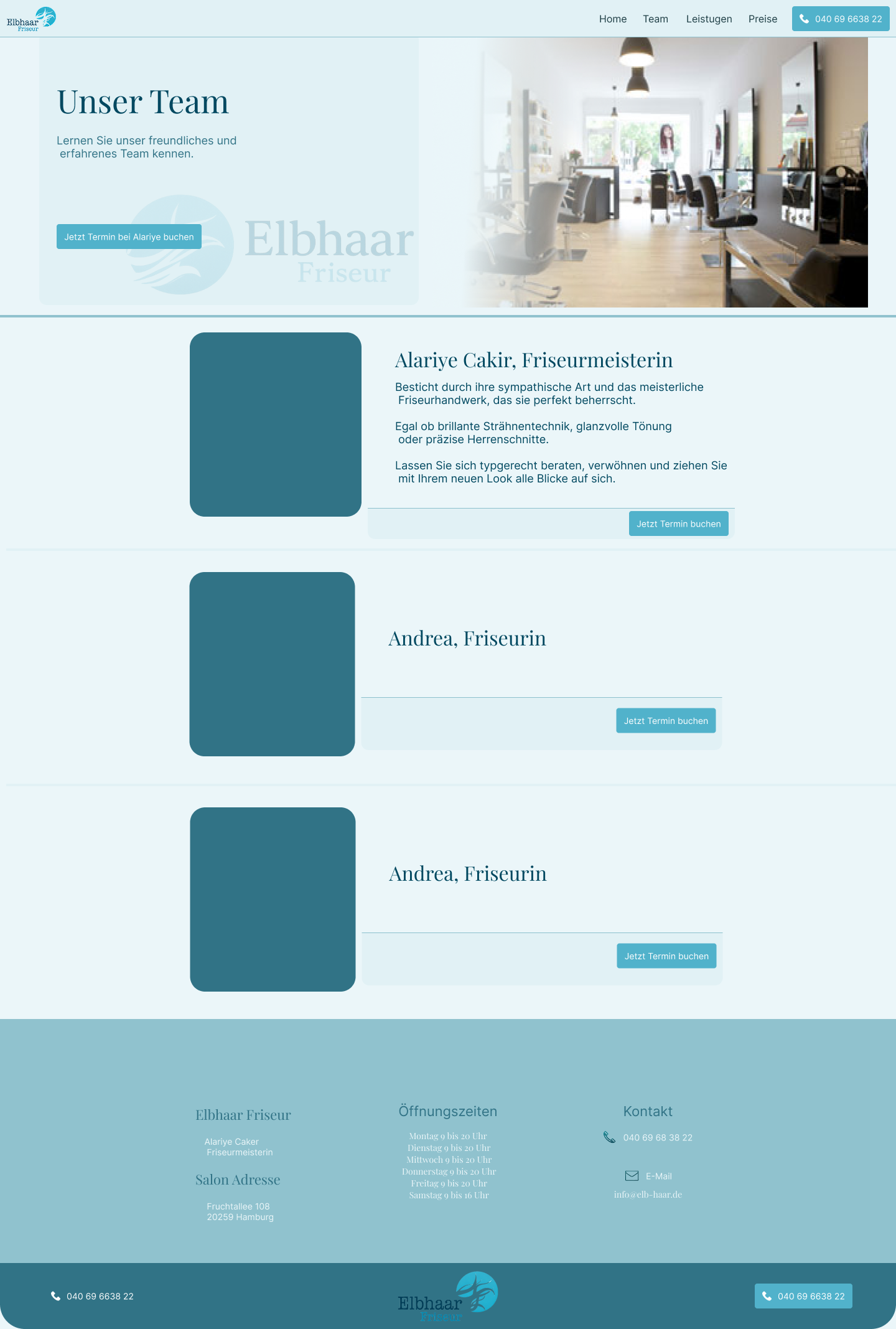
Team page
Each stylist gets a personal card with a direct booking CTA. Personalizes the service before the first visit.
Responsive design
Designed for mobile first. The booking CTA is always reachable within one scroll. Content reflows — nothing hides, everything stacks.
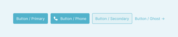
Button system
4 button variants — Primary, Phone, Secondary, Ghost. Single teal accent color throughout. No second guessing what to click.