IldaMoves — Physiotherapy Website
6-page website for a physiotherapy brand. Conversion-focused, purple identity, full page set from homepage to contact.
The brief
Self-initiated concept. The scenario: a physiotherapy practice with no website, converting entirely through word-of-mouth and social media. The owner wants to grow — but without a web presence, potential patients who don't get a personal recommendation have nowhere to land.
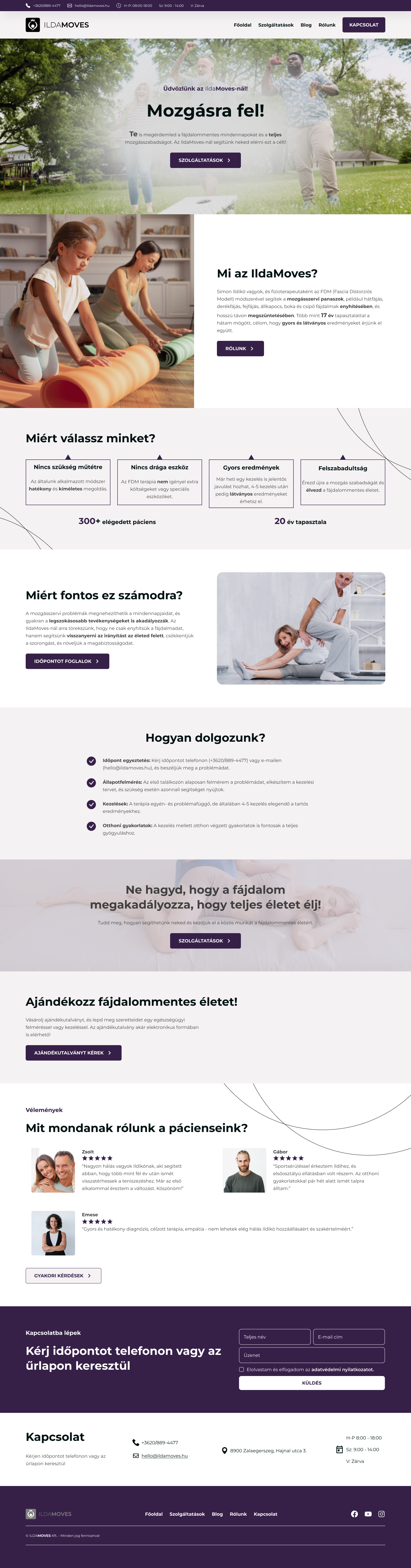
The core problem with physiotherapy websites is trust. It's a hands-on, personal service — people need to feel confident before they book. Most healthcare sites lead with services and credentials. IldaMoves leads with the outcome: move better. Credentials come second, once the visitor is already interested.
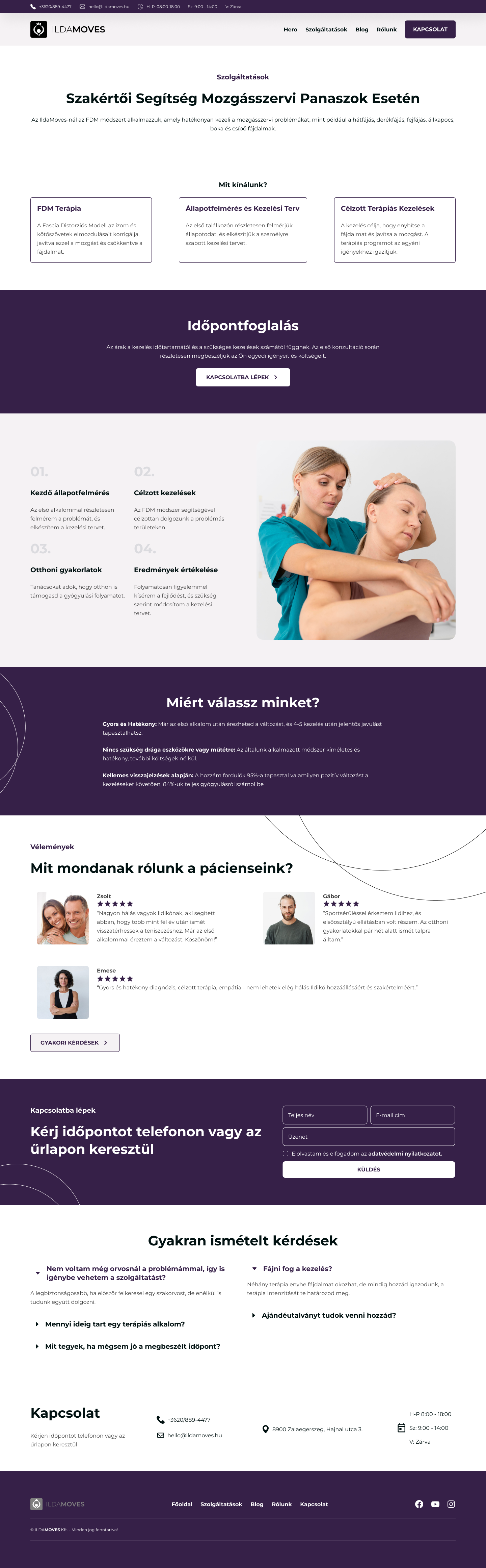
Design decisions
Purple was a deliberate break from the clinical blue-and-white that dominates healthcare design — professional but warm, approachable without feeling unprofessional. The CTA appears three times across the homepage: after the hero, after services, after about. Not aggressive — contextual. At each point where a visitor might be ready to decide, the next step is right there.
Scope
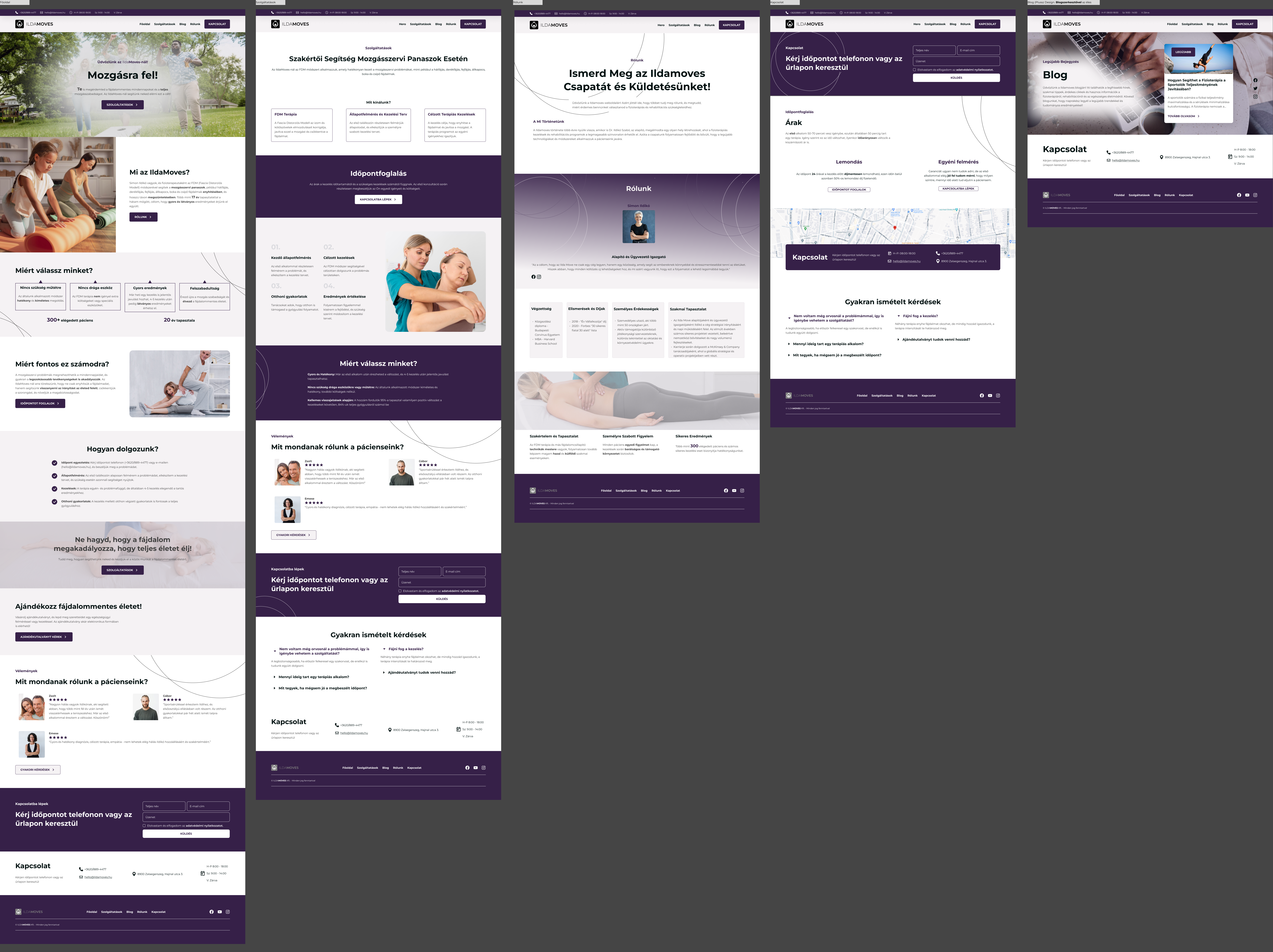
Full website — Homepage, Services, About, Blog, Contact. All 6 pages with a consistent visual language across different content structures.
Conversion structure
Hero → trust signals → social proof → booking CTA. The appointment CTA appears at three natural decision points — never aggressive, always contextual.
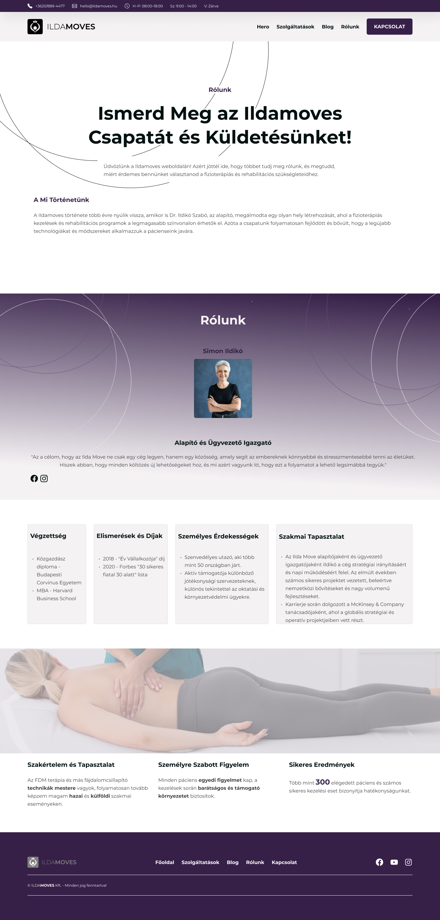
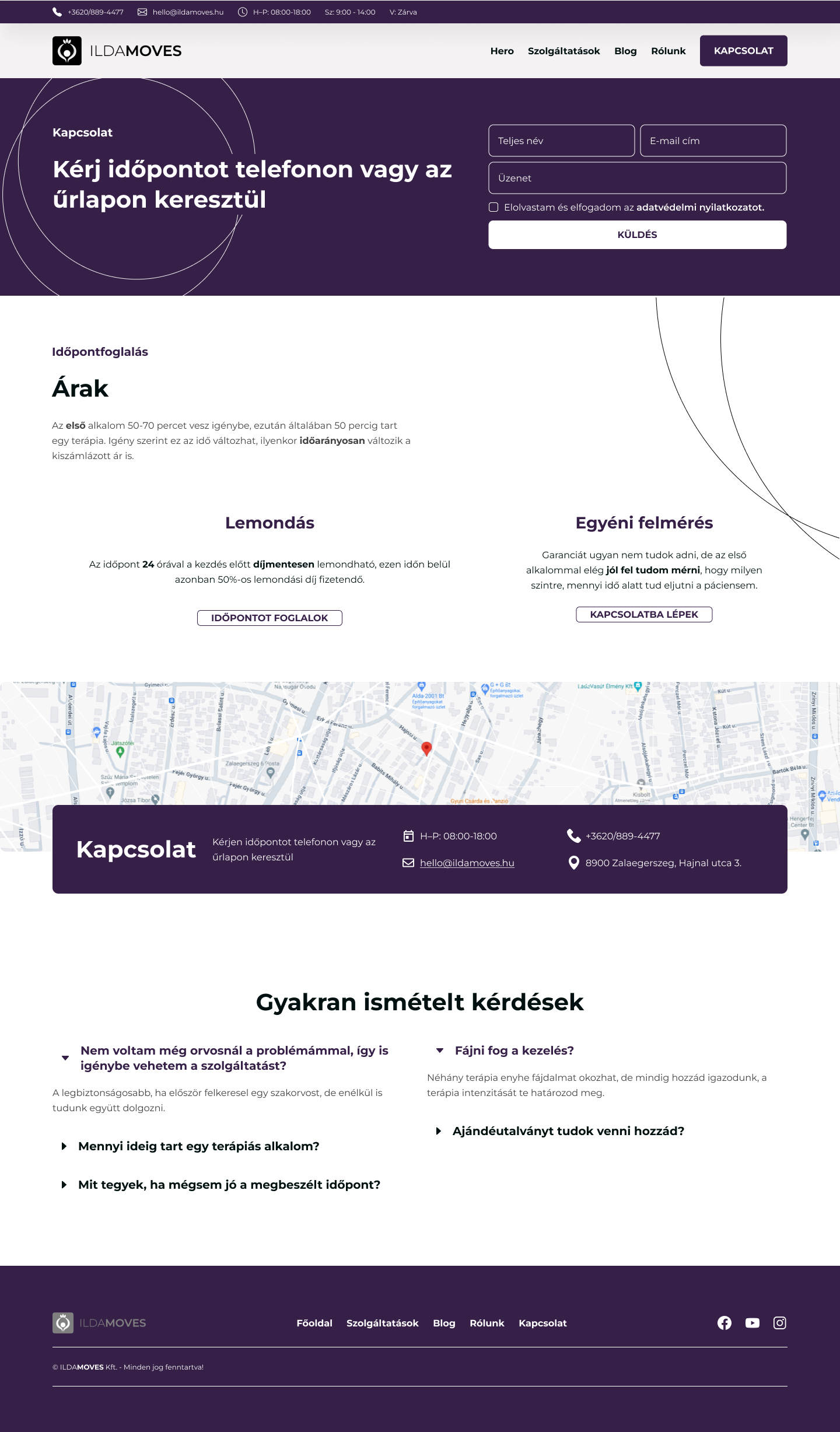
About & Contact