Personal Brand Platform UI
SaaS dashboard for creators — metrics, content system, and offer tracking. Light/dark mode, full component library.
The brief
Self-initiated concept. The problem I was designing for: content creators manage their personal brand across four or five platforms simultaneously — YouTube analytics in one tab, Instagram in another, a spreadsheet for revenue, a Notion doc for content. No single view of what's actually working.
The goal was a dashboard that collapses all of that into one screen. Not by connecting every platform — but by identifying the three numbers that actually matter (visibility, revenue, leads) and giving them the space they deserve. Everything else one click away, never in the way.
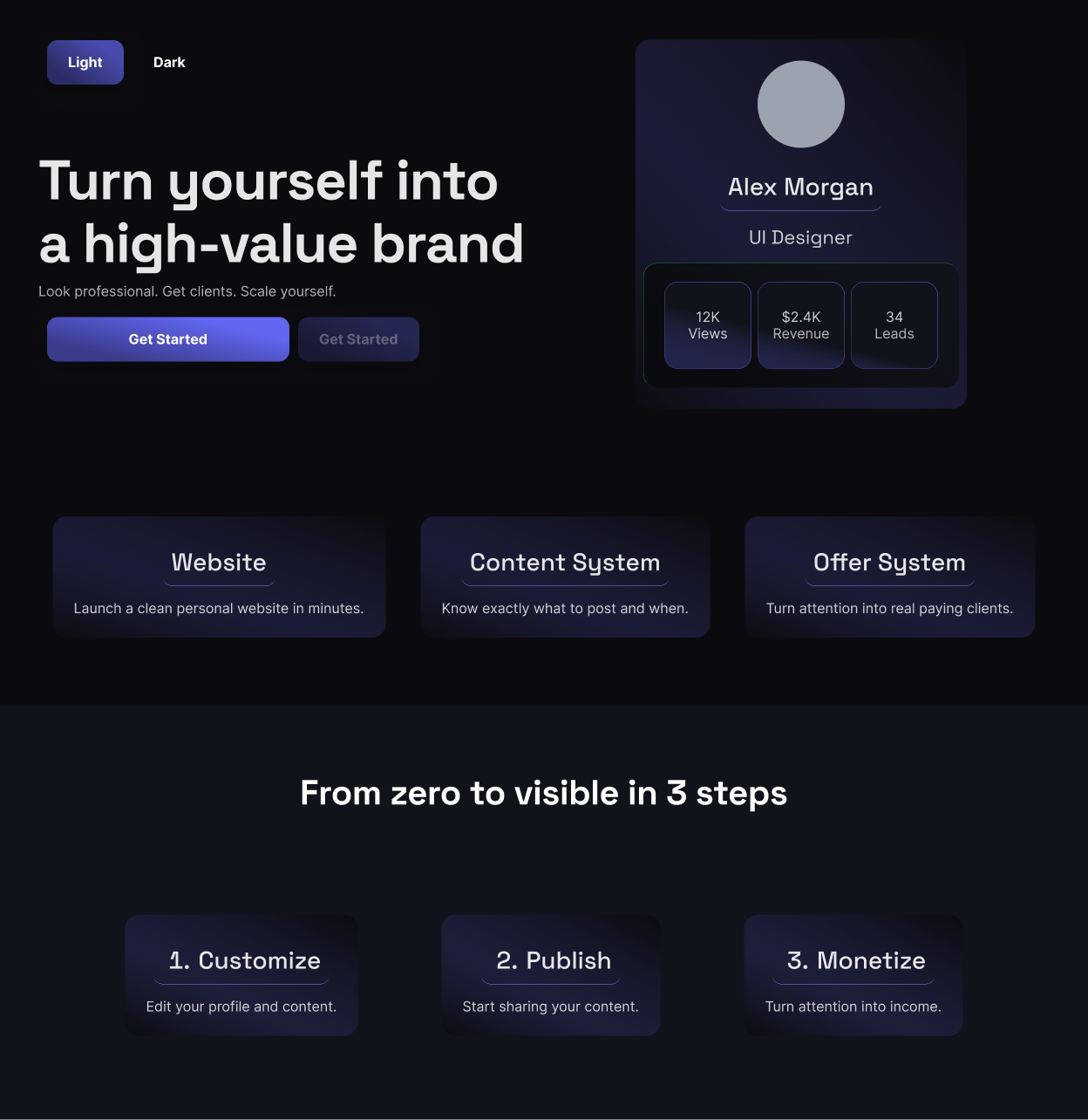
Key decisions
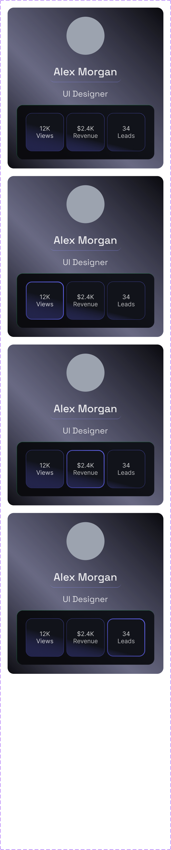
Dark as the default — creators work late, on screens all day. A bright dashboard at midnight is a UX problem. The profile card doubles as a live preview so you see exactly what your audience sees before you hit publish. Three metrics above the fold, no more — if everything is important, nothing is.
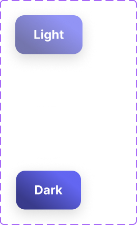
Light / Dark
Both modes fully designed — not a color inversion. Dark is the default. Light keeps the same structure, cleaner for professional contexts. Same layout, same hierarchy — only the surface changes.
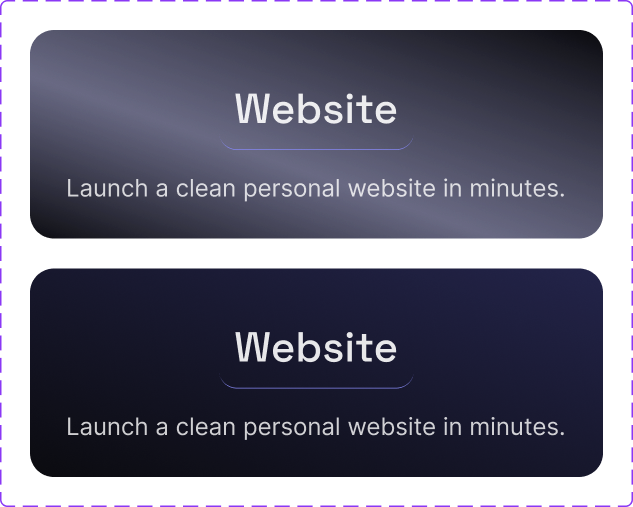
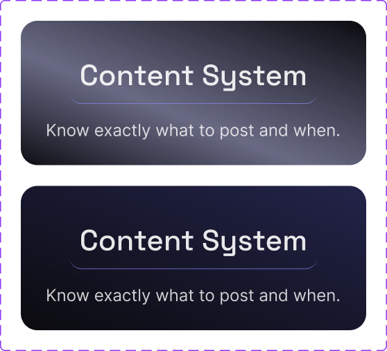
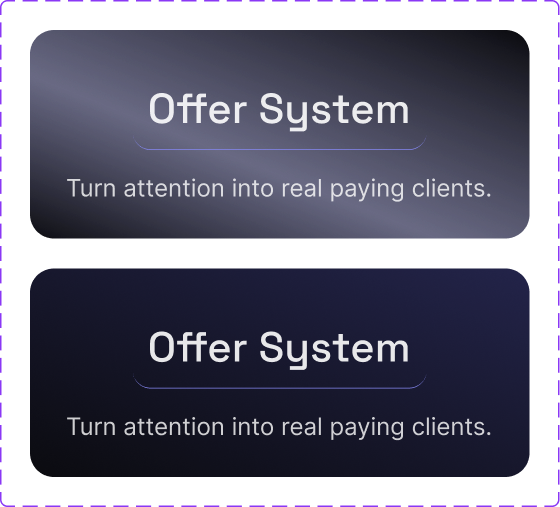
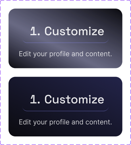
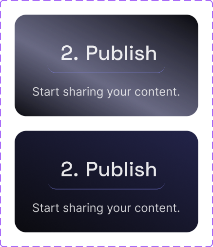
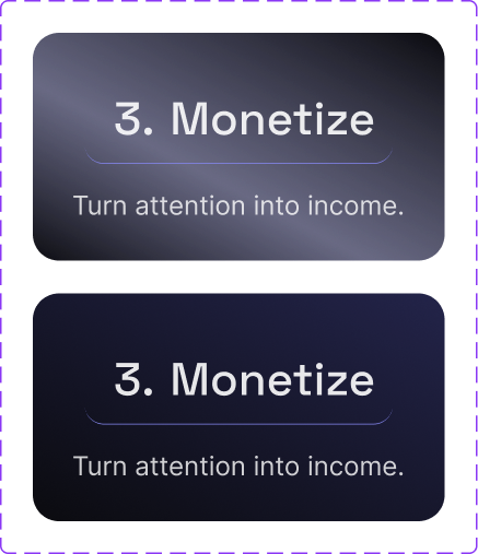
Components
Profile card, feature cards, step cards, and button variants — all built as Figma components with light/dark states. Click to expand.