Netflix TV — Navigation Redesign
A UX-focused redesign of Netflix's TV interface. One structural change, clear reasoning: the navigation belongs on the left, not the top.
The problem
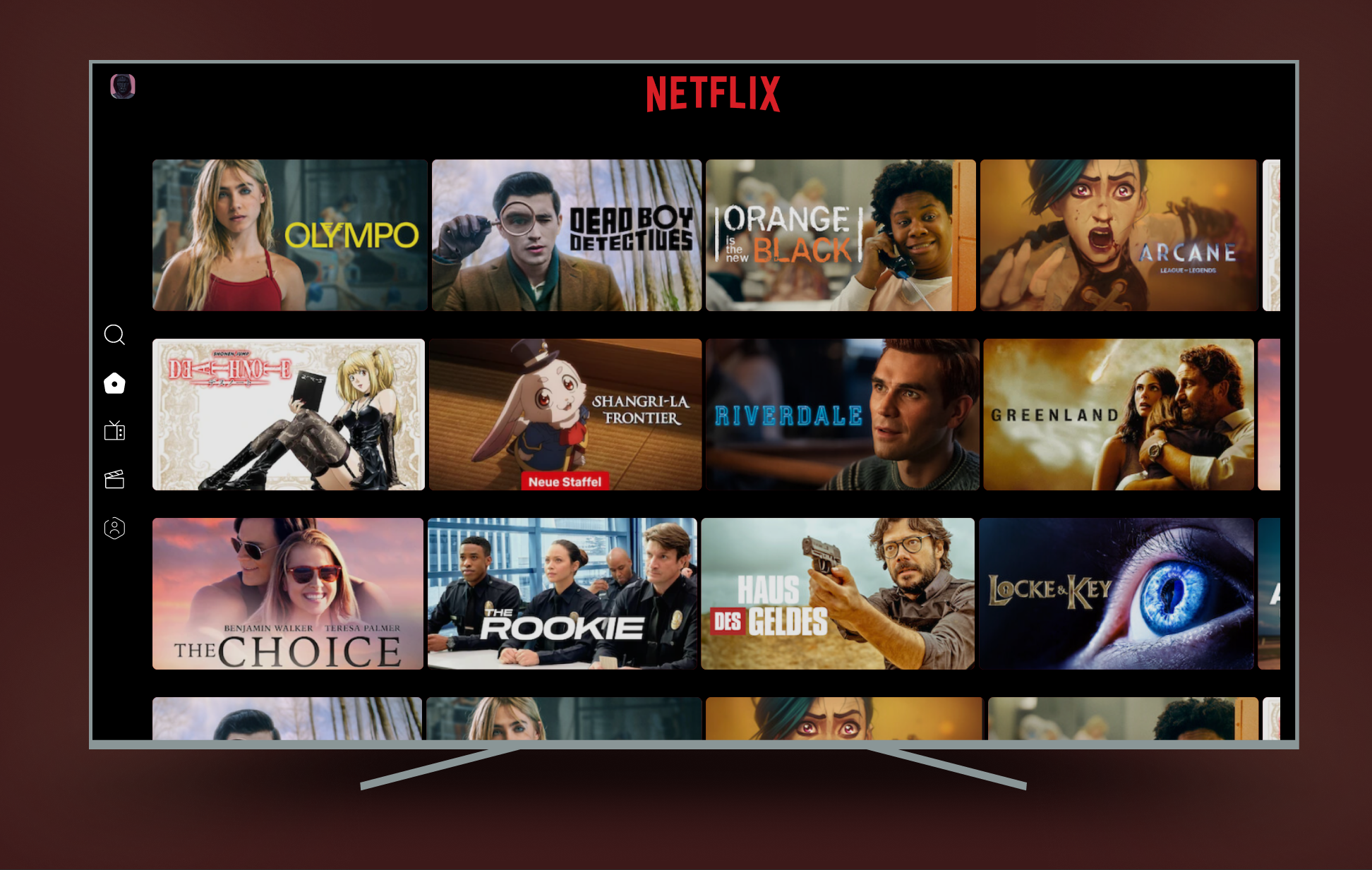
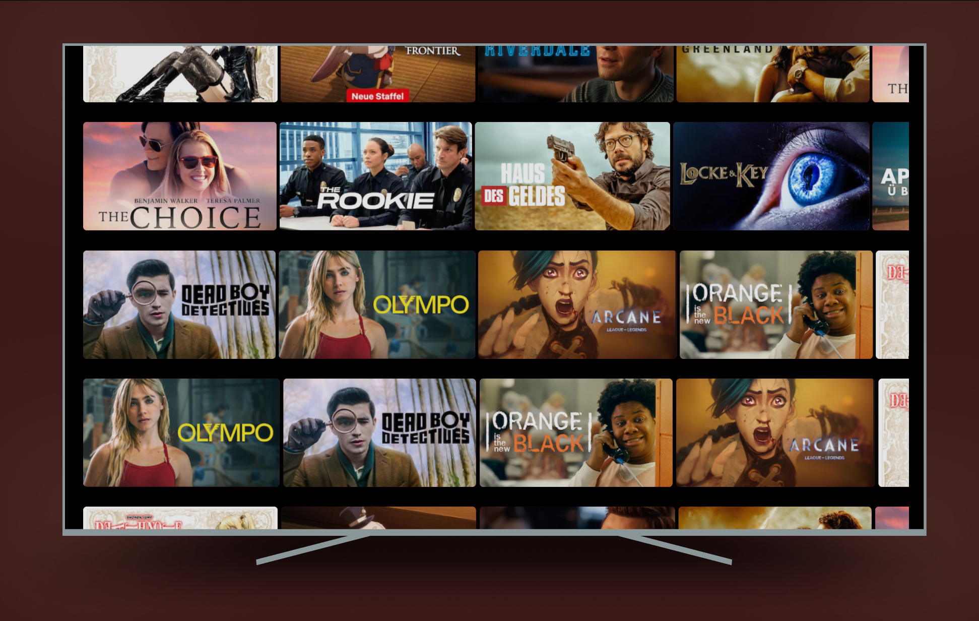
Netflix on TV puts the navigation at the top of the screen — Home, Shows, Movies, My Netflix, all in a horizontal bar. On a phone or laptop, that's fine. You reach up and tap.
On a TV remote, it doesn't work. If you've scrolled down three rows of content and want to switch category, you press up four times to climb back to the top before you can navigate anywhere. Every time. Without exception.
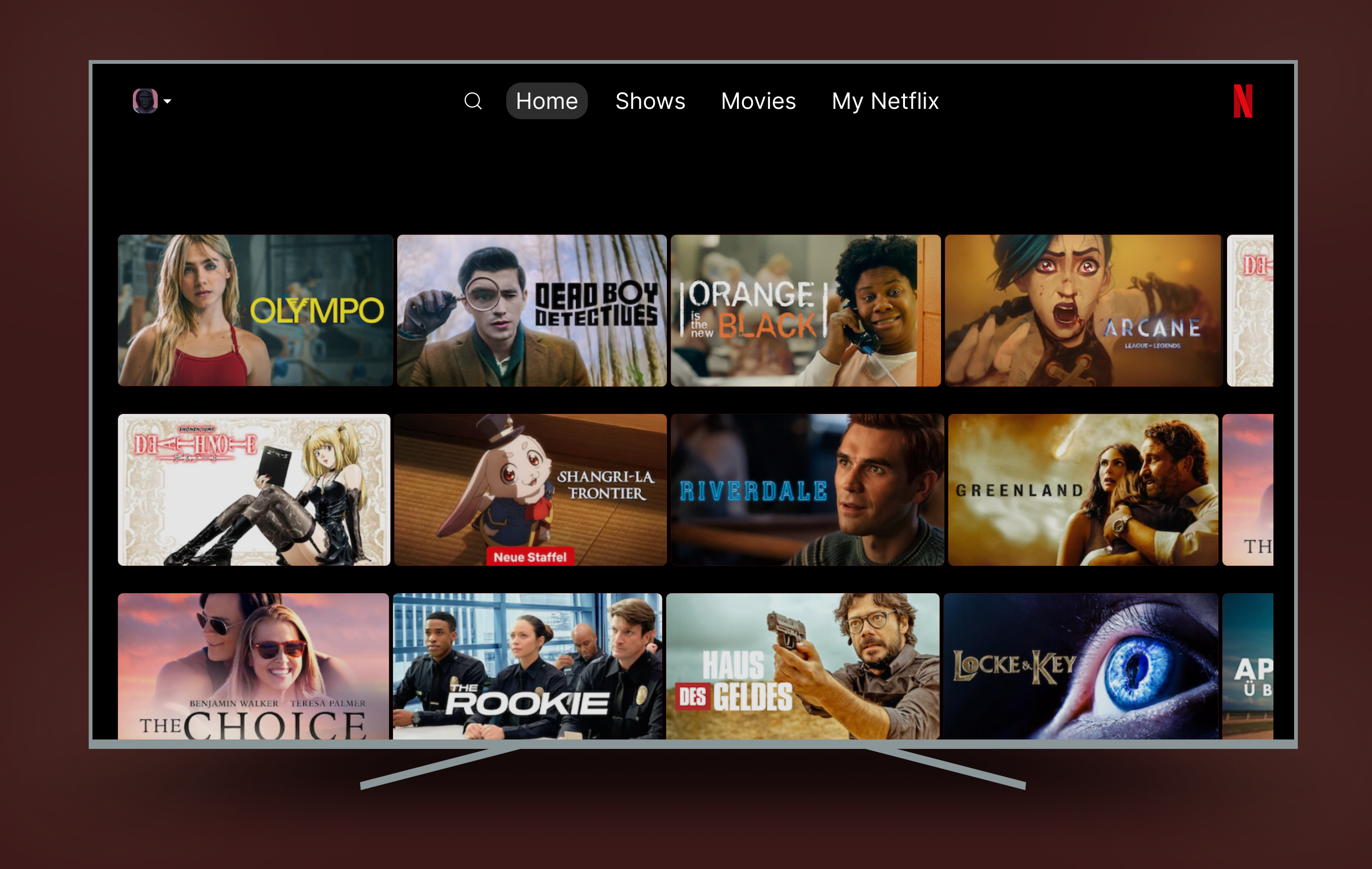
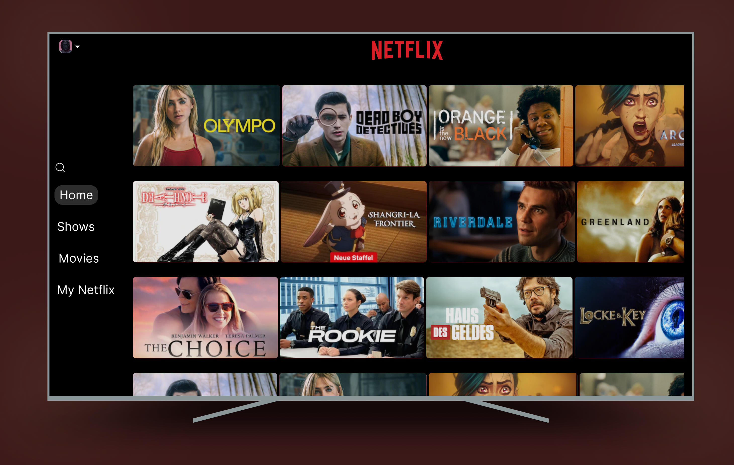
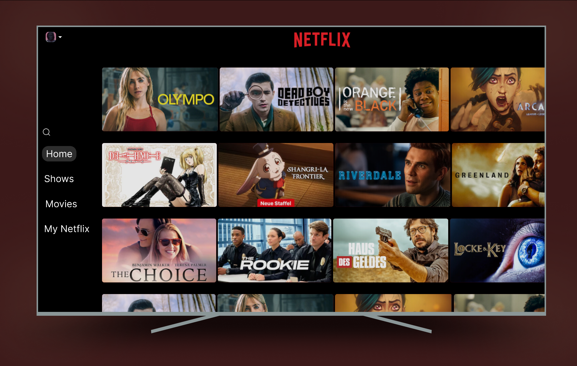
A TV remote has four directional buttons. The navigation should map to natural remote movement — pressing Left should always reach the menu, from any row, at any scroll depth. No climbing required.
Before / After
The only structural change is where the navigation lives. Everything else — branding, thumbnail grid, content density — stays identical.
Two nav states
The sidebar has two states. Collapsed: just icons, minimal screen real estate, content takes the full width. Expanded: press Left on the remote, labels slide in, you navigate, content shifts right. Release and it collapses again.
This follows the pattern already established by Apple TV, Amazon Fire TV, and YouTube TV — all of which use left-side navigation for exactly the same reason. Netflix TV is the outlier.
What I didn't touch
The Netflix visual identity — logo, red, thumbnail grid — is untouched. A good redesign solves the problem without creating new ones. Changing the visual language would have made this about aesthetics. This is about interaction architecture.
The thumbnail grid stays the same size. The content density is identical. Nothing is lost — one thing is fixed.
Interactive prototype
The prototype shows the full navigation flow — collapsed state, triggering the expanded menu, switching categories, and returning to content.