Steam Library — Redesign Concept
A personal exploration of Steam's biggest daily frustration. Not because the design is bad — because I use it every day, a few things kept bothering me, and I wanted to see if I could solve them properly.
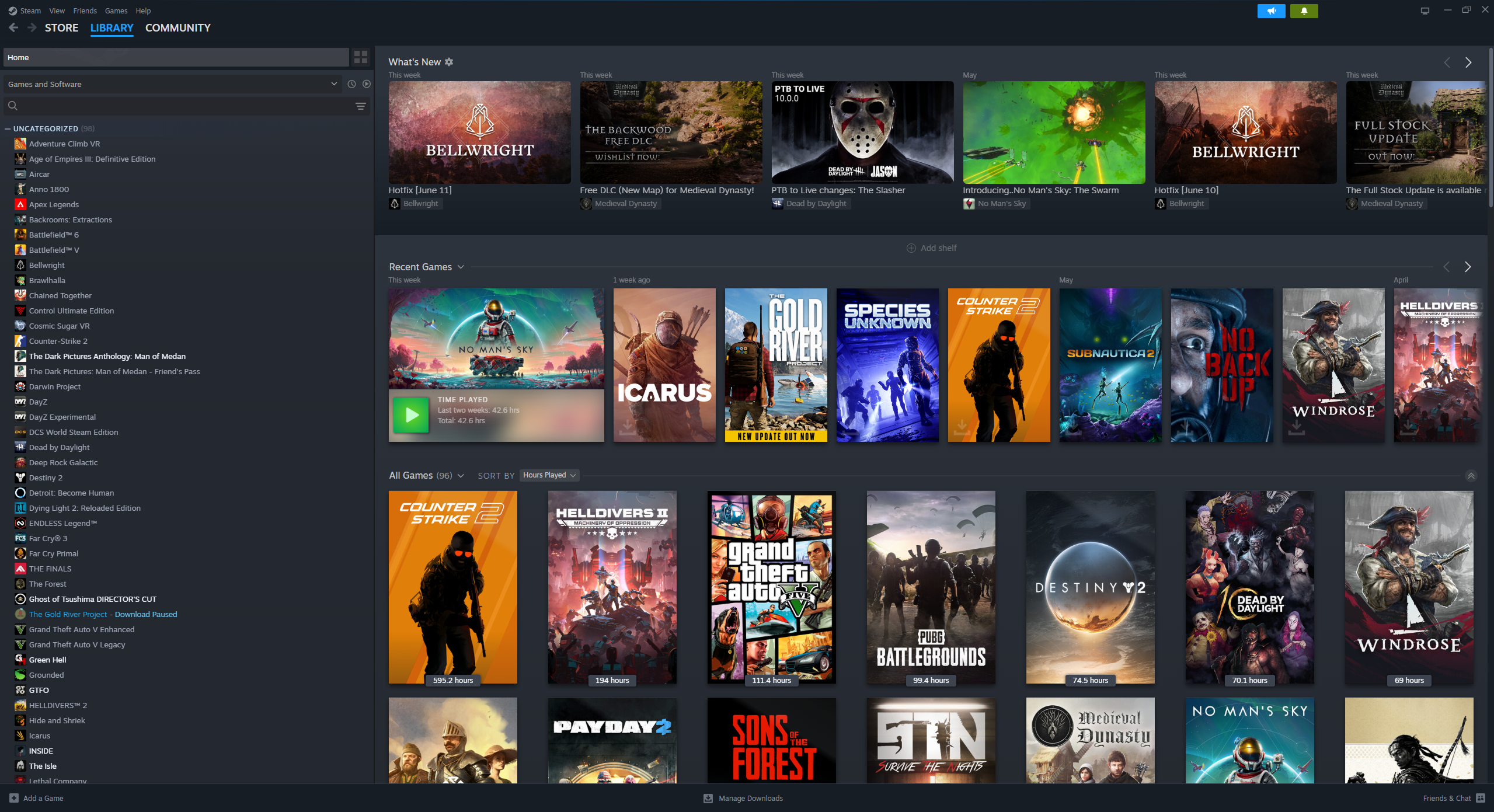
Steam's Library shows everything you own — sorted alphabetically. It knows your playtime, your friends' activity, recent updates. It just doesn't use any of it to help you decide what to play right now.
Solve three specific friction points: mood-based discovery, inline friend context, and storage pulled out of Settings. Respect Steam's visual language — it shouldn't look like a different app.
Why I made this
I play games daily. Steam is open on my PC every single day. And for all its power as a platform, the Library screen has always felt like a missed opportunity. It's a list. Alphabetical. That's it.
I didn't set out to redesign Steam. I sat down one day, opened my library, stood in front of 200 games for five minutes, closed Steam, and played nothing. That was the moment I thought — there's a real problem here worth exploring.
This isn't a criticism of Valve's work. Steam is an enormous product serving hundreds of millions of users. This is me, as a UI designer and daily user, asking: what would I actually want this to feel like?
The core problem: a library that doesn't help you choose
Steam's Library shows you everything you own — sorted alphabetically by default, with categories you've (probably) never set up. The platform knows what you've played, how long, when you last played it, which friends are online, what's been updated. It has all the data.
It just doesn't use any of it to help you decide.
The real question isn't "what do I own?" — Steam already answers that. The real question is "what should I play right now?" That's the question Steam's Library doesn't answer at all.
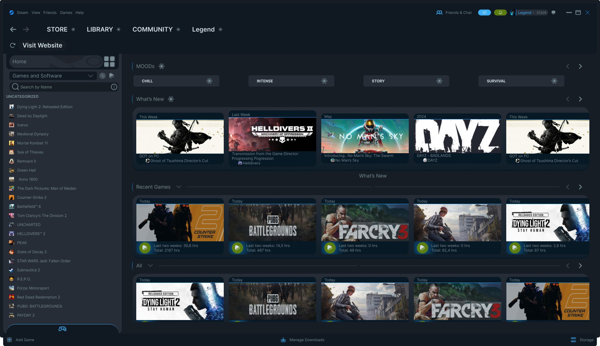
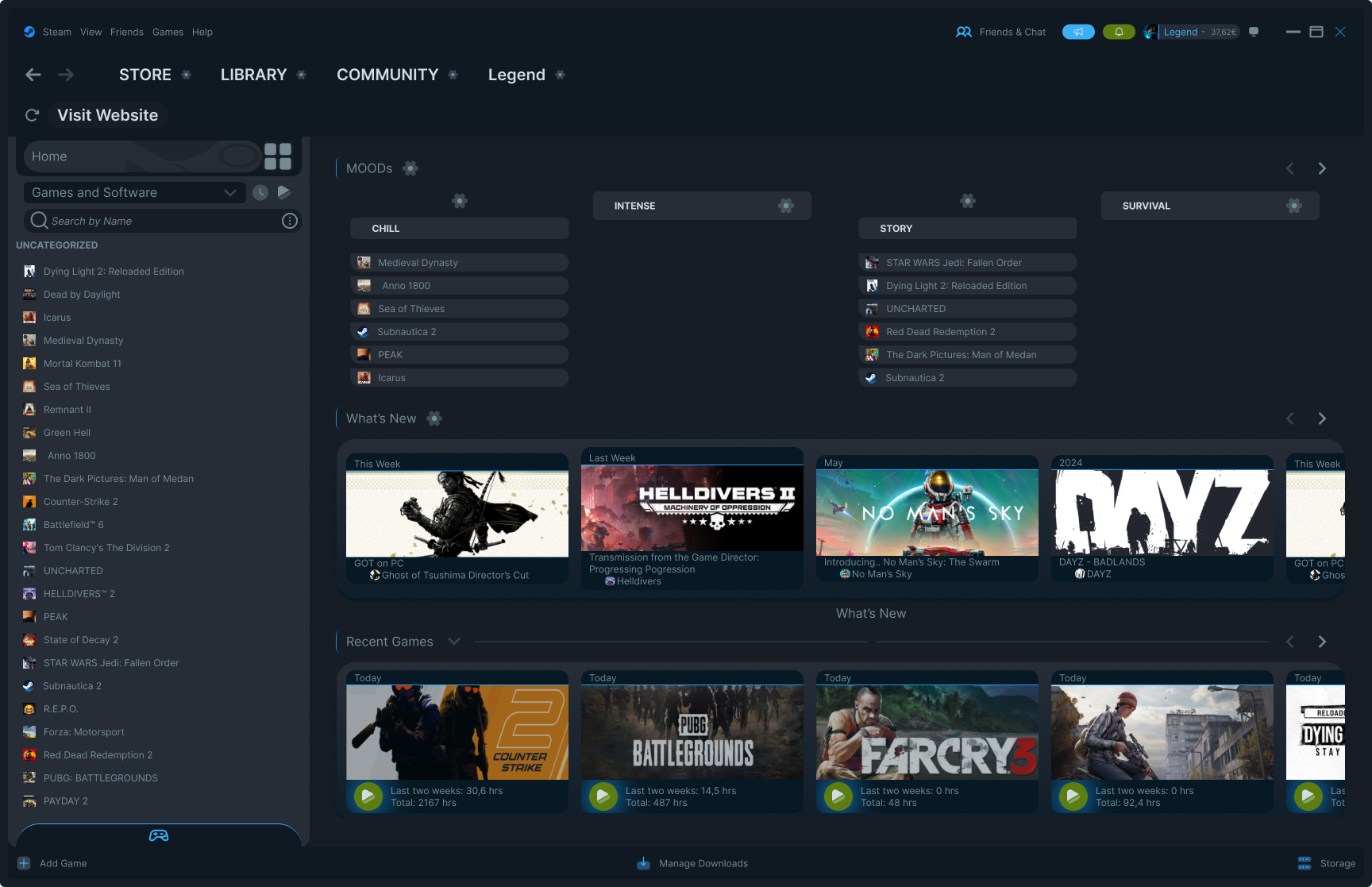
Solution 1 — Mood-based discovery
Instead of showing all games in a flat list, the redesign introduces a Mood system at the top of the Library. Four categories — not genres, not tags — moods. The way you actually think when you sit down to play.
Each mood is fully customizable — you can rename, reorder, assign games manually, or delete moods you don't use. A gear icon on each tab opens a small settings menu with exactly those options. Nothing more.
Before / After — The Library
The original Steam Library shows everything you own in one undifferentiated view. The redesign keeps the same layout and information density — the difference is in how the content is surfaced and organized.
Solution 2 — Hover cards with context
Steam already knows which friends are playing right now. It knows your playtime. It knows when you last touched a game. But none of that information appears when you're browsing your library — you have to click into a game to see any of it.
The redesign surfaces this inline. Hover over any game and a card appears: which friends are currently playing, their avatars, the hero artwork, and your playtime at a glance. No clicking required — the context comes to you.
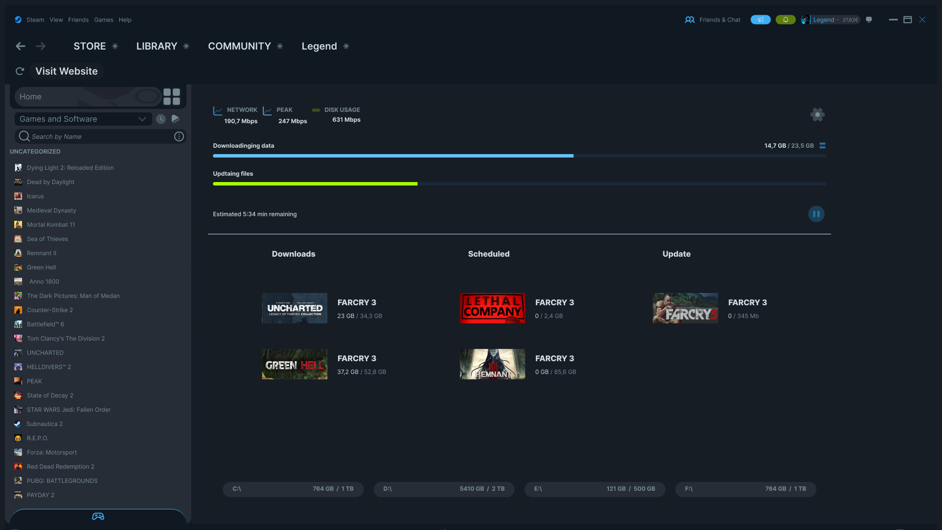
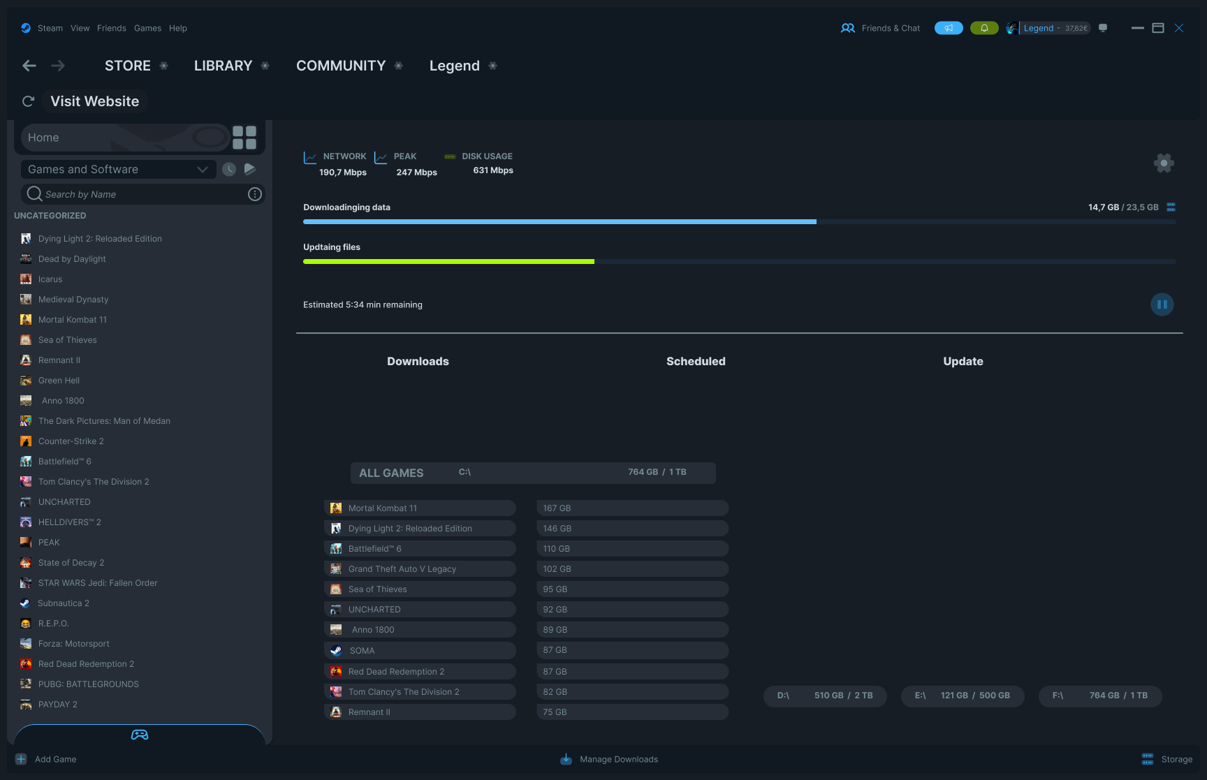
Solution 3 — Downloads & Storage, redesigned together
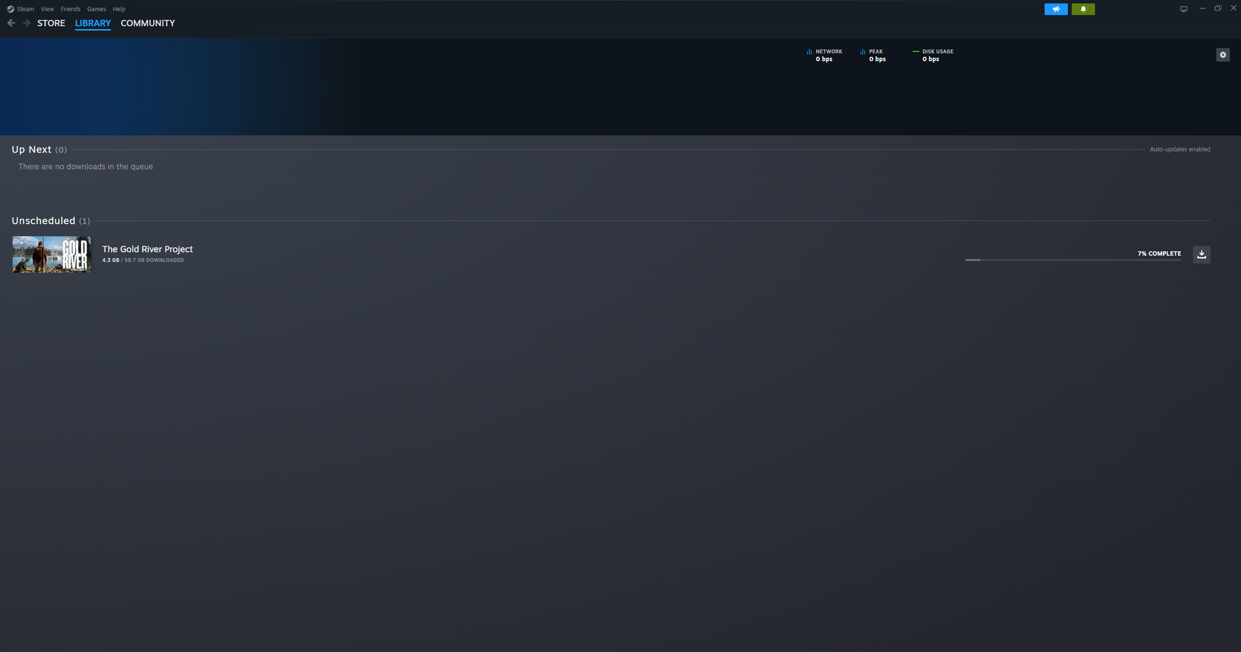
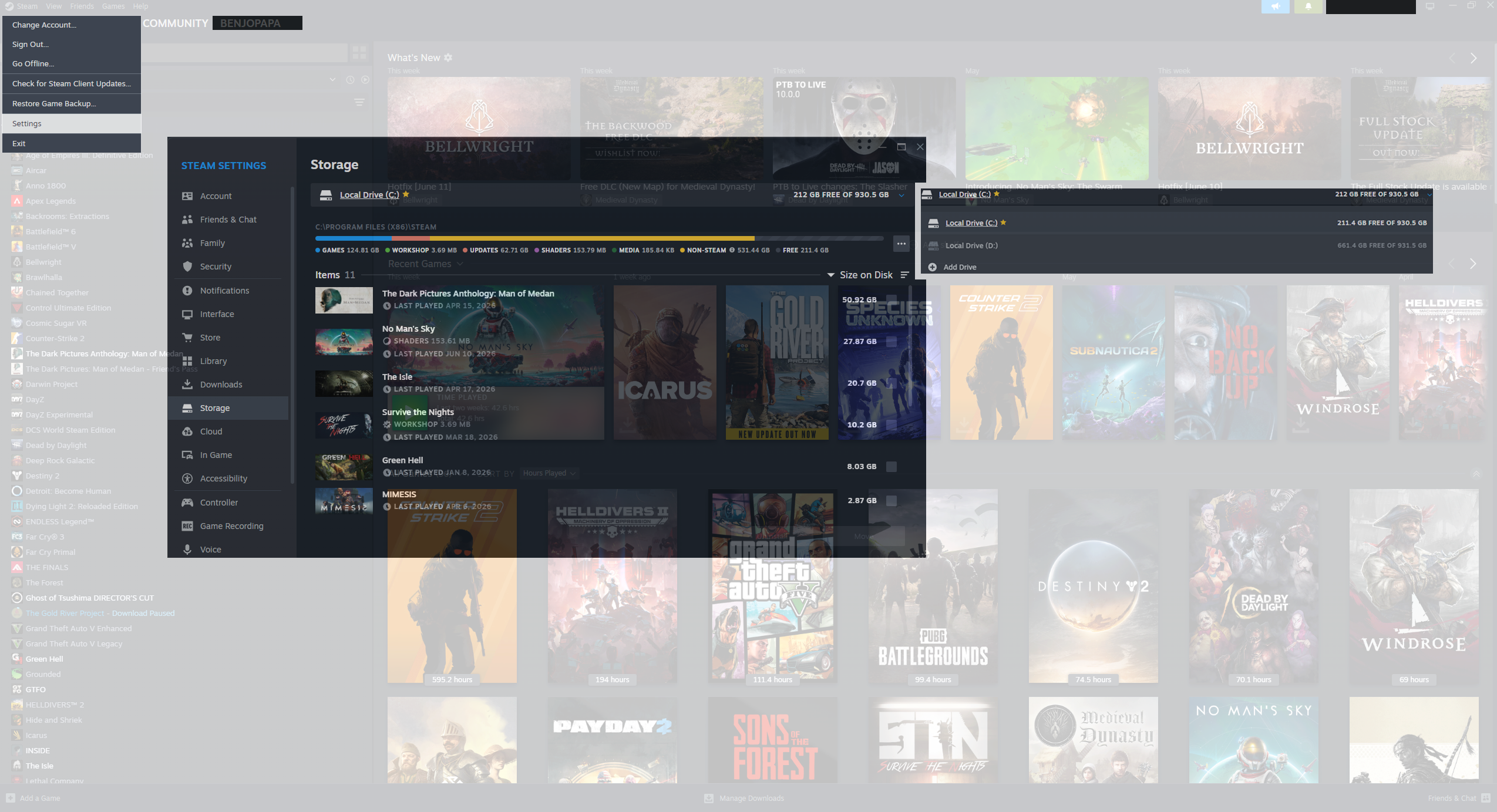
The original Steam Downloads screen is almost empty most of the time. It shows what's downloading — and nothing else. Storage information is completely absent: to find out how full your drives are, you navigate to Steam → Settings → Storage, three menus deep.
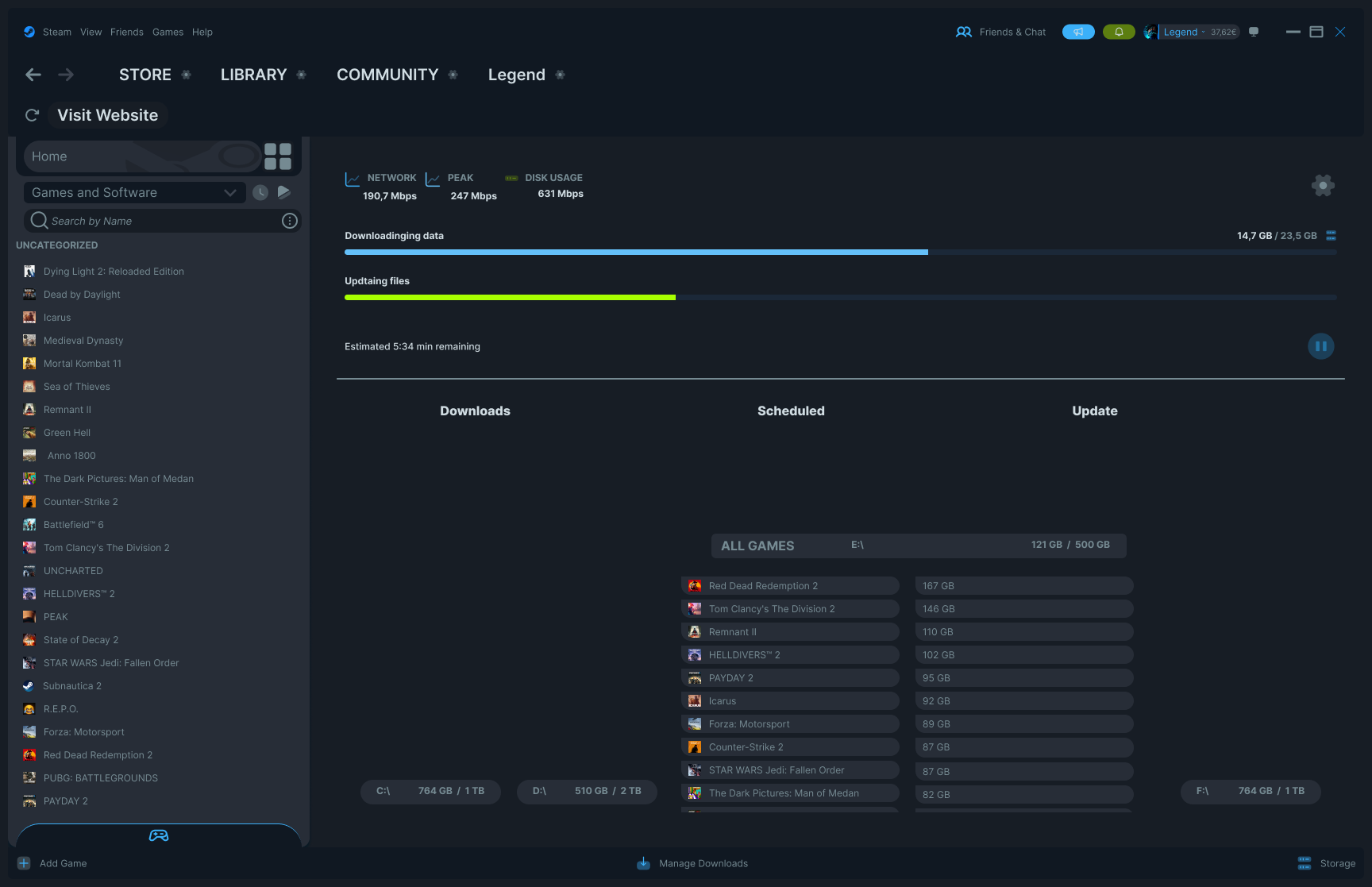
The redesign adds three things to the Downloads screen: a Downloads queue (active), a Scheduled queue (waiting), and an Update queue — all visible side by side. At the bottom of the screen, all installed drives are shown as compact bars, always visible.
Storage information belongs next to download management — not buried in Settings. When you're deciding whether to install a 40GB game, you need to see your available space in the same view, not after navigating three menus.
The collapsible drive detail
Each drive bar at the bottom can be expanded to show which games are installed on that drive and how much space each one takes. Click the bar — the list expands inline. Click again — it collapses. This was previously accessible only through the full Storage settings panel.
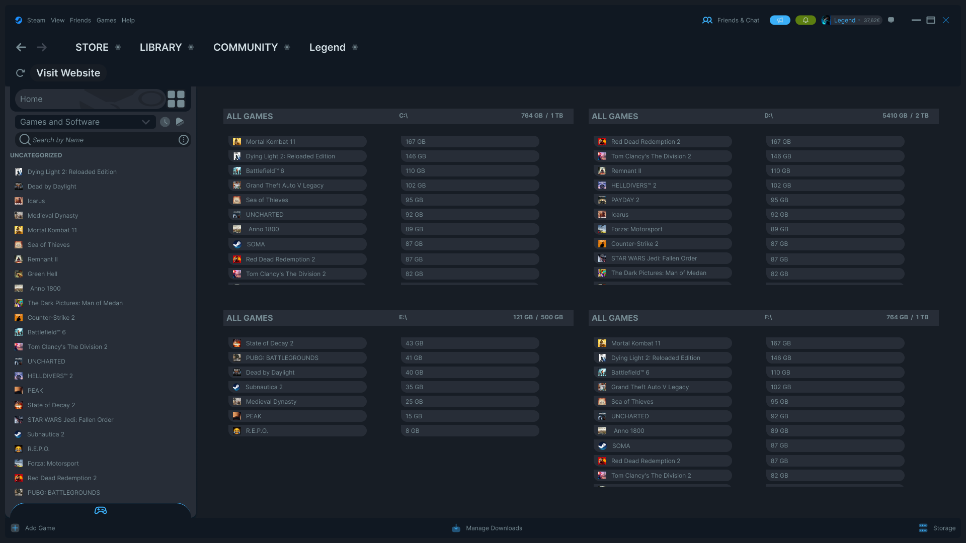
The full Storage view
For users who want a complete overview of all drives at once, a dedicated Storage view is accessible from the footer of any Library screen — one click. All drives shown side by side, all games listed with sizes, no settings menu required.
What I didn't change
The core Steam visual language is intact. Dark background, same sidebar structure, same navigation bar, same typography weight. The redesign doesn't try to look like a different app — it tries to feel like a better version of the same one.
Steam works. It's reliable, fast, and trusted by hundreds of millions of users. The goal here was never to redesign Steam's identity. It was to solve three specific friction points I encounter every time I open it.
Interactive prototype
The prototype shows the full flow — desktop to Steam Library, mood navigation, hover cards, downloads screen, and the collapsible storage drives. Built and connected in Figma.